The Colors of Prague: An Old-World Palette Inspired by Red Roofs, Stone Bridges and Literary Cafés
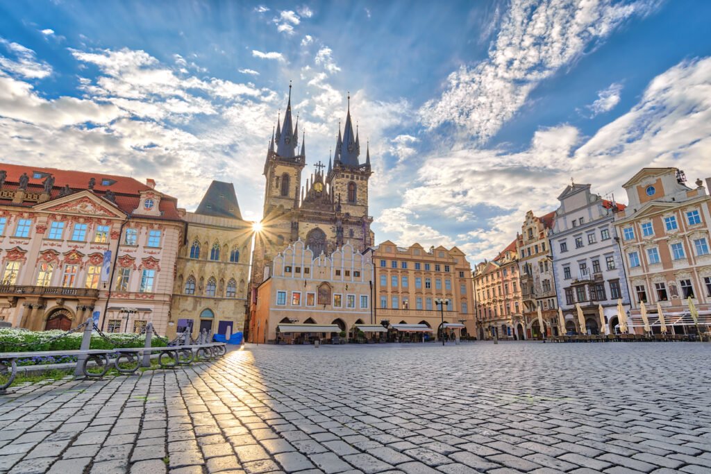
Prague is often described in black and gold.
Gothic towers. Dark church interiors. Gas lamps glowing against stone. Kafka. Absinthe. Candlelit cafés.
But walk through the city in daylight and Prague reveals a much more complicated palette.
There are terracotta rooftops above the Old Town, warm sandstone along Charles Bridge, faded cream and ochre façades, oxidised copper domes, dusty pink townhouses and the deep blue-grey of the Vltava.
Look closer still and another Prague appears: polished walnut, dark burgundy, marble, brass and muted green inside the city’s historic cafés and Art Nouveau buildings.
Prague City Tourism itself describes the view from above as a mosaic of red roofs surrounding the Vltava, while Old Town Square is defined partly by its collection of multicoloured historic façades. Charles Bridge, meanwhile, was constructed from sandstone blocks — one of the most important natural colours in the Prague streetscape. Prague City Tourism
So rather than reducing the city to medieval black, this Prague color palette takes its inspiration from the real materials, architecture and atmosphere of the Czech capital.
The Prague Master Palette
If you wanted to capture Prague in ten colours, I would start here:
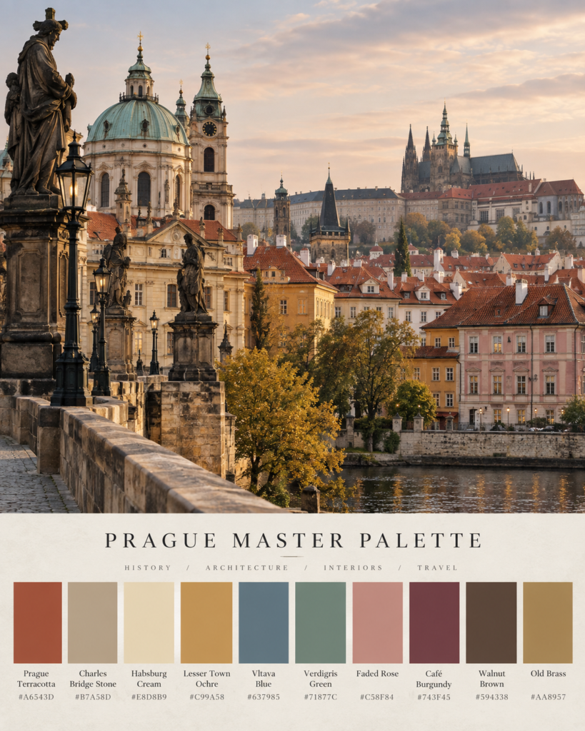
| Colour | Hex | Inspired by |
|---|---|---|
| Prague Terracotta | #A6543D | Historic tiled rooftops |
| Charles Bridge Stone | #B7A58D | Weathered sandstone |
| Habsburg Cream | #E8D8B9 | Old Town façades |
| Lesser Town Ochre | #C99A58 | Baroque plasterwork |
| Vltava Blue | #637985 | The river beneath an overcast sky |
| Verdigris Green | #71877C | Oxidised copper roofs and domes |
| Faded Rose | #C58F84 | Pastel historic façades |
| Café Burgundy | #743F45 | Velvet, polished interiors and old cafés |
| Walnut Brown | #594338 | Historic café furniture |
| Old Brass | #AA8957 | Art Nouveau detailing |
Together they create a palette that feels historic without becoming heavy: warm stone, faded pigment, dark wood and restrained jewel tones.
And within that master palette are several very different versions of Prague.
Prague Terracotta + Charles Bridge Stone
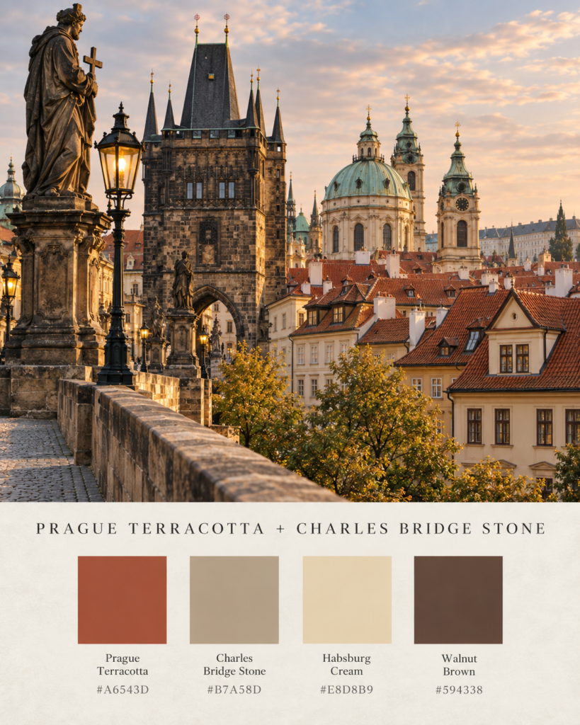
Prague Terracotta — #A6543D
Charles Bridge Stone — #B7A58D
Habsburg Cream — #E8D8B9
Walnut Brown — #594338
Feel: warm, architectural, historic, grounded.
Seen from Prague’s towers and hilltops, terracotta is one of the city’s defining colours. Rows of reddish roofs stretch between church towers and pale façades before meeting the Vltava.
Bring that red down to street level, however, and it is balanced by something quieter: stone.
Charles Bridge is built from sandstone blocks, giving it the softly weathered beige-grey colour that becomes particularly atmospheric on cloudy mornings. Prague City Tourism
This is perhaps the most recognisably Prague palette of the group.
In an interior, avoid using terracotta everywhere. Let warm stone or cream dominate, then introduce terracotta through upholstery, artwork, tiles or ceramics. Dark walnut gives the palette the weight needed to stop it drifting into Mediterranean territory.
Vltava Blue + Prague Terracotta
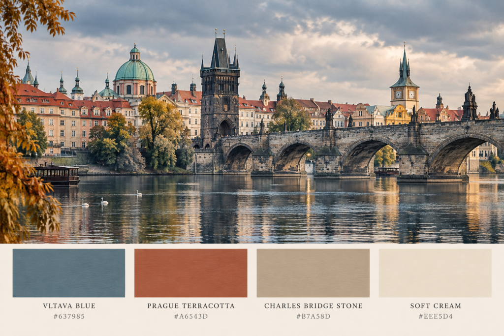
Vltava Blue — #637985
Prague Terracotta — #A6543D
Charles Bridge Stone — #B7A58D
Soft Cream — #EEE5D4
Feel: romantic, slightly moody, distinctly Central European.
Prague’s rooftops become even more striking when seen beside the Vltava.
Terracotta and muted blue sit opposite each other beautifully: one warm and earthy, the other cool and slightly grey.
The trick is keeping the blue subdued.
This isn’t Santorini blue or bright coastal navy. Vltava Blue is cloudy, mineral and restrained — closer to water beneath a November sky than a tropical sea.
For interiors, this combination works particularly well with blue-grey cabinetry, stone walls, off-white linen and small amounts of rust-coloured upholstery.
It gives you the romance of Prague without resorting to Gothic clichés.
Habsburg Cream + Lesser Town Ochre
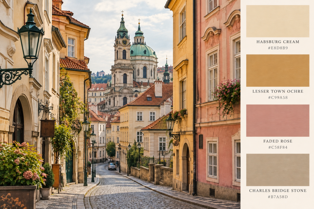
Habsburg Cream — #E8D8B9
Lesser Town Ochre — #C99A58
Faded Rose — #C58F84
Charles Bridge Stone — #B7A58D
Feel: elegant, faded, warm, old-world.
Cross Charles Bridge into Malá Strana — Prague’s Lesser Town — and the city softens.
Here the Gothic drama of the Old Town sits alongside richly varied Baroque architecture. Official Czech tourism material specifically notes the diversity of Baroque façades that gives Lesser Town much of its character. VisitCzechia
Cream, warm yellow, muted peach and faded rose work particularly well because none needs to feel freshly painted.
The Prague version of pastel should feel slightly dusty and softened by age.
At home, this palette lends itself beautifully to plaster walls, creamy cabinetry, limestone, linen, worn timber and aged brass.
Think old European apartment rather than pastel cottage.
Verdigris Green + Old Stone
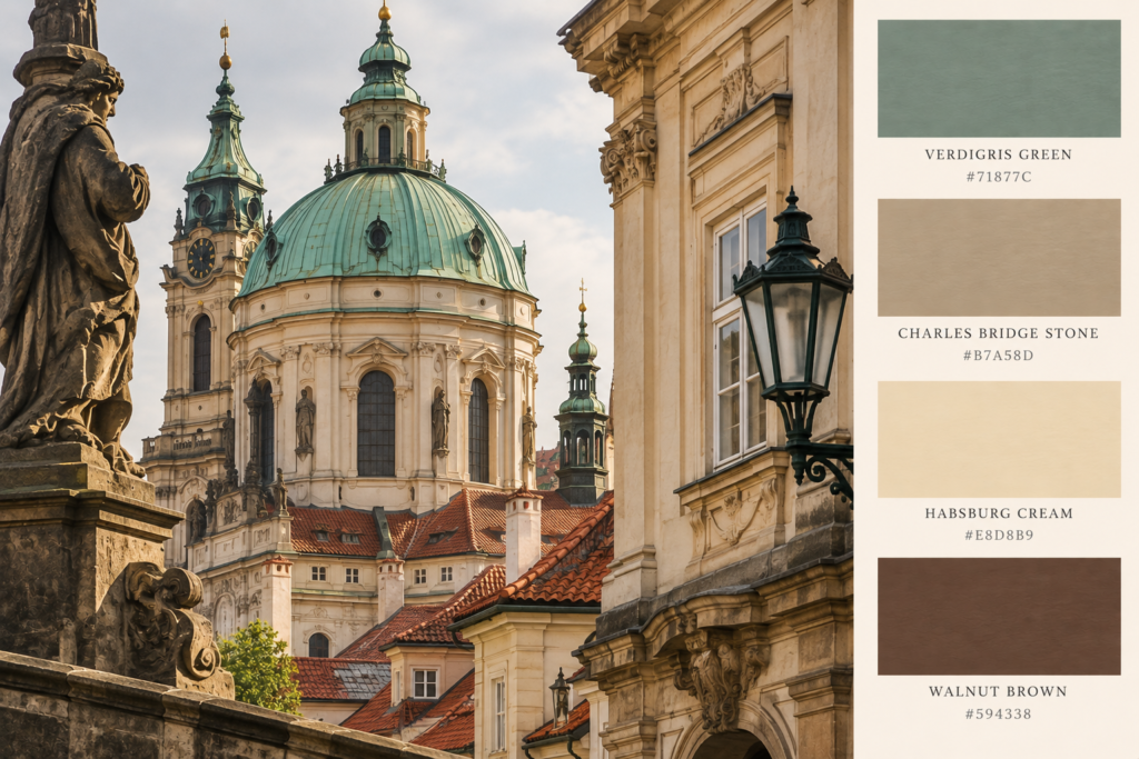
Verdigris Green — #71877C
Charles Bridge Stone — #B7A58D
Habsburg Cream — #E8D8B9
Walnut Brown — #594338
Feel: quiet, scholarly, architectural.
Look above Prague’s red rooftops and flashes of muted green begin appearing among them.
Copper roofs, domes and architectural details weather over time into blue-green tones, creating one of the city’s most effective colour contrasts.
Rather than using a bright emerald, the Prague version is greyed and mineral.
Pair it with stone and walnut and the result immediately feels more mature.
This would be particularly beautiful in a study or reading room: muted green walls, dark timber shelves, warm off-white curtains and a single aged brass lamp.
It has just enough literary moodiness without becoming theatrical.
Faded Rose + Terracotta
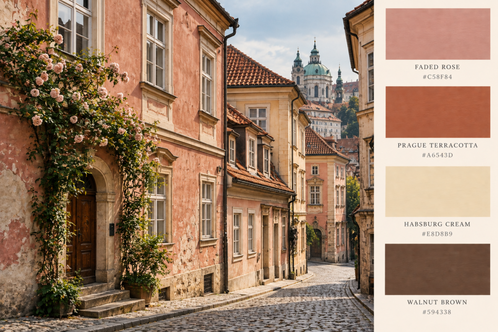
Faded Rose — #C58F84
Prague Terracotta — #A6543D
Habsburg Cream — #E8D8B9
Walnut Brown — #594338
Feel: romantic, softly aged, warm but sophisticated.
Prague’s colourful façades are one of the reasons the city can feel surprisingly light despite all those Gothic towers.
Old Town Square alone contains houses in a variety of colours and architectural periods. VisitCzechia
Among the yellows and creams are softer pink and peach tones that work exceptionally well against terracotta roofs.
The key word here is faded.
Avoid millennial pink.
A Prague rose should contain enough brown and grey to look as though it has spent a century exposed to Central European winters.
Used with warm white walls, timber and rust-coloured textiles, it can produce a bedroom or sitting room that feels romantic without becoming sugary.
Art Nouveau Green + Old Brass
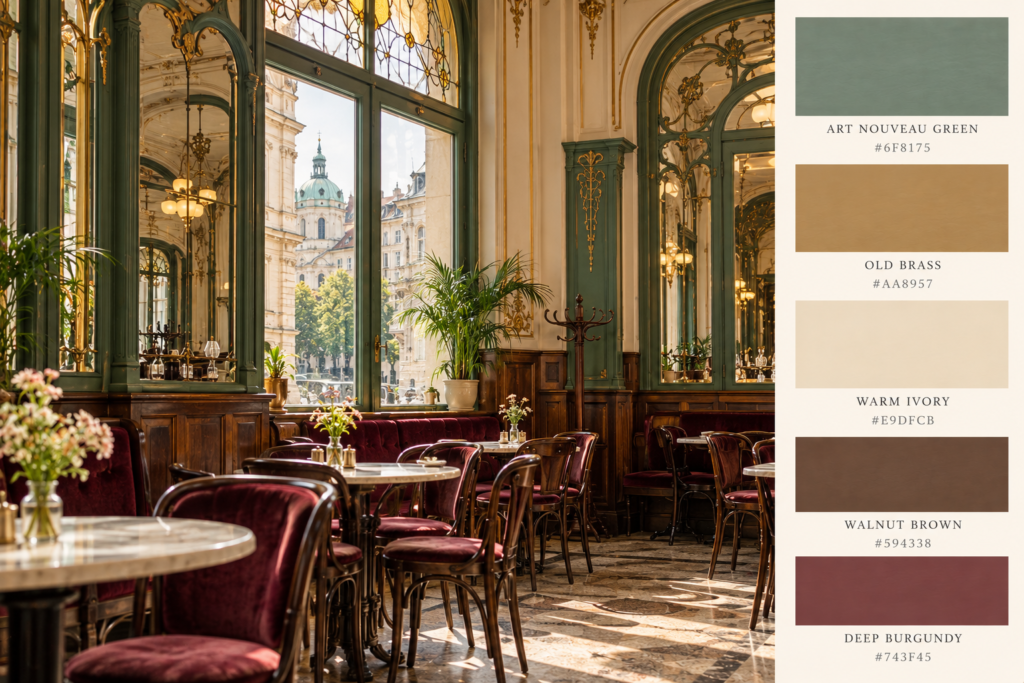
Muted Art Nouveau Green — #6F8175
Old Brass — #AA8957
Warm Ivory — #E9DFCB
Walnut Brown — #594338
Deep Burgundy — #743F45
Feel: elegant, artistic, turn-of-the-century.
Prague isn’t only Gothic and Baroque.
Around the turn of the twentieth century, Art Nouveau became another major layer in the city’s architectural identity. Prague’s Municipal House is one of its most important examples, while Art Nouveau and historicist details also appear along streets such as Pařížská. VisitCzechia
This is where Prague’s palette becomes richer.
Green.
Brass.
Cream.
Dark timber.
A little burgundy.
But restraint matters.
You don’t need swirling Mucha murals covering the walls to reference Prague Art Nouveau. A muted green wall, walnut furniture, an antique brass light and a marble-topped table will do considerably more.
This is perhaps the easiest Prague palette to translate into a contemporary interior.
Café Burgundy + Walnut
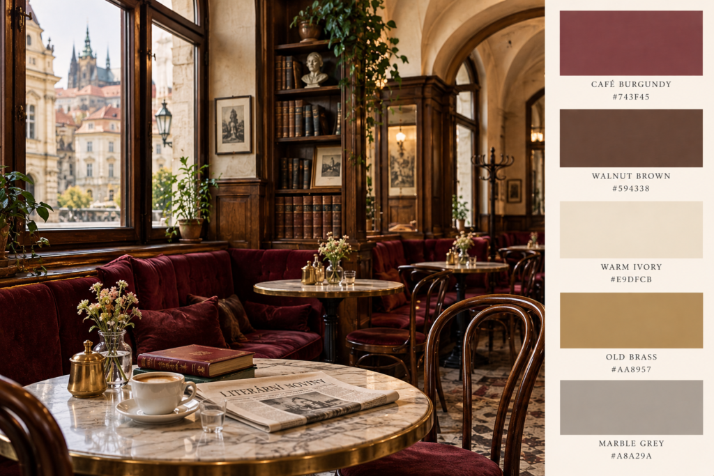
Café Burgundy — #743F45
Walnut Brown — #594338
Warm Ivory — #E9DFCB
Old Brass — #AA8957
Marble Grey — #A8A29A
Feel: literary, intimate, sophisticated.
For the Prague of writers and cafés, the palette becomes darker.
Deep reddish brown.
Polished timber.
Cream ceilings.
Marble tabletops.
Brass catching the light.
Prague’s historic coffeehouse culture flourished around the turn of the twentieth century, and surviving spaces such as the café inside Municipal House still show how timber, marble, decorative metalwork and pale architectural detailing can coexist without making a room feel oppressive.
This is the palette I’d choose for anyone wanting the literary Prague aesthetic.
Paint the entire room burgundy and it risks becoming a themed restaurant.
Instead, start with cream or warm stone walls. Add walnut furniture. Use burgundy for an armchair, curtain, rug or book-lined alcove, then introduce brass sparingly.
Put a stack of books on the table.
That’s enough.
How to Use the Prague Palette Without Making Your Home Look Medieval
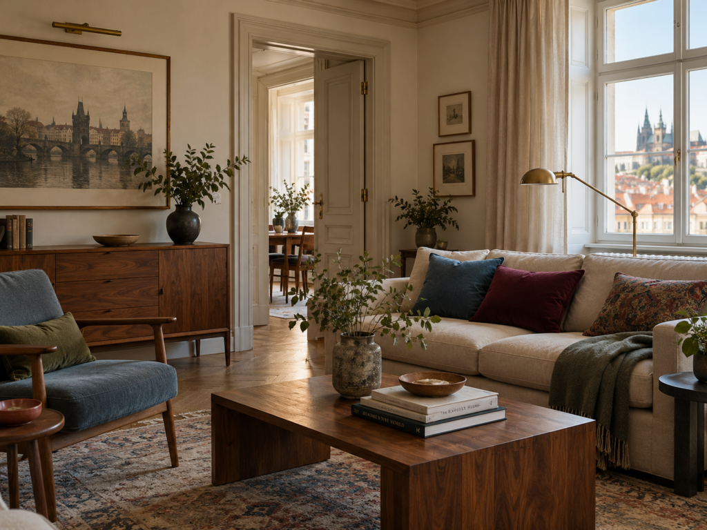
The most interesting thing about Prague’s colour palette is that the city itself rarely relies on one dramatic colour.
It relies on layers.
Warm plaster sits beside weathered stone.
Terracotta rises above faded façades.
Dark timber appears behind glass café windows.
Green copper cuts through fields of red rooftops.
The easiest way to translate that into a modern interior is therefore to use the quieter architectural colours first.
Start with Habsburg Cream, Charles Bridge Stone or a soft warm white as the room’s foundation.
Introduce one stronger Prague colour — terracotta, verdigris, burgundy, ochre or faded rose.
Then ground everything with walnut, aged brass or blackened metal.
That approach references Prague without attempting to recreate it.
Because the goal isn’t to make your house look like an apartment above Old Town Square.
It’s to borrow the things Prague does particularly well: aged colour, architectural warmth and a little darkness around the edges.
Which Prague Palette Feels Most Like the City?
For me, Prague’s defining combination isn’t black and gold.
It’s terracotta, weathered sandstone, faded cream and Vltava blue.
Those are the colours you repeatedly encounter when moving through the city: rooftops seen from above, old stone beneath your feet, pale historic façades and the river threading through everything.
But Prague changes after dark.
Then the walnut, burgundy and brass begin to make sense.
And perhaps that’s why the city is such a good source of colour inspiration.
There isn’t really one Prague palette.
There is Prague in the morning, Prague from the rooftops, Prague beside the river — and Prague from a corner table in an old café.
Continue Exploring Prague
If you’re planning a trip rather than simply stealing its colour palette, pair this article with our Literary Prague Walking Tour, following the writers, cafés, strange sculptures and atmospheric streets that helped shape Prague’s literary identity.
And if the darker side of the city is what caught your attention, there is plenty more to explore beyond Kafka: Gothic churches, Czech Cubism, Art Nouveau interiors and some of the most unusual architecture in Central Europe. Prague’s historic centre layers Gothic and Baroque buildings with later movements including Art Nouveau and Prague’s distinctive Cubist architecture.
Britt & Tyler
We’re Britt and Tyler, the two Australians behind Cocktails & Cathedrals. We’re drawn to old buildings, beautiful rooms, bookshops and places that seem to hold a story. Our journal brings those interests together, with a fondness for slow afternoons and a well-made cocktail. We hope it helps you find places you’ll want to linger.
Travel slowly. Stay beautifully.
A little more about us →