The Kinsale Colour Palette: 10 Irish Coastal Colours to Steal for Your Home

Kinsale is one of those places that seems to have ignored every sensible rule about colour and somehow come out looking better for it.
Coral pink sits beside turquoise.
Mustard yellow rubs shoulders with deep navy.
Seafoam green turns up next to soft lavender.
And somehow, rather than looking chaotic, the whole thing feels warm, coastal and completely intentional.
That’s because Kinsale’s colour isn’t really random.
Look past the brightly painted shopfronts and you’ll notice that the town is grounded by quieter tones: slate roofs, cream render, old stone, dark timber, muted greens and soft greys.
Those calmer colours do most of the heavy lifting.
The brighter ones simply get to have more fun.
Which is why Kinsale gives us a surprisingly good lesson in interior design.
You don’t need to paint your entire house turquoise.
You just need to understand how the colours work together.
So if you like the idea of an Irish coastal palette that feels cheerful without becoming twee, here are ten Kinsale-inspired colours worth stealing.
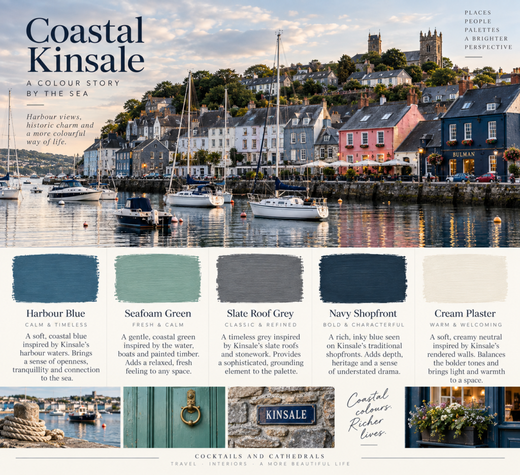
1. Harbour Blue
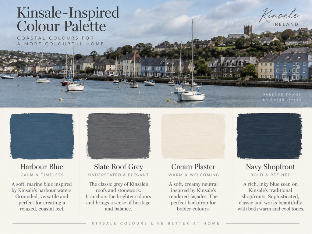
Let’s start with the obvious one.
Kinsale is a harbour town, and blue is everywhere.
Not tropical blue.
Not glossy Mediterranean blue.
Something softer.
A slightly greyed marine blue that feels like painted boats, Atlantic water and old shopfronts.
This shade works beautifully because it has enough grey in it to feel grown-up.
Where to use it
Try it on:
- kitchen cabinetry
- a study wall
- built-in shelving
- a bathroom vanity
- a front door
Pair it with warm white, natural timber and aged brass.
It also works particularly well beside terracotta and coral tones, which gives you that slightly unexpected Kinsale contrast.
2. Slate Roof Grey
Every bright colour needs something quieter beside it.
In Kinsale, that job is often done by slate.
The roofs bring a slightly weathered charcoal-grey tone into the streetscape, and it stops all the pinks and yellows from becoming too sugary.
This is one of the most useful colours in the entire palette.
Think soft charcoal rather than black.
Where to use it
Slate grey works well on:
- kitchen islands
- interior doors
- lower cabinetry
- feature walls
- joinery
- exterior trim
It is particularly good if you like colour but don’t want your home to feel overly playful.
You can put almost any of the brighter Kinsale colours beside it and they suddenly look more sophisticated.
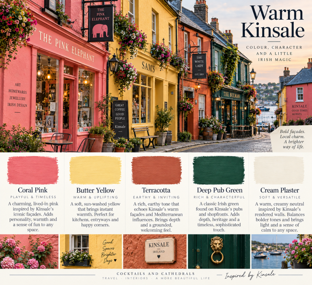
3. Butter Yellow
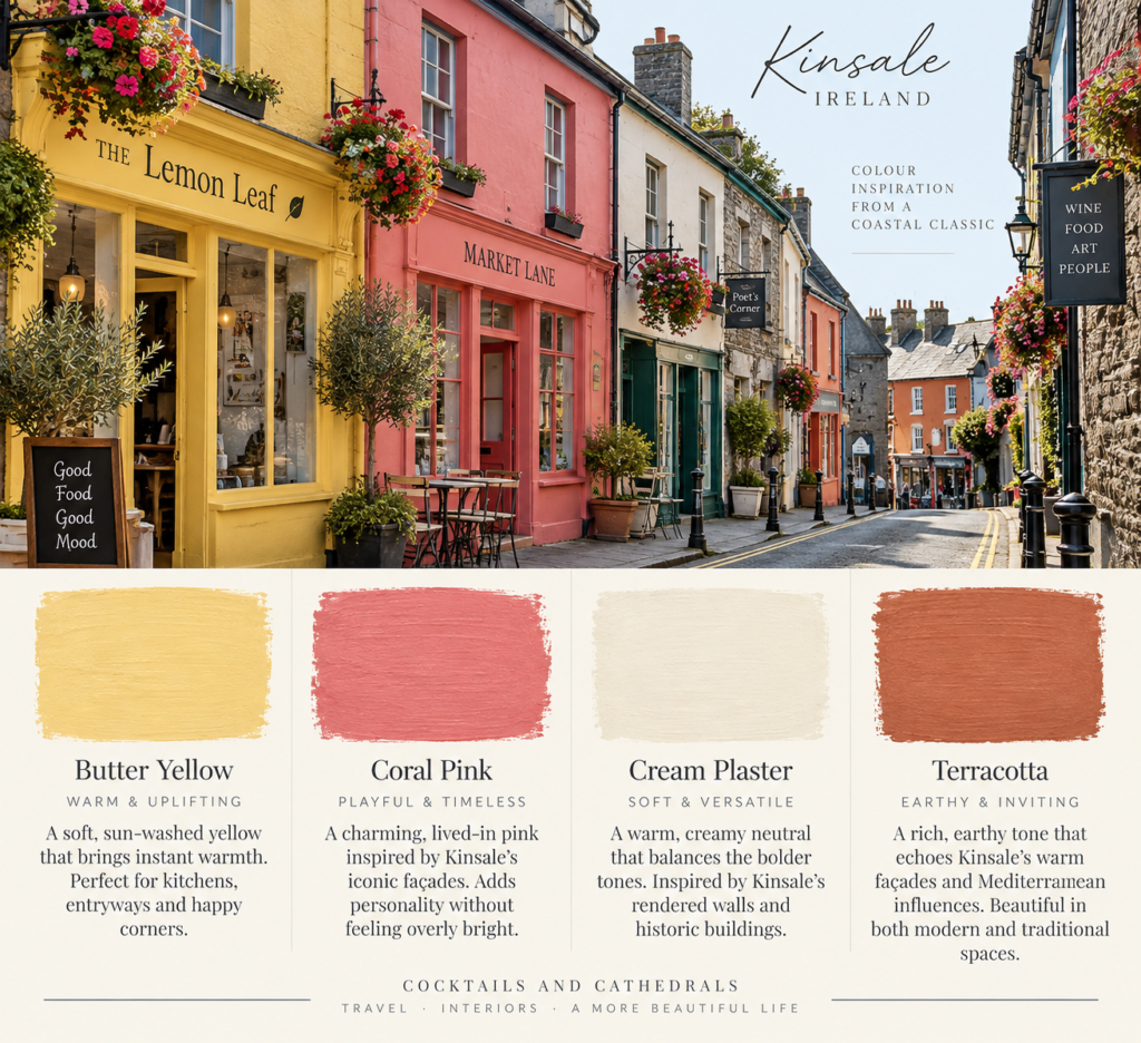
Kinsale does yellow exceptionally well.
The key is that it isn’t a sharp lemon.
It’s warmer.
More like old butter, faded plaster or a building that has been sitting in the Irish weather for a very long time.
That softness makes all the difference.
Where to use it
Butter yellow is perfect for:
- breakfast nooks
- kitchens
- mudrooms
- small bathrooms
- hallway walls
- painted furniture
It also works beautifully in rooms without huge amounts of natural light because it adds warmth without becoming aggressive.
Pair it with cream, slate grey and dark green.
4. Coral Pink
This is probably the colour most people notice first in Kinsale.
Pink façades appear everywhere.
But again, the best versions aren’t neon or sugary.
They lean coral.
A little dusty.
A little weathered.
Sometimes almost salmon.
That makes them surprisingly usable indoors.
Where to use it
Try coral pink in:
- a small dining room
- a bedroom
- a powder room
- a reading nook
- soft furnishings
- painted cabinetry
The trick is restraint.
One coral wall against cream, dark timber and olive green can look incredible.
An entire house in coral?
You may have accidentally opened a boutique hotel.
5. Seafoam Green
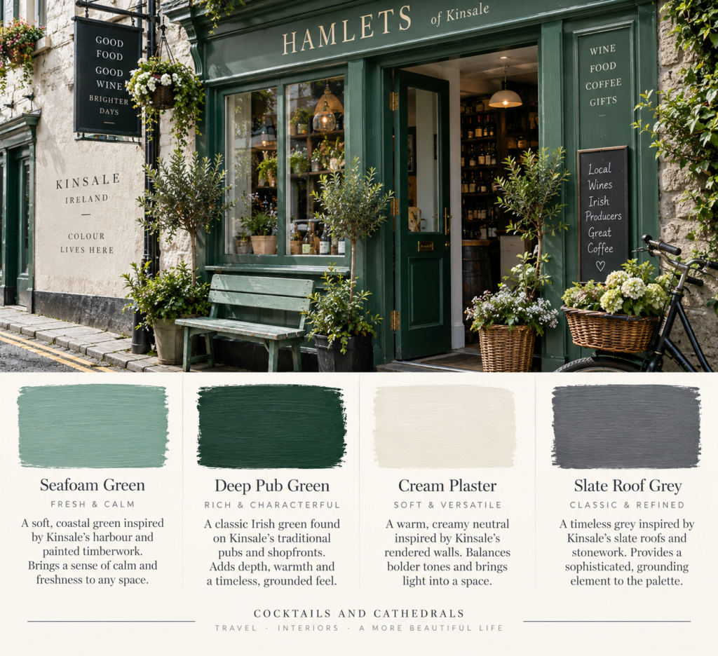
Kinsale has a lot of greens, but the softer ones are particularly good.
Think pale coastal green with a little blue and grey underneath.
Not mint.
Not sage exactly.
Something in between.
This shade feels incredibly calm.
Where to use it
Seafoam works beautifully in:
- bathrooms
- bedrooms
- kitchens
- laundry rooms
- cabinetry
- panelling
Pair it with warm white, natural oak, limestone and aged brass.
It’s probably the easiest Kinsale colour to bring into a modern home.
6. Deep Pub Green
Now we go darker.
Kinsale’s streets are full of deep greens on doors, shopfronts and traditional façades.
This is not a fresh botanical green.
It’s darker.
More like bottle glass, old pubs and painted timber.
And it is one of the best grounding colours in the whole palette.
Where to use it
Deep green is ideal for:
- kitchens
- libraries
- studies
- dining rooms
- cabinetry
- front doors
Pair it with cream, brass, leather and dark timber.
This is where Kinsale starts to feel less “colourful seaside town” and more “old Irish building with very good taste.”
7. Terracotta
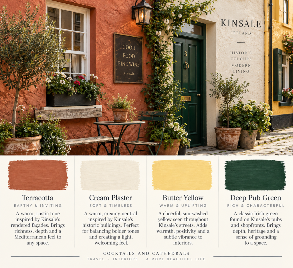
There is a warm reddish-orange undertone running through many of Kinsale’s painted façades.
Sometimes it’s bright.
Sometimes it’s muted.
But terracotta is the more usable version for interiors.
It feels warmer and earthier than coral.
And it works beautifully against all those cooler coastal blues and greens.
Where to use it
Use terracotta in:
- rugs
- cushions
- ceramic tiles
- feature walls
- upholstery
- painted niches
It pairs brilliantly with navy, seafoam and warm cream.
If you like Mediterranean interiors but want something slightly moodier and more Irish, this is the bridge.
8. Cream Plaster
This might be the least exciting colour in the palette.
It might also be the most important.
Kinsale’s bright colours work because there is plenty of cream, stone and off-white sitting quietly between them.
A cold white would make the palette feel harsher.
A warm cream softens everything.
Where to use it
Pretty much everywhere.
Walls.
Ceilings.
Trim.
Kitchen cabinets.
Hallways.
Bedrooms.
Cream gives the stronger colours somewhere to breathe.
And that is exactly what happens in Kinsale.
9. Navy Shopfront
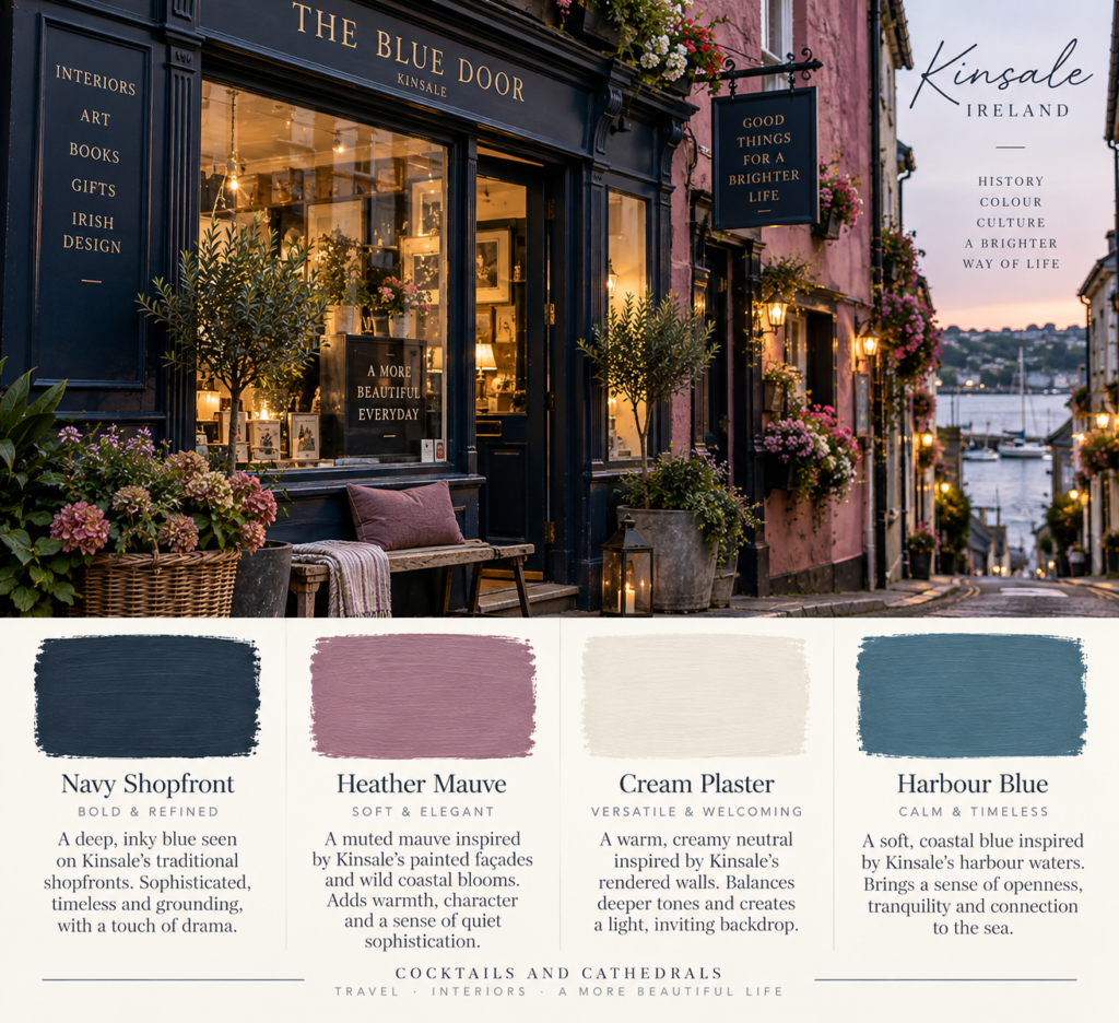
There’s a reason dark navy turns up so often on traditional shopfronts.
It looks expensive.
It makes brass lettering stand out.
It works with almost every other colour.
And it provides contrast without the severity of black.
Kinsale’s brighter façades become even more interesting when a dark navy shopfront appears between them.
Where to use it
Navy works well for:
- lower kitchen cabinetry
- joinery
- studies
- front doors
- built-ins
- bathroom vanities
Pair it with warm white, brass, oak and coral accents.
If you want the Kinsale look without embracing ten different colours, navy plus cream plus one brighter tone gets you most of the way there.
10. Heather Mauve
This is the quiet wildcard.
Kinsale’s colour palette occasionally drifts into lavender, mauve and dusty purple tones.
They work because they’re slightly greyed down.
Nothing too sweet.
Nothing too floral.
Just a muted purple that feels soft and a little unexpected.
Where to use it
Heather mauve works particularly well in:
- bedrooms
- dressing rooms
- small sitting rooms
- painted furniture
- soft furnishings
- linen
Pair it with cream, deep green and aged timber.
Used properly, it feels elegant rather than feminine.
How to Use the Kinsale Palette Without Making Your Home Look Like a Theme Park
This is the important bit.
Do not use all ten colours at once.
Kinsale gets away with it because you are looking at an entire town.
Your living room is considerably smaller.
The easiest formula is:
one neutral + one dark grounding colour + one brighter accent.
For example:
Cream + navy + coral
or
Cream + deep green + butter yellow
or
Slate grey + seafoam + terracotta
That is enough to give you the feeling of Kinsale without turning your house into a row of painted shopfronts.
Why the Palette Works
The real genius of Kinsale’s colour palette is contrast.
Warm and cool.
Bright and muted.
Dark and light.
Old and playful.
The colours rarely exist on their own.
A coral wall feels stronger because there is a slate roof above it.
A yellow doorway works because it sits beside cream render.
A turquoise shopfront feels grounded because it is surrounded by dark timber, paving and grey sky.
This is one of the easiest design lessons to steal.
If you want to use bold colour, give it something quiet to sit against.
The Kinsale Colour Formula
If you wanted to reduce the whole town down to one simple interior formula, it would probably be this:
Warm cream + slate grey + one coastal colour + one unexpected bright accent.
That’s it.
The coastal colour could be:
- harbour blue
- seafoam green
- navy
The accent could be:
- coral
- yellow
- terracotta
- mauve
That combination will feel colourful without becoming loud.
What Kinsale Gets Right About Colour
Kinsale doesn’t treat colour as decoration added at the end.
It treats colour as identity.
A doorway becomes memorable because of its paint.
A shopfront becomes recognisable because of its tone.
A street feels lively because no two façades are exactly the same.
But underneath all that individuality is consistency.
Similar materials.
Similar building scales.
Slate roofs.
Stone.
Plaster.
Timber.
The colours change.
The architecture holds everything together.
Which is probably the biggest lesson of all.
A good colour palette doesn’t need every colour to match.
It just needs them to belong in the same story.
Final Thoughts
Kinsale is proof that colourful design doesn’t have to be childish, loud or overly curated.
The reason it works is balance.
Soft neutrals.
Deep grounding tones.
Weathered finishes.
And then, every now and again, a building painted completely unapologetically pink.
That’s the part worth stealing.
Not the exact colours.
The confidence.
Start with cream.
Add something dark.
Choose one coastal shade.
Then give yourself permission to do something slightly unexpected.
Kinsale certainly did.
Britt & Tyler
We’re Britt and Tyler, the two Australians behind Cocktails & Cathedrals. We’re drawn to old buildings, beautiful rooms, bookshops and places that seem to hold a story. Our journal brings those interests together, with a fondness for slow afternoons and a well-made cocktail. We hope it helps you find places you’ll want to linger.
Travel slowly. Stay beautifully.
A little more about us →