Modern Gothic Colour Palettes: 10 Moody Schemes That Don’t Feel Like Halloween
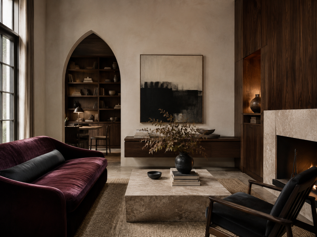
Modern Gothic interiors have a bit of a reputation problem.
Say the words Gothic colour palette and most people immediately picture black walls, blood-red velvet, dripping candles and a house that looks permanently prepared for Halloween.
But modern Gothic interiors are far more interesting than that.
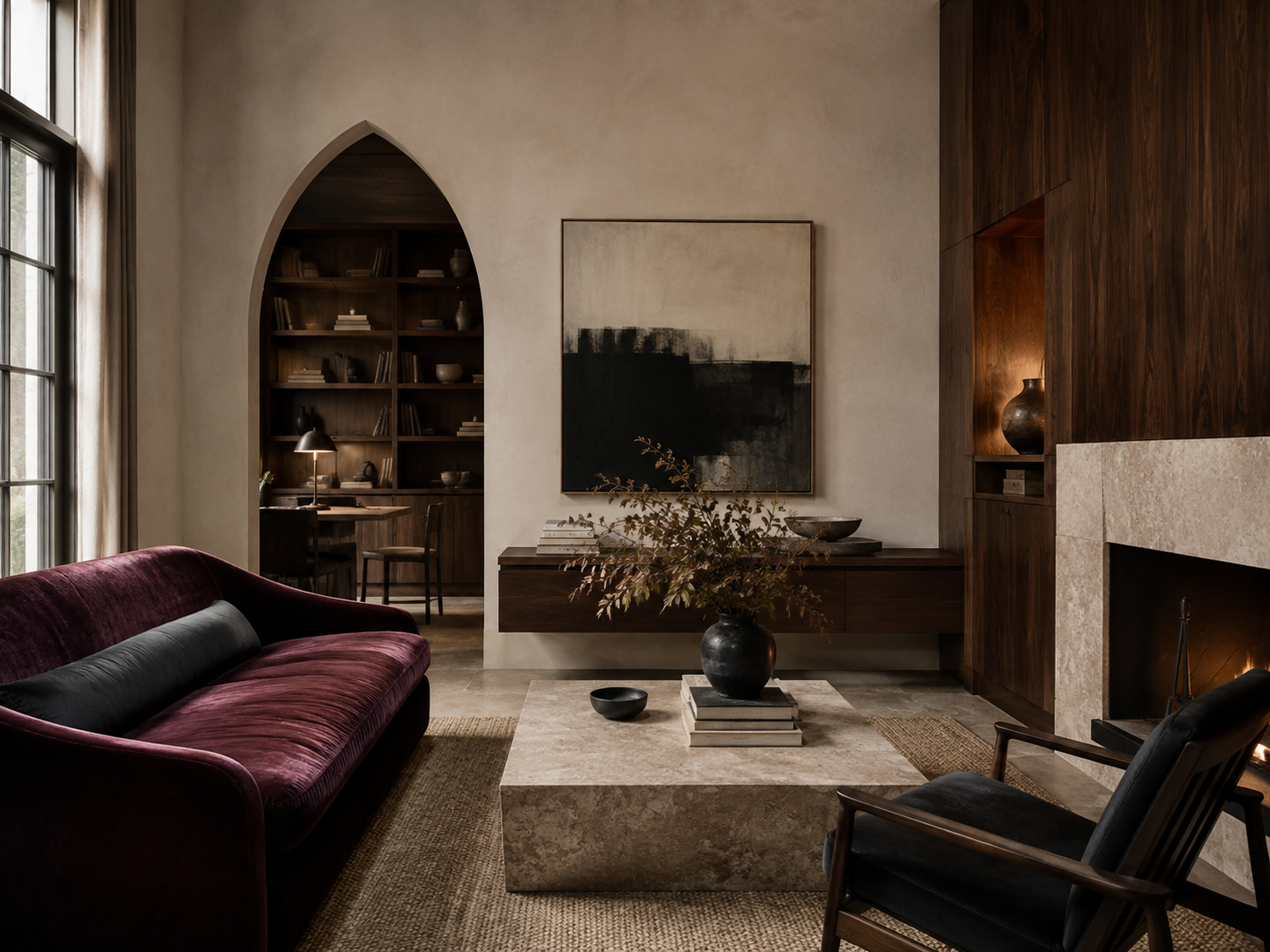
The best Gothic-inspired rooms today tend to borrow the mood of historic Gothic architecture rather than copying the decoration. They use shadow, contrast, dark timber, stone, muted colour and dramatic proportions to create rooms that feel atmospheric without becoming theatrical.
And perhaps most importantly, they rarely rely on black alone.
Some of the most beautiful modern Gothic colour palettes include muddy greens, aubergine, tobacco brown, burgundy, smoked blue, mushroom, limestone and warm plaster tones.
The trick is knowing how to combine them.
Here are ten modern Gothic colour palettes that feel moody, architectural and surprisingly contemporary.
What Actually Makes a Colour Palette Gothic?
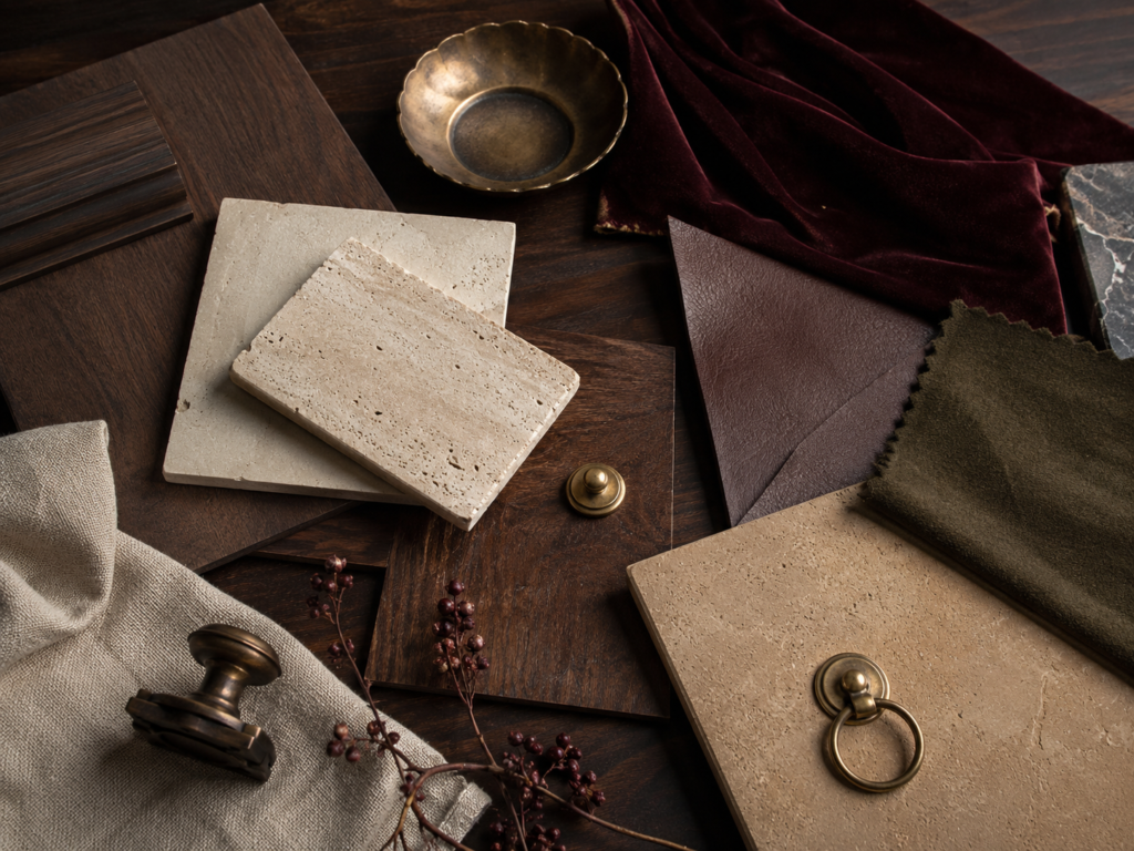
Gothic interiors were never simply about using dark colours.
Historic Gothic buildings were full of contrast.
Dark timber sat beside pale stone. Coloured glass glowed against shadowy interiors. Iron, carved wood and deep reds appeared alongside relatively neutral architectural materials.
Modern Gothic interiors work in much the same way.
Rather than covering every surface in black paint, think about creating layers of light and dark.
A pale plaster wall beside a dark walnut cabinet can feel more Gothic than an entirely black room.
So can oxblood leather against limestone, forest green beside aged brass or aubergine against warm mushroom.
The mood comes from contrast, material and depth.
Colour simply helps amplify it.
If you’re drawn to these darker palettes, our guide to Modern Gothic interior design explores how to use them alongside contemporary furniture, architecture and materials without making your home feel like a period set.
1. Oxblood + Dark Walnut + Warm Plaster
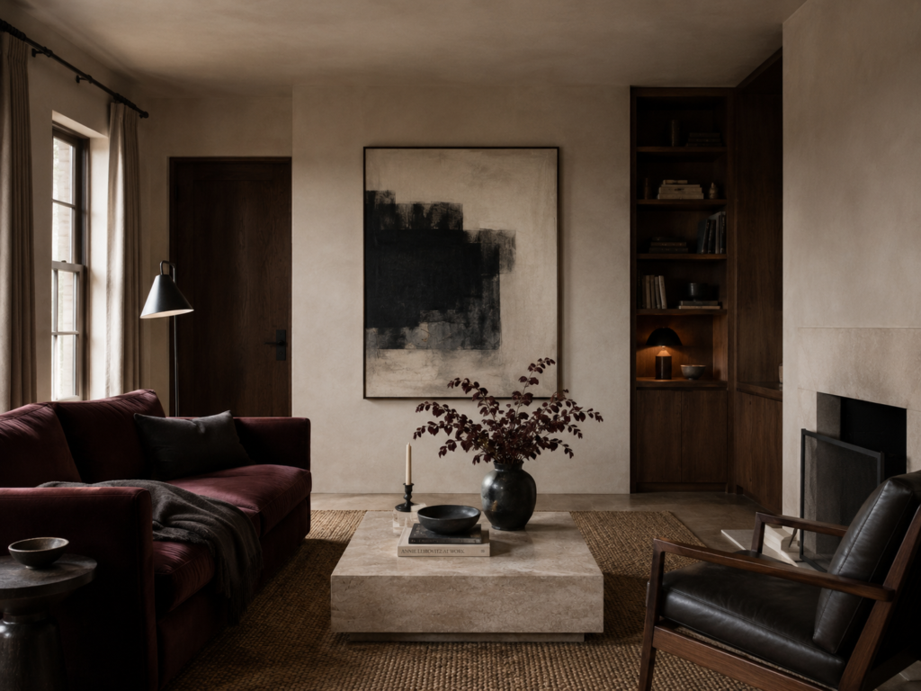
If there is one colour palette that seems almost tailor-made for Modern Gothic interiors, this might be it.
Oxblood has all the drama of red without the brightness.
It is darker, browner and slightly more mysterious, sitting somewhere between burgundy and deep leather.
Pair it with dark walnut and suddenly the palette begins to feel architectural rather than decorative.
The important element here is the warm plaster.
Without something pale in the room, oxblood and walnut together can become heavy very quickly.
Warm off-white, chalk, limestone or pale mushroom walls allow the darker colours to feel deliberate.
Try:
Oxblood
Dark walnut
Warm plaster
Charcoal
Aged brass
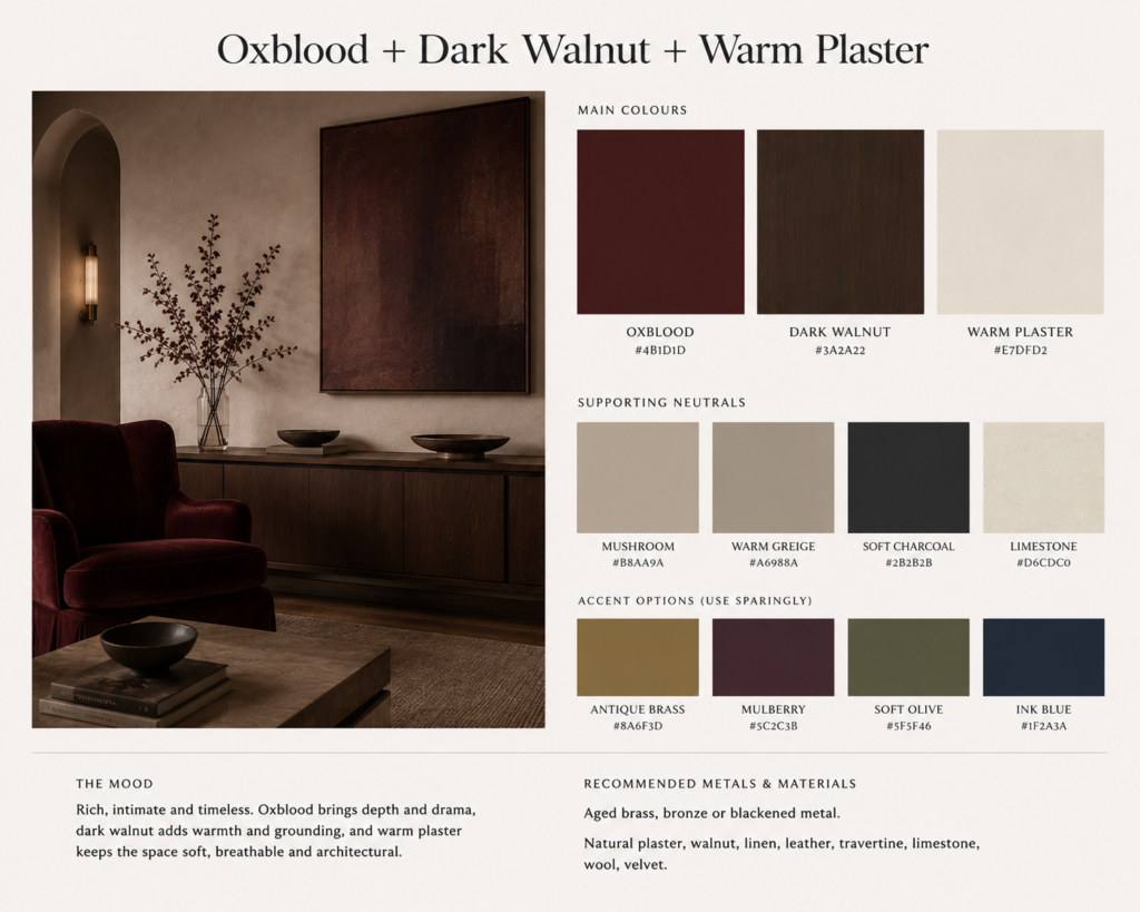
An oxblood sofa or armchair against pale plaster walls with walnut cabinetry would be enough to establish the entire mood.
You do not need ten Gothic elements competing for attention.
Sometimes one extraordinary dark red object does most of the work.
2. Aubergine + Mushroom + Dark Oak
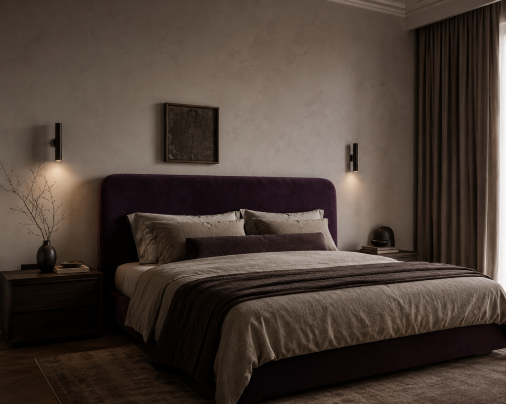
Purple can go wrong extraordinarily quickly.
Too bright and the room starts feeling theatrical.
Too blue and it can look cold.
But aubergine — that wonderfully muddy, brownish purple found in an actual eggplant — is different.
It behaves almost like a neutral.
Against mushroom, taupe or warm stone, aubergine feels sophisticated rather than whimsical.
Dark oak adds another layer of depth while blackened metal keeps everything grounded.
Try:
Aubergine
Mushroom
Warm taupe
Dark oak
Soft black
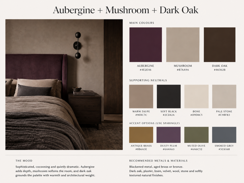
This palette works particularly beautifully in bedrooms.
Imagine mushroom walls, an aubergine upholstered bed, dark timber bedside tables and one black sculptural light.
It feels Gothic without needing anything remotely medieval.
3. Moss Green + Limestone + Blackened Bronze
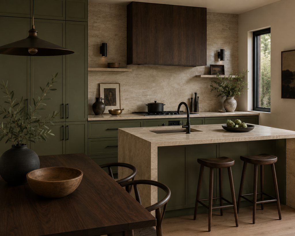
There is something inherently Gothic about green.
Perhaps it is the connection to old stone buildings covered in moss.
Perhaps it is the association with dark woodland.
Either way, muted green works beautifully in modern Gothic interiors.
The key is choosing greens with grey or brown undertones rather than anything too fresh.
Moss, olive, lichen and deep sage all work extremely well.
Pair them with pale limestone and blackened bronze and the result feels almost ecclesiastical — but still modern.
Try:
Moss green
Olive
Pale limestone
Blackened bronze
Walnut
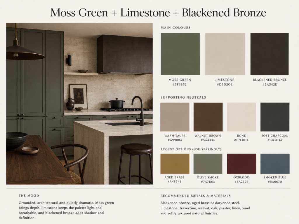
A moss-green wall beside a limestone fireplace or stone table can create a surprisingly dramatic room without making it especially dark.
This is also a wonderful palette for kitchens.
Green cabinetry, stone benchtops and aged metal hardware already contain almost everything you need.
4. Smoked Blue + Burgundy + Stone
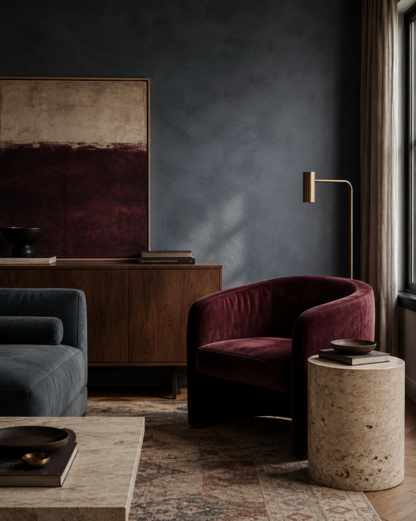
Blue is not usually the first colour people associate with Gothic interiors.
Which is precisely why it can be so good.
The right blue — smoky, greyed and slightly desaturated — brings a coolness that prevents burgundy and dark timber from becoming too heavy.
Think storm clouds rather than navy.
Combine smoked blue with burgundy, warm stone and walnut and you get a palette that feels sophisticated, atmospheric and a little unexpected.
Try:
Smoked blue
Burgundy
Warm stone
Walnut
Antique brass
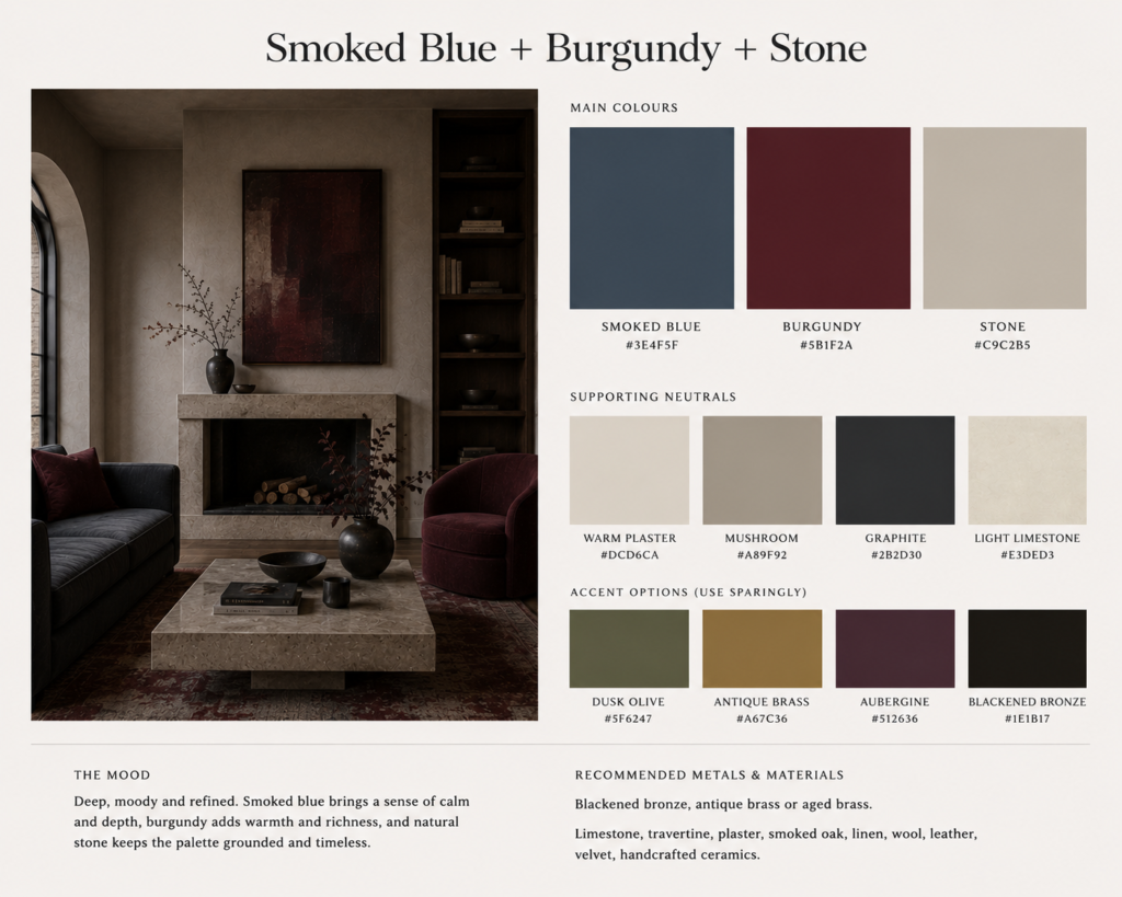
This combination works beautifully in living rooms where you can allow one colour to dominate.
Perhaps smoked blue walls, a burgundy chair and walnut furniture.
Or pale stone walls with blue upholstery and a single oxblood accent.
The Gothic influence is there, but you have to look twice to understand why the room feels so moody.
5. Charcoal + Tobacco + Bone
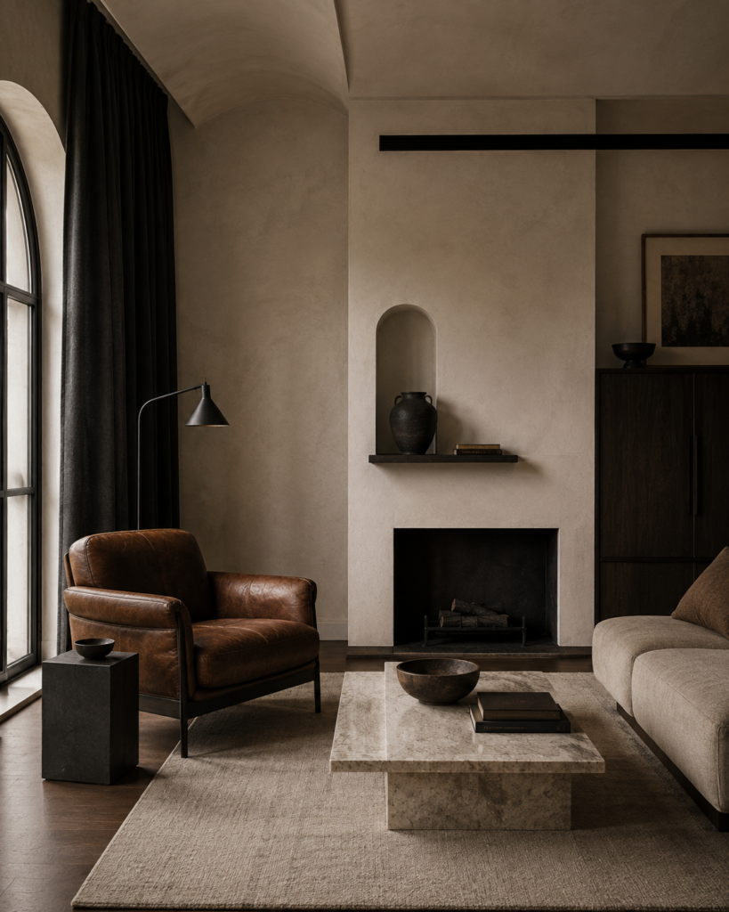
Not every Gothic palette needs jewel tones.
Some of the most convincing modern Gothic interiors rely almost entirely on neutrals.
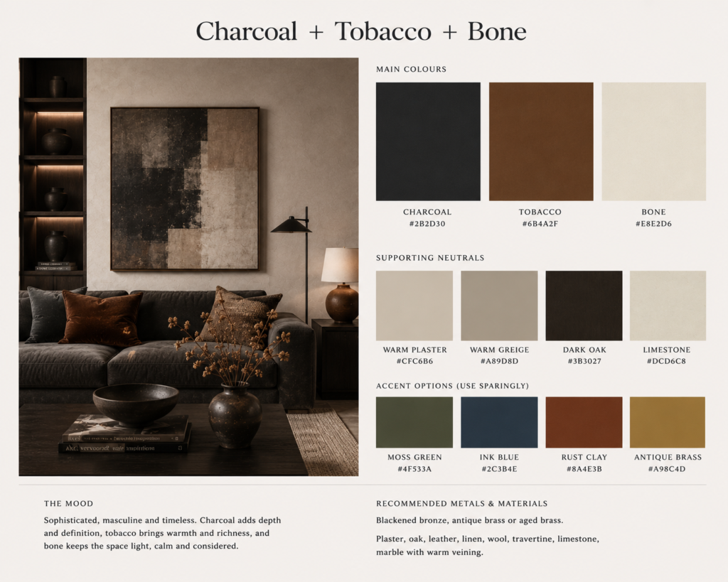
Charcoal, tobacco brown and bone create a palette that feels dark, architectural and slightly monastic.
The warmth of tobacco is crucial.
Without it, charcoal and off-white can become stark and overly minimalist.
Try:
Charcoal
Tobacco brown
Bone
Blackened steel
Warm beige
Leather works beautifully here.
So does dark timber.
Imagine pale bone-coloured plaster, a tobacco leather chair, charcoal curtains and a blackened-steel side table.
The effect is restrained, but there is still enough shadow and contrast for the room to feel distinctly Gothic.
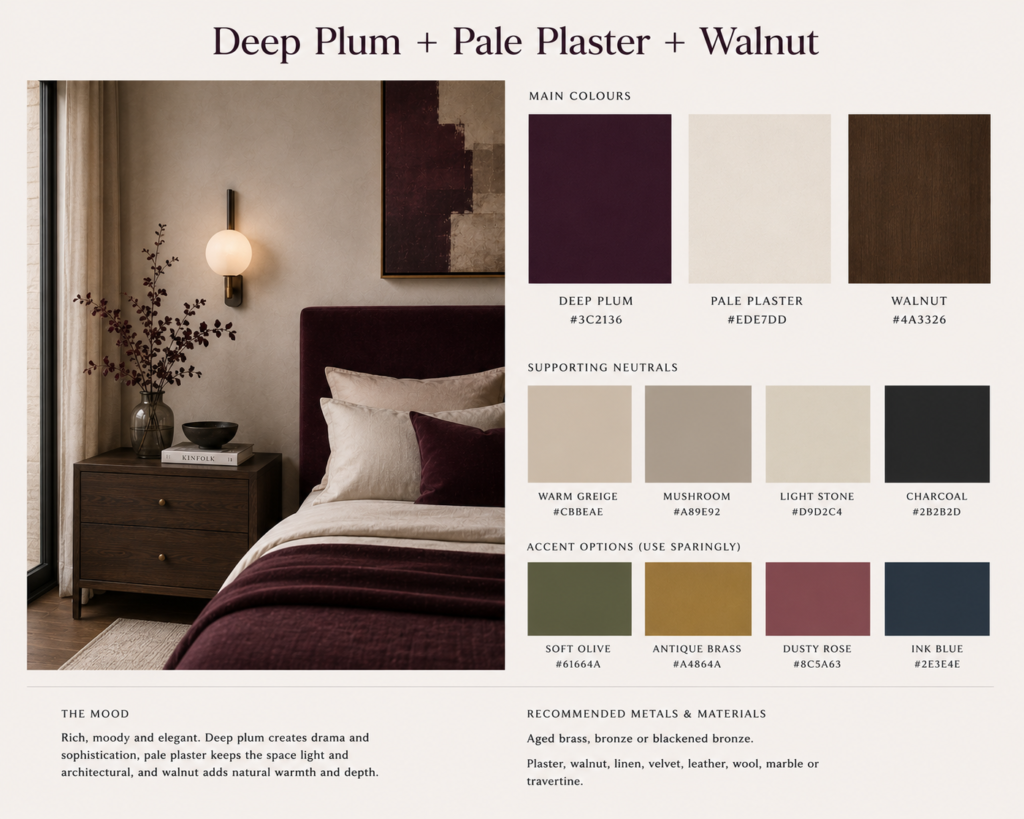
6. Deep Plum + Pale Plaster + Walnut
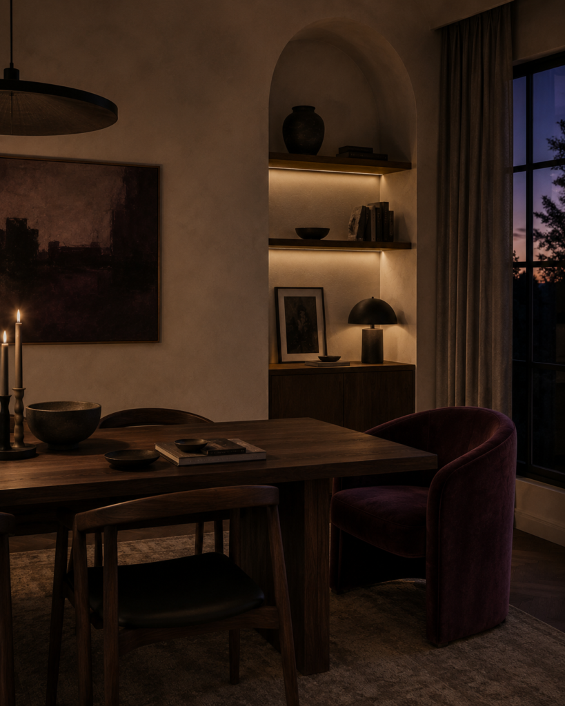
Deep plum sits somewhere between burgundy and aubergine.
It has the romantic quality people often associate with Gothic interiors, but when paired with pale plaster rather than black it suddenly feels far more contemporary.
Try:
Deep plum
Pale plaster
Walnut
Muted taupe
Antique bronze
This palette works wonderfully when plum is used sparingly.
A plum sofa.
A single painted wall.
A bedhead.
Perhaps even a heavily veined stone containing similar purple or reddish tones.
The mistake would be repeating the colour everywhere.
Modern Gothic interiors generally look more convincing when the dramatic colour appears once or twice and everything around it remains relatively calm.
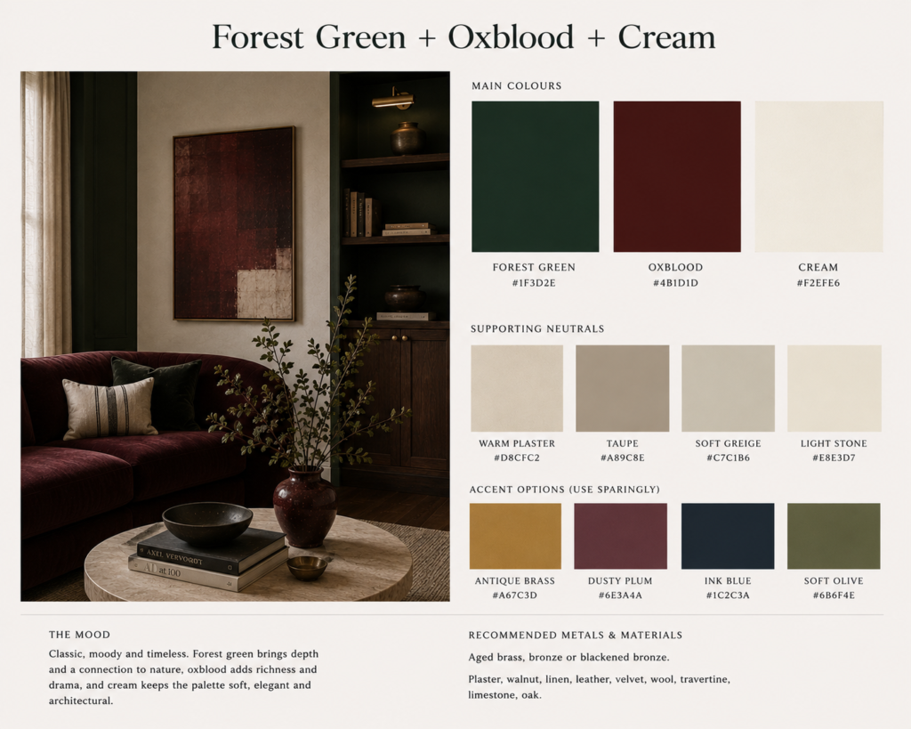
7. Forest Green + Oxblood + Cream
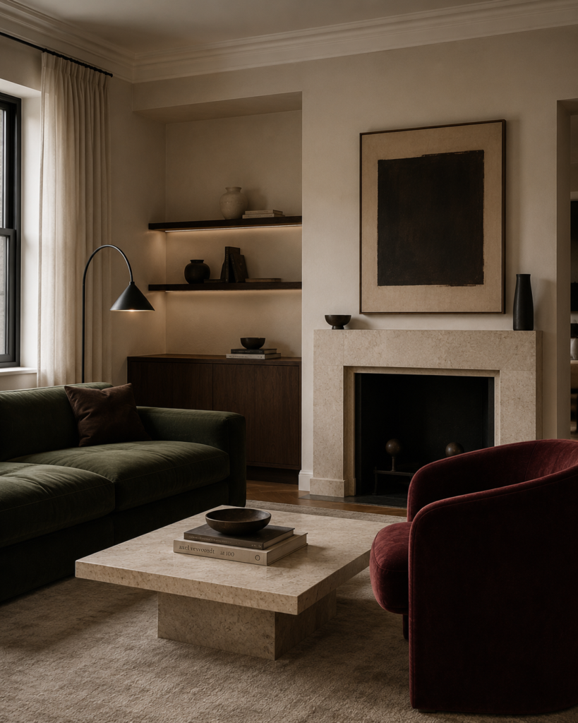
This is probably the richest palette on the list.
Forest green and oxblood together can feel incredibly luxurious.
They can also make a room look like a Victorian pub if you are not careful.
The solution is cream.
Lots of it.
Use pale plaster, light stone or warm off-white across the largest surfaces, then introduce forest green and oxblood in smaller areas.
Try:
Forest green
Oxblood
Warm cream
Dark walnut
Aged brass
A cream room with a green sofa and one oxblood chair can look extraordinary.
So can green cabinetry with pale stone and a small burgundy accent.
Keeping the architecture clean and contemporary is what prevents these colours from drifting into historical pastiche.
8. Black + Warm White + Natural Timber
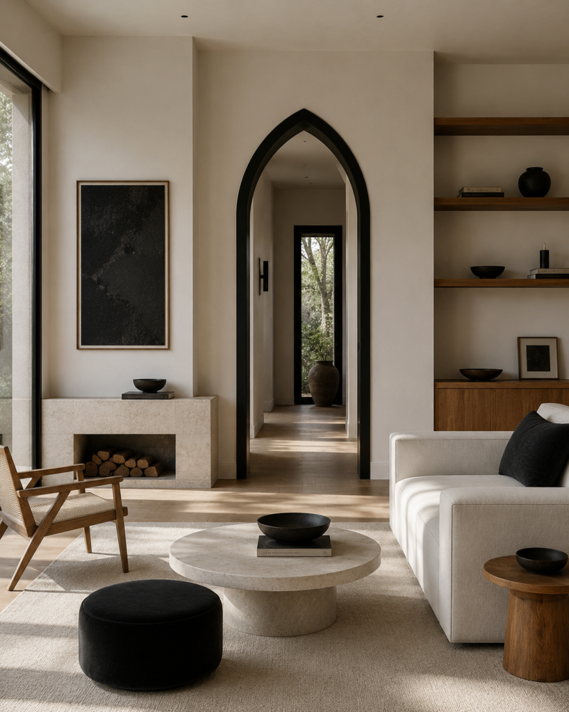
Yes, black can absolutely be part of a Modern Gothic palette.
It just does not need to dominate it.
One of the easiest ways to create a minimalist Gothic interior is to use black almost like punctuation.
Black window frames.
A black fireplace.
A black side table.
Perhaps one black architectural opening.
Surround those elements with warm white walls and natural timber and suddenly the room feels dramatic without becoming dark.
Try:
Soft black
Warm white
Natural oak
Walnut
Pale stone
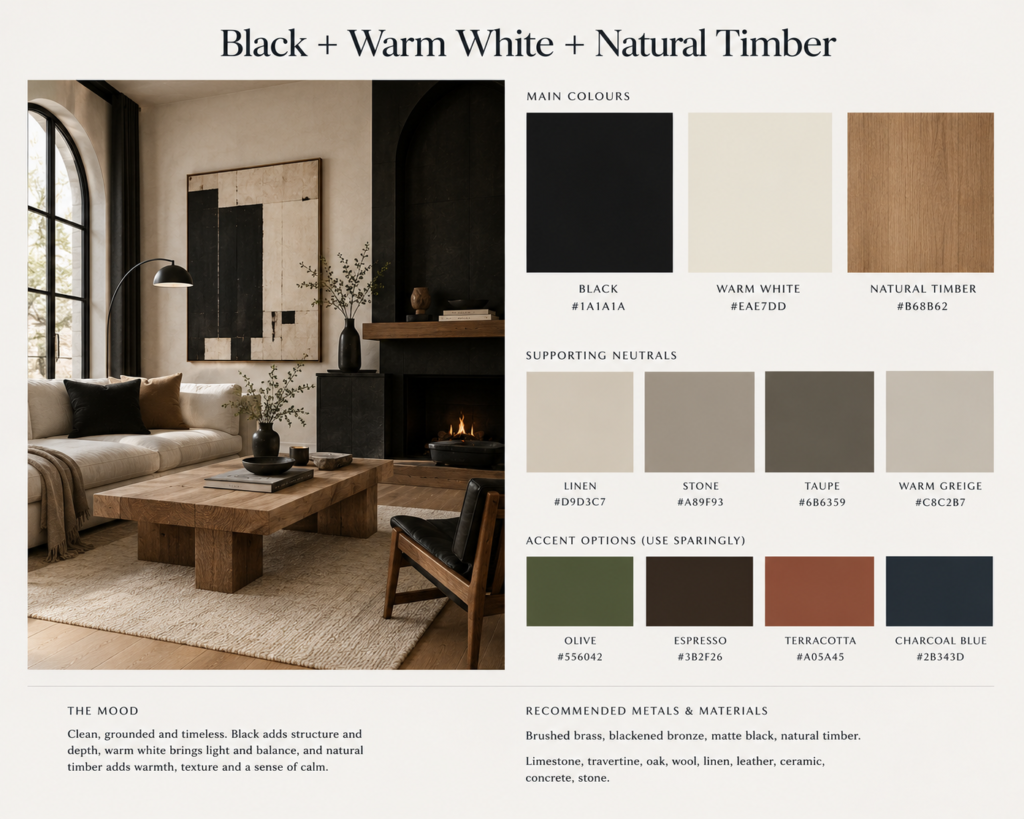
This palette is ideal if you love Gothic architecture but normally prefer minimalist interiors.
It allows pointed arches, strong vertical lines or dramatic doorways to provide the Gothic character while the colour scheme remains relatively calm.
9. Rust + Burgundy + Stone Grey
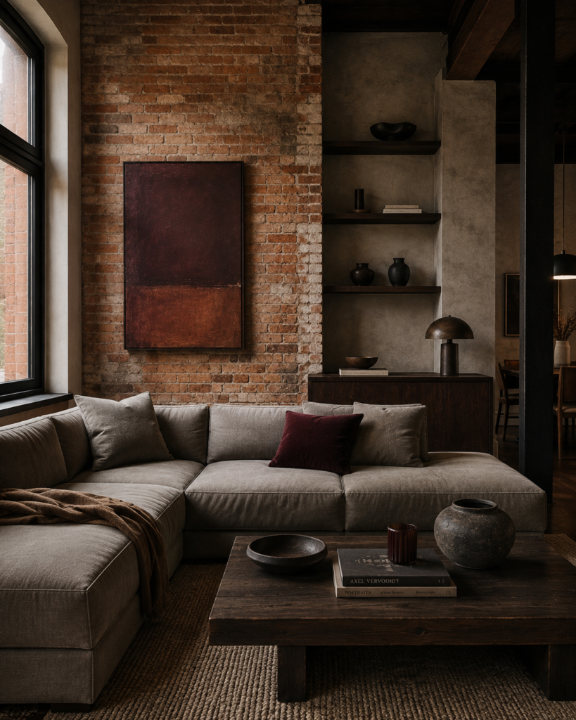
Rust introduces something slightly medieval without becoming literal.
It references weathered iron, terracotta, brick and aged architectural materials.
Combined with burgundy and stone grey, it produces a palette that feels ancient and modern simultaneously.
Try:
Rust
Burgundy
Stone grey
Dark brown
Warm plaster
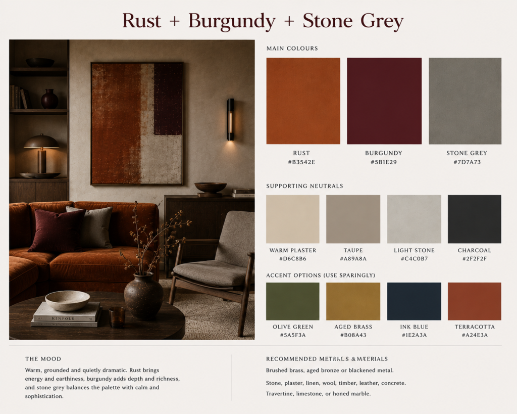
This is especially good if your home already contains brick.
Rather than painting over it, you can use the brick as part of the colour palette.
Add stone-grey upholstery, dark timber furniture and perhaps one burgundy accent.
Suddenly the existing architecture becomes part of the Gothic story.
10. Dusty Mauve + Espresso + Travertine
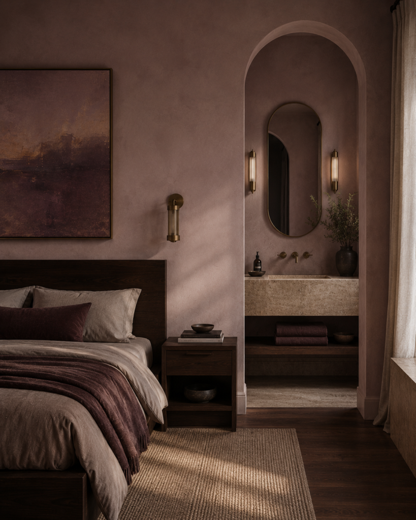
Modern Gothic does not always need to feel severe.
There is a softer version of the style that works particularly well in bedrooms and bathrooms.
Dusty mauve brings a faded romantic quality while espresso brown gives the palette enough weight.
Travertine or warm limestone stops everything becoming overly sweet.
Try:
Dusty mauve
Espresso brown
Travertine
Mushroom
Antique brass
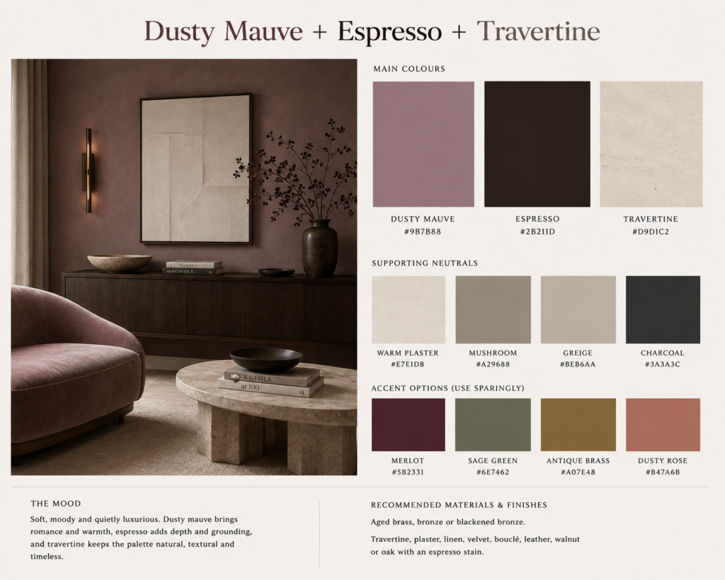
The important word here is dusty.
Avoid bright pinkish mauves.
Look instead for colours that feel slightly faded, muddy or greyed.
An espresso bed against mauve plaster walls with a pale stone bedside table can feel incredibly sophisticated.
It is Gothic romance without the costume.
An Almost-Monochrome Gothic Palette
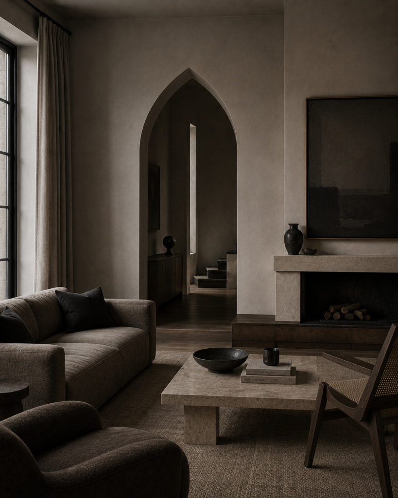
There is another way to approach Modern Gothic colour entirely.
Remove most of it.
Greige, graphite, dark walnut and warm stone can create a room that feels Gothic almost entirely through architecture and contrast.
Try:
Greige
Graphite
Dark walnut
Warm stone
Blackened metal
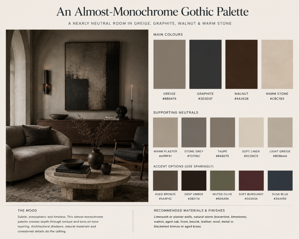
This approach works particularly well if the room already contains arches, tall ceilings, dramatic windows or substantial stone.
The architecture does not need competing decoration.
Instead, the restricted palette allows shadow and form to become the main features.
It is perhaps the most contemporary version of Gothic design.
How to Use Dark Colours Without Making Your House Feel Dark
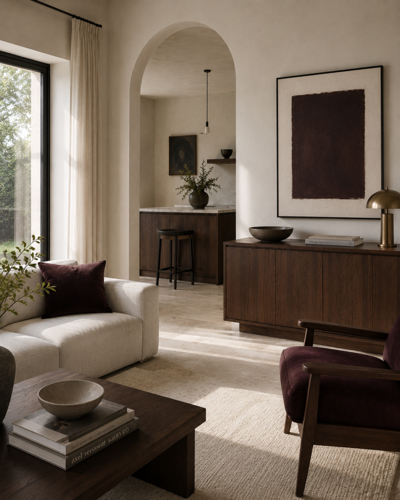
One of the biggest misconceptions about Gothic interiors is that everything needs to be dark.
It does not.
In fact, some of the best Modern Gothic spaces contain quite a lot of pale colour.
The drama comes from contrast.
A useful starting point is to allow the architecture to remain relatively light.
Walls might be warm plaster, mushroom, limestone, bone or pale grey.
Then introduce darker elements through cabinetry, furniture, curtains, rugs or architectural details.
Finally add one deeper saturated colour.
That might be oxblood.
Aubergine.
Forest green.
Plum.
Or smoked blue.
Think of the darkest colour as an accent rather than the entire room.
This approach makes the darker elements feel more dramatic because they have somewhere to contrast against.
Materials Matter Almost More Than Colour
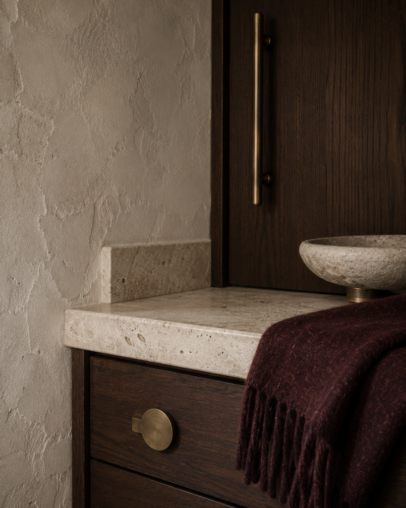
You could use every colour in this article and still somehow create a room that does not feel Gothic.
Materials are what give the palette weight.
Dark walnut looks different from brown laminate.
Limestone feels different from beige ceramic tile.
Blackened bronze feels different from shiny chrome.
Modern Gothic interiors tend to work beautifully with materials that develop character.
Stone.
Timber.
Plaster.
Leather.
Wool.
Aged metals.
Textured glass.
These surfaces catch light unevenly and create the shadow and depth that Gothic interiors rely on.
Even a relatively neutral room can feel Gothic when those materials are used well.
The Best Modern Gothic Rooms Usually Hold Something Back
Perhaps the easiest way to ruin a Gothic interior is to try too hard.
A pointed arch, burgundy walls, carved furniture, black chandeliers, velvet curtains and Gothic artwork might all individually work.
Together, they can quickly become a theme.
Modern Gothic interiors tend to be more convincing when one or two references are allowed to carry the room.
Perhaps the architecture provides the Gothic element.
Perhaps it is the palette.
Perhaps it is an unusually tall dark timber cabinet against pale walls.
The rest of the room can remain surprisingly contemporary.
That restraint is what makes the style feel relevant again.
Gothic Colour Does Not Have to Mean Black
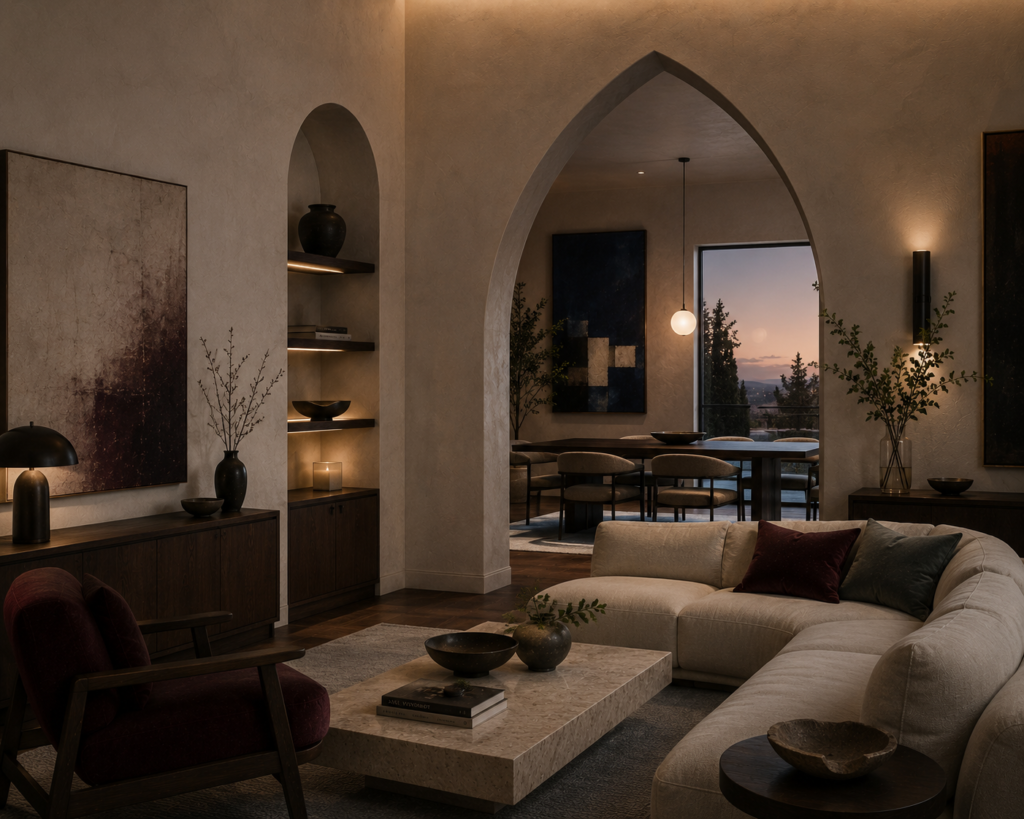
Modern Gothic design works because it understands something Gothic architecture has always understood.
Darkness is only powerful when there is also light.
The same principle applies to colour.
Oxblood looks richer beside plaster.
Walnut looks deeper beside limestone.
Forest green becomes more dramatic against cream.
Aubergine becomes surprisingly sophisticated next to mushroom.
Modern Gothic colour palettes are not really about making a room dark.
They are about creating contrast, depth and atmosphere.
And once you stop assuming Gothic interiors have to be black, the colour possibilities become far more interesting.
Britt & Tyler
We’re Britt and Tyler, the two Australians behind Cocktails & Cathedrals. We’re drawn to old buildings, beautiful rooms, bookshops and places that seem to hold a story. Our journal brings those interests together, with a fondness for slow afternoons and a well-made cocktail. We hope it helps you find places you’ll want to linger.
Travel slowly. Stay beautifully.
A little more about us →