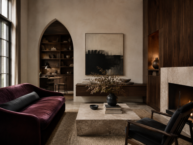
Trieste Colour Palette: Habsburg Elegance Meets the Adriatic
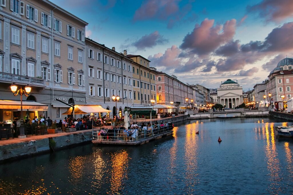
Trieste doesn’t have the sun-baked colour of Rome or the jewel tones of Venice. Its palette is quieter.
Here, pale limestone meets a steel-blue Adriatic. Cream façades catch the afternoon light, faded yellows and dusty pinks sit beneath grey roofs, and the city’s historic cafés add deep coffee brown, burgundy and old brass to the mix.
It feels part Italian port city, part Vienna-by-the-sea.
That visual tension is what makes Trieste such an interesting place to borrow colour from.
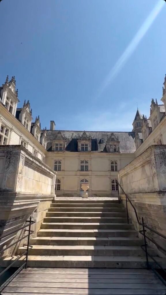
Trieste developed for centuries as an important Habsburg port, and much of its centre still carries that Austro-Hungarian character. Piazza Unità d’Italia and the surrounding waterfront are dominated by 18th- and 19th-century architecture, while the Borgo Teresiano district is largely neoclassical. Its café culture also retains a distinctly Viennese influence.
For interiors, that gives us something much more useful than a collection of colours copied from photographs.
It gives us a Trieste palette.
The Trieste Master Colour Palette
If we were building one 10-colour palette to capture the city, it would look something like this:
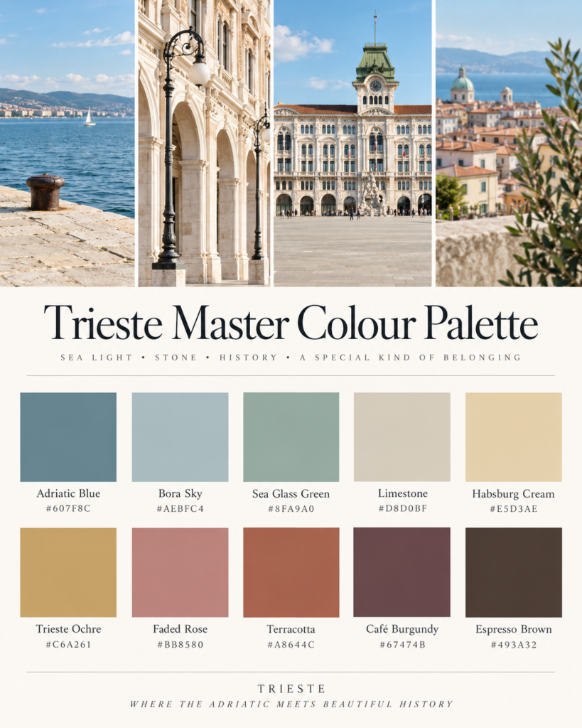
The point isn’t necessarily to use all ten together. The most convincing Trieste-inspired rooms would usually take three or four colours from the palette, supported by warm white, wood, stone and metal.
Here are seven combinations that work particularly well.
1. Adriatic Blue + Limestone
The waterfront palette
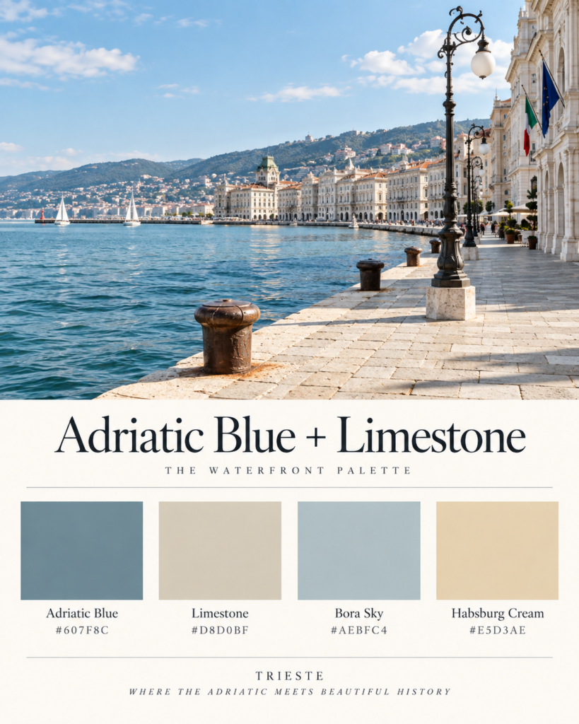
This is probably the most immediately recognisable Trieste palette.
Stand near Piazza Unità d’Italia and the city seems to divide almost perfectly between pale architecture and water. The square itself retains much of its late Austro-Hungarian appearance and opens directly towards the Adriatic.
Rather than Mediterranean turquoise, though, think muted blue-grey.
Use it at home
Start with limestone or warm cream walls, then introduce Adriatic blue through:
- linen upholstery
- cabinetry
- painted joinery
- cushions
- ceramic pieces
- muted artwork
Keep the blue slightly grey rather than bright.
The result should feel breezy but not coastal-themed.
2. Habsburg Cream + Trieste Ochre
The grand city palette
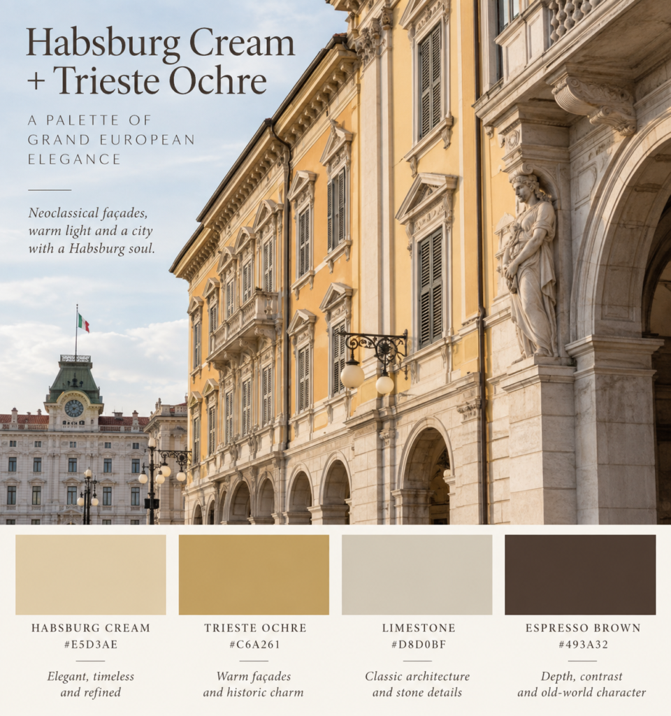
Much of central Trieste was shaped during its Habsburg period, particularly the elegant neoclassical districts around the waterfront and Grand Canal. Borgo Teresiano itself was developed under Maria Theresa of Austria in the 18th century.
That history gives Trieste its enormous supply of creams, yellows and warm stone tones.
The trick is keeping them dusty rather than buttery.
Use it at home
Try:
Walls: Habsburg Cream
Upholstery: oatmeal or natural linen
Accent colour: muted ochre
Furniture: dark walnut or espresso timber
Add aged brass sparingly.
It gives you old-European elegance without turning the room into a period set.
3. Café Burgundy + Espresso Brown
The literary Trieste palette
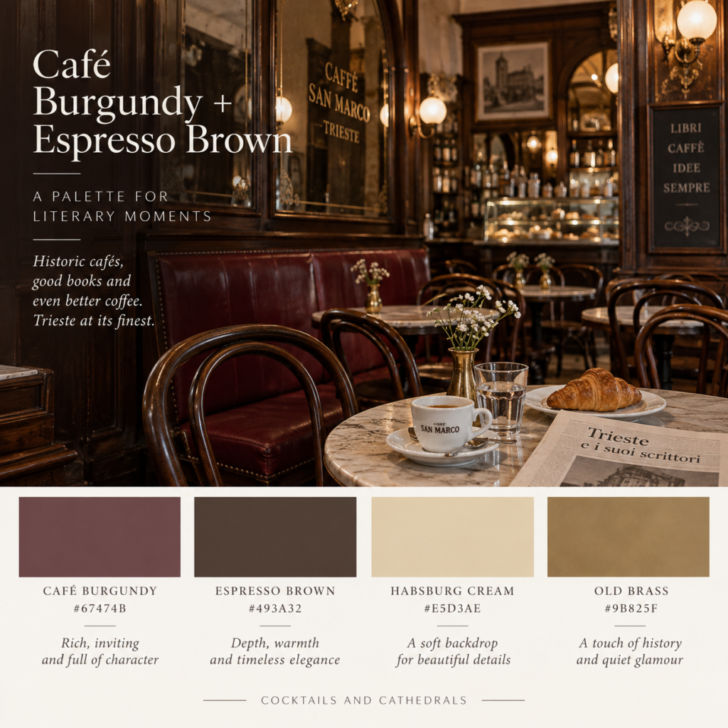
If the waterfront gives Trieste its light colours, the cafés provide the darker half of the palette.
Trieste’s historic coffee houses developed a notably Viennese character, and cafés including Tommaseo and San Marco became meeting places for writers, artists and intellectuals.
This is the palette I’d use for a study, library or intimate dining room.
Think:
dark wood
aged mirrors
cream plaster
burgundy upholstery
books
small touches of brass
The important part is restraint.
One burgundy chair against cream walls and dark timber will feel more Trieste than painting an entire room red.
4. Faded Rose + Terracotta
The old streets palette
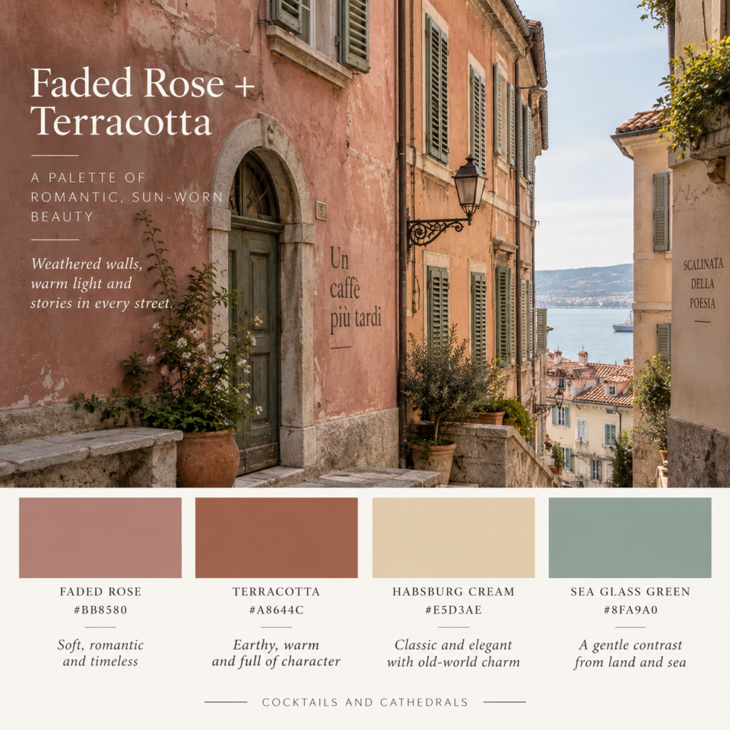
Walk away from the monumental waterfront and Trieste gets softer.
Pink and rust-toned façades, terracotta roofs and weathered shutters begin to interrupt the more formal Habsburg palette.
This is a warmer, more romantic interpretation of Trieste.
Use it at home
Faded rose works beautifully as a small wall colour, especially when paired with:
- terracotta pottery
- warm timber
- cream linen
- muted green
- natural stone
Avoid sugary pink.
Trieste pink should look as though it has been exposed to sea air for about 80 years.
5. Sea Glass Green + Stone Grey
The quiet Adriatic palette
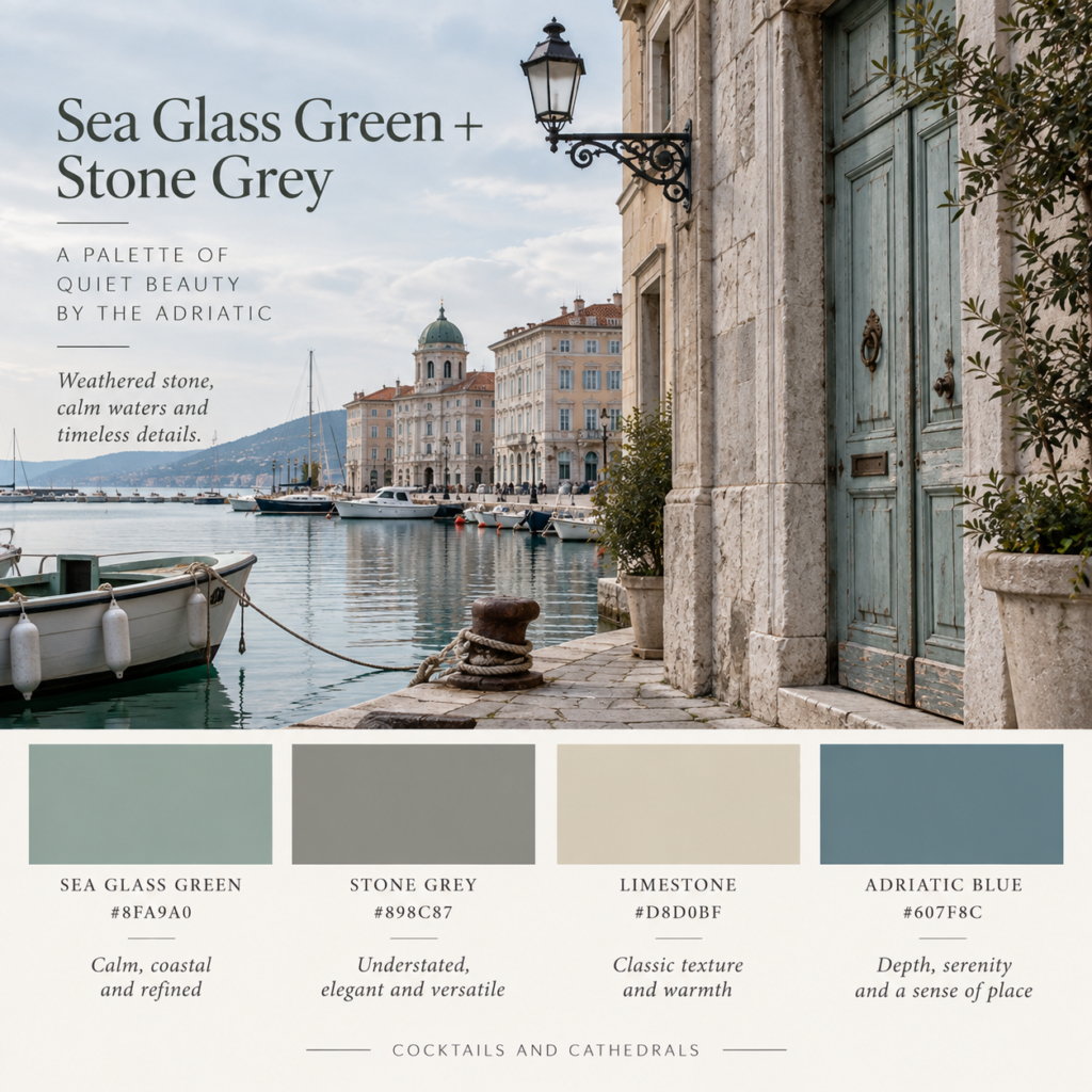
This is the least traditionally Italian palette in the collection — which is exactly why it feels right for Trieste.
Its position between the Adriatic and the Karst plateau gives the city a cooler atmosphere than many of Italy’s better-known destinations.
Sea green, weathered grey and limestone capture that mood beautifully.
Use it at home
This combination suits a quiet living room or bedroom particularly well.
Try limestone walls with sea-glass cabinetry and grey-green textiles.
Then introduce one deeper Adriatic blue through art or upholstery.
Very calm.
Very grown-up.
6. Bora Blue + White
The crisp coastal palette
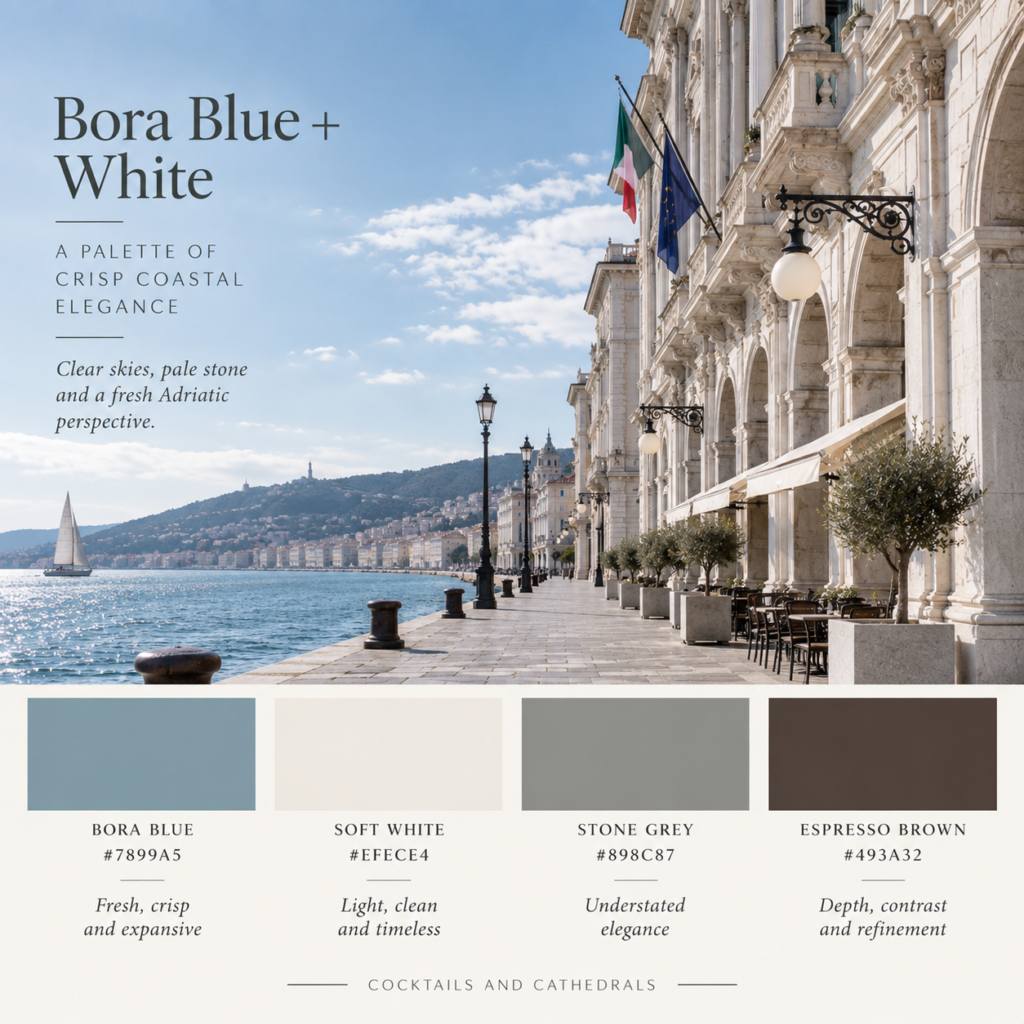
Trieste is famously associated with the Bora, the powerful northeasterly wind that sweeps down towards the Adriatic.
Rather than turning that into a literal nautical theme, borrow the atmosphere instead.
Cool blue. White stone. Grey shadows. Dark timber.
Use it at home
This is ideal if you like coastal interiors but don’t want anything obviously beachy.
Skip shells, rope and navy stripes.
Instead use:
white limewashed walls
blue-grey linen
pale stone
dark wooden furniture
The contrast gives it more European character than the typical coastal palette.
7. The Literary Trieste Palette
For the room where you disappear with a book
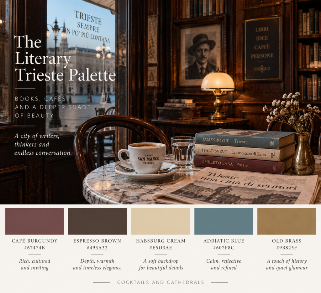
Trieste’s connection with literature is unusually strong.
James Joyce lived here for years, while Italo Svevo and Umberto Saba were deeply connected with the city. Its traditional cafés became part of that literary culture, and many remain operating today.
So if you’re creating a reading room inspired by Trieste, don’t make it pristine.
It should feel slightly accumulated.
A burgundy armchair.
Dark shelves.
Cream walls.
A blue-grey rug.
A brass reading lamp.
Books stacked where books probably shouldn’t be stacked.
And somewhere nearby, coffee.
How to Create a Trieste-Inspired Interior
Trieste style works because it mixes two visual worlds.
There is the formal European city — neoclassical façades, grand cafés, dark timber and architectural symmetry.
Then there is the Adriatic port — water, pale stone, weathering, salt air and softer coastal colour.
The best rooms borrow from both.
A good formula is:
60% pale architectural neutral
25% muted coastal colour
10% dark timber
5% deeper accent
For example:
Habsburg Cream walls + Adriatic Blue sofa + walnut furniture + Café Burgundy cushions.
Or:
Limestone walls + Sea Glass Green kitchen cabinetry + dark timber dining table + aged brass hardware.
You don’t need chandeliers or ornate antiques to make it work.
In fact, keeping the furniture relatively simple makes the palette much easier to use in a modern home.
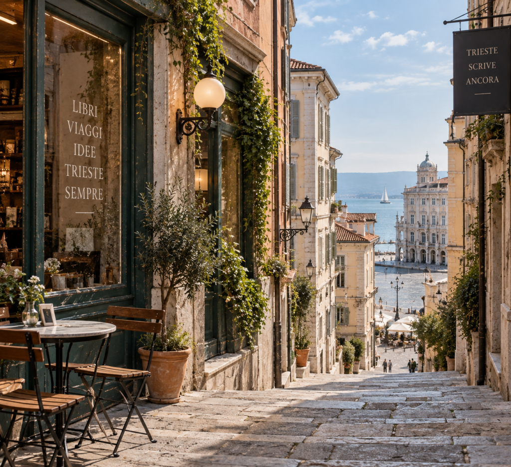
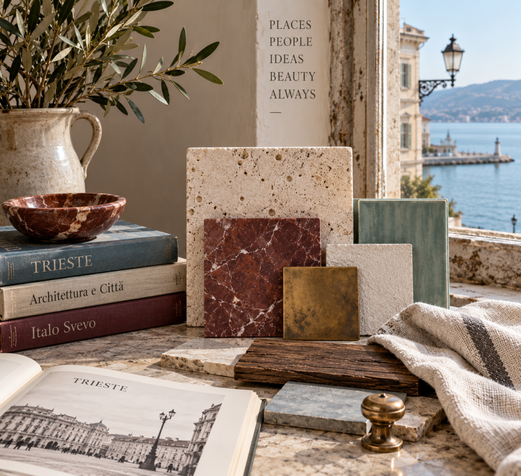
What Materials Work With the Trieste Palette?
Colour is only half of it.
To make the palette convincing, pair it with materials that feel slightly aged rather than perfectly polished.
Look for:
- limestone or limestone-look surfaces
- walnut and dark oak
- linen
- wool
- aged brass
- ceramic
- lightly veined marble
- plaster or limewash walls
- small amounts of velvet
Avoid anything excessively rustic.
Trieste isn’t Tuscan farmhouse Italy.
Its character is more urban, intellectual and cosmopolitan.
Even the city’s famous cafés developed from a coffee-house tradition with strong Viennese influence rather than the rustic trattoria aesthetic often associated with Italy.
Which Trieste Palette Is Right for You?
If you want something light and timeless, start with Adriatic Blue + Limestone.
For something warm and European, use Habsburg Cream + Ochre.
For a library, study or moody living room, the Café Burgundy + Espresso palette is hard to beat.
If you prefer softer interiors, try Faded Rose + Terracotta.
And for a calm modern space, Sea Glass Green + Stone Grey is probably the easiest Trieste palette to live with every day.
That may be the real appeal of the city’s colours.
Trieste isn’t about one dramatic shade.
It’s about layers — Austrian grandeur, Italian warmth, old coffee houses and the cool Adriatic sitting beside one another.
And somehow, they work.
Exploring Trieste?
If these colours have you curious about the city itself, pair this guide with our Literary Walking Tour of Trieste, where we follow the writers, cafés and streets that helped give Trieste its wonderfully strange literary character.
Britt & Tyler
We’re Britt and Tyler, the two Australians behind Cocktails & Cathedrals. We’re drawn to old buildings, beautiful rooms, bookshops and places that seem to hold a story. Our journal brings those interests together, with a fondness for slow afternoons and a well-made cocktail. We hope it helps you find places you’ll want to linger.
Travel slowly. Stay beautifully.
A little more about us →