Budapest Colour Palette: 7 Colour Schemes Inspired by the Danube, Thermal Baths and Grand Cafés
Budapest is not a beige city.
At first glance, its grand boulevards and rows of cream stone buildings can make the Hungarian capital seem relatively restrained. But look a little closer and the colour starts appearing everywhere.
There is the strange turquoise of Budapest’s historic thermal baths. Deep burgundy curtains inside old cafés. Green oxidised copper above the rooftops. Warm limestone beside the Danube. Dark walnut furniture, red paprika, faded ochre façades and flashes of gold.
The famous Gellért Baths are perhaps the clearest example. Their Art Nouveau interiors combine turquoise and blue Zsolnay tiles with mosaics, decorative ceramics and metallic detailing — exactly the sort of unusual colour combination that makes Budapest such good interior-design inspiration. We Love Budapest
The result is a palette that can feel grand without being excessively formal, colourful without becoming bright, and European without falling into the usual cream-and-grey clichés.
Here are seven Budapest-inspired colour schemes worth stealing for your own home.
The Budapest Master Palette
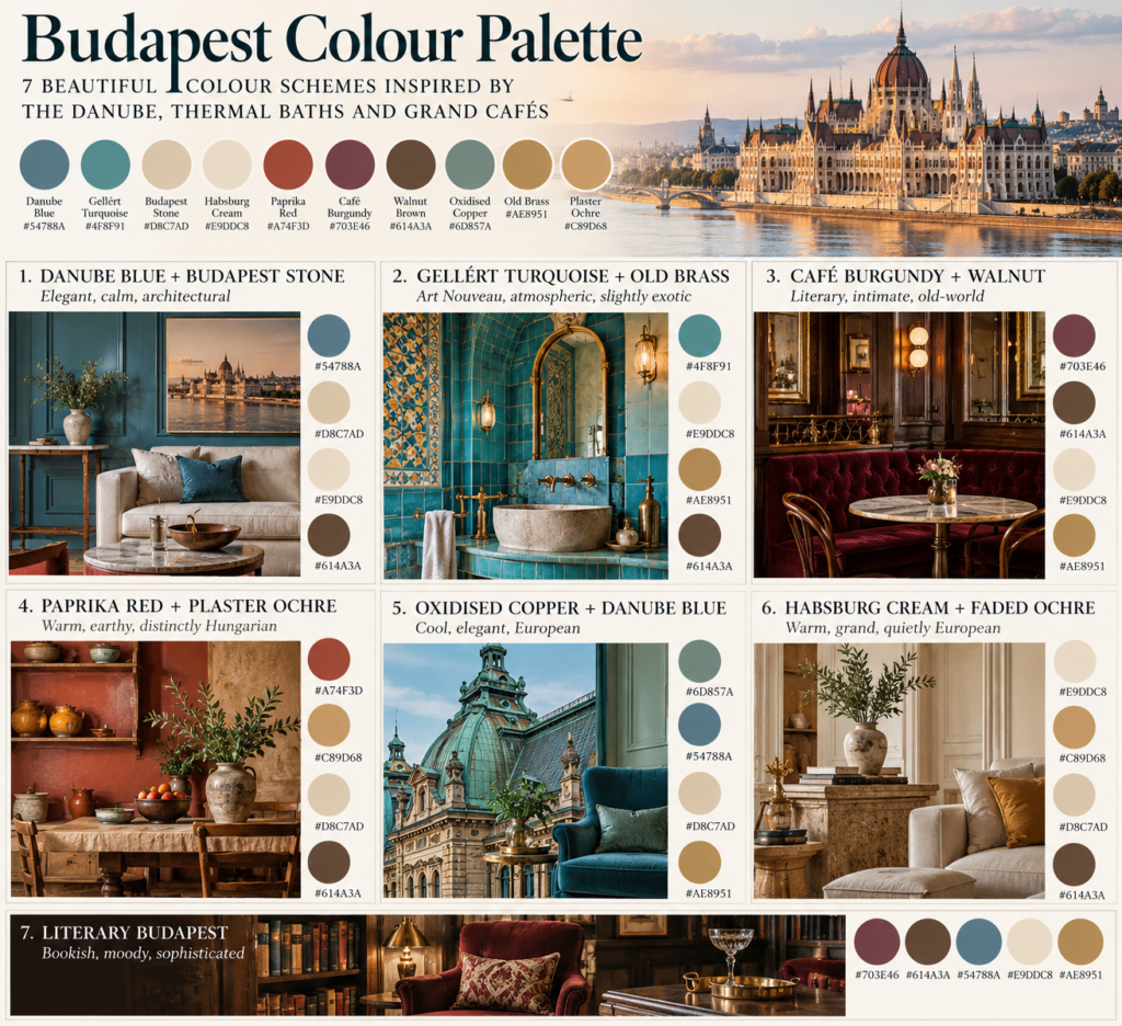
Before breaking the city into individual schemes, these are the colours I would use to represent Budapest as a whole.
Danube Blue — #54788A
A muted blue-grey inspired by the river rather than a bright coastal blue.
Gellért Turquoise — #4F8F91
The distinctive blue-green seen in Budapest’s historic bath interiors.
Budapest Stone — #D8C7AD
Warm limestone and weathered architectural stone.
Habsburg Cream — #E9DDC8
A soft, slightly aged cream rather than stark white.
Paprika Red — #A74F3D
A muted earthy red with enough brown in it to remain sophisticated.
Café Burgundy — #703E46
Deep wine red inspired by velvet, upholstery and old café interiors.
Walnut Brown — #614A3A
The dark timber tone that grounds the richer colours.
Oxidised Copper — #6D857A
A subdued green taken from Budapest’s aged metal roofs and architectural details.
Old Brass — #AE8951
Warm metal rather than shiny gold.
Plaster Ochre — #C89D68
The faded yellow and ochre seen across older Central European façades.
Together, they create something that feels immediately Central European: warm, historic, slightly faded and surprisingly colourful.
1. Danube Blue + Budapest Stone
Colours
- Danube Blue — #54788A
- Budapest Stone — #D8C7AD
- Habsburg Cream — #E9DDC8
- Walnut Brown — #614A3A
Feel
Elegant, calm, architectural
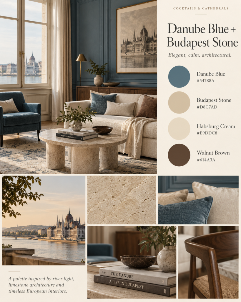
This is probably the easiest Budapest palette to use in a modern home.
The Danube isn’t usually the brilliant Mediterranean blue seen in travel photographs of southern Europe. Its more interesting colours are the muted blue-greys that appear against Budapest’s stone embankments and monumental architecture.
That contrast is what makes this scheme work.
Use warm stone or cream as the dominant colour, then introduce Danube Blue through cabinetry, an upholstered chair, curtains or a painted feature wall.
Walnut prevents it from becoming too coastal.
This shouldn’t feel like a beach house.
Think:
Budapest apartment overlooking the river, not Hamptons living room.
2. Gellért Turquoise + Old Brass
Colours
- Gellért Turquoise — #4F8F91
- Habsburg Cream — #E9DDC8
- Old Brass — #AE8951
- Walnut Brown — #614A3A
Feel
Art Nouveau, atmospheric, slightly exotic
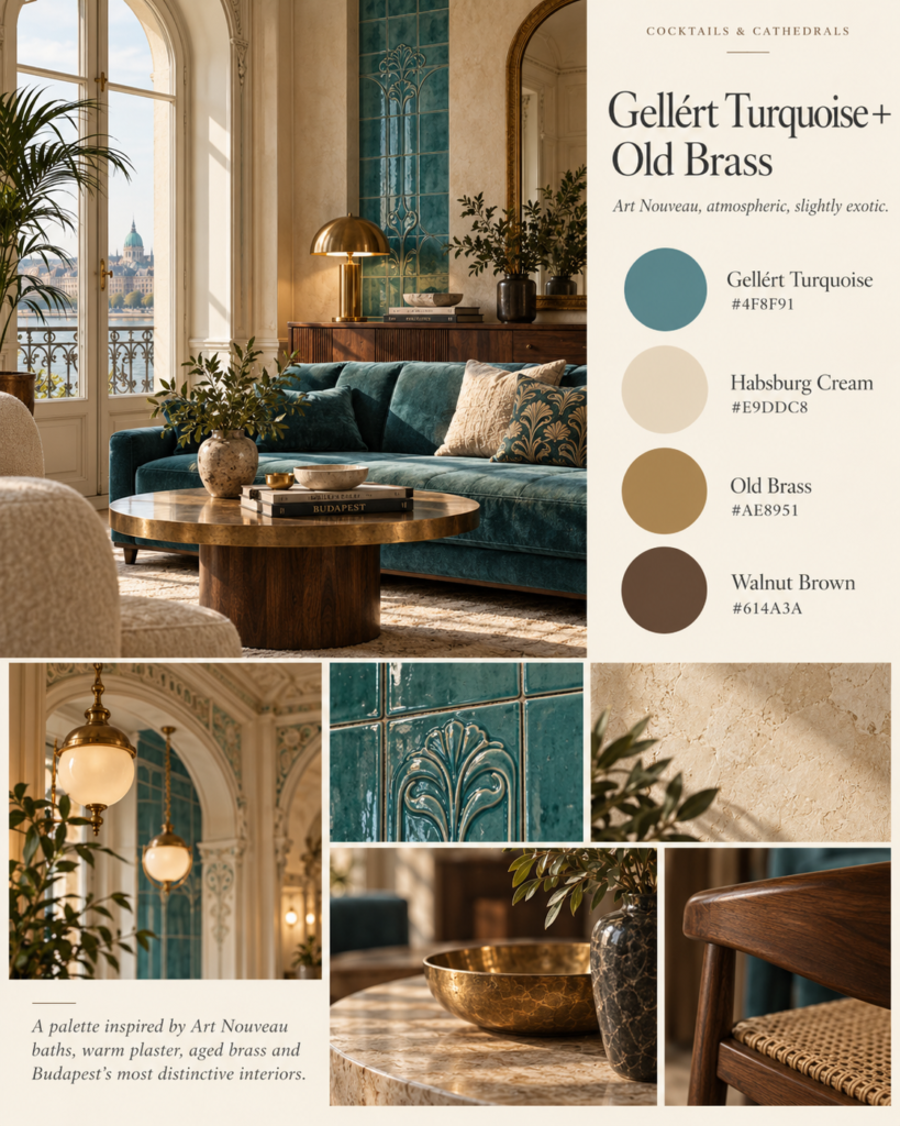
This is the palette that really belongs to Budapest.
Historic Gellért interiors famously use turquoise Zsolnay ceramics, colourful mosaics and decorative natural motifs. Sources describing the baths repeatedly highlight their distinctive blue and turquoise surfaces. We Love Budapest
At home, however, don’t reproduce the bathhouse literally.
Instead, take the combination.
A muted turquoise cabinet could sit against warm cream walls. Add an aged brass lamp, dark timber and perhaps a small amount of patterned tile.
That’s enough.
The secret is using turquoise as an architectural colour rather than a tropical colour.
3. Café Burgundy + Walnut
Colours
- Café Burgundy — #703E46
- Walnut Brown — #614A3A
- Habsburg Cream — #E9DDC8
- Old Brass — #AE8951
Feel
Literary, intimate, old-world
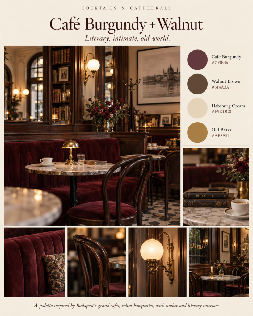
Budapest’s historic café culture gives us one of the richest palettes in the city.
Think dark timber cabinetry, cream ceilings, aged mirrors, wine-coloured fabrics and warm metallic details.
It’s also perfect for rooms that benefit from being slightly darker.
Try it in a:
- reading room
- study
- dining room
- home library
- small sitting room
Paint doesn’t even need to be burgundy.
Cream walls with a burgundy sofa, walnut shelves and one old-brass lamp could create the entire effect.
The richness should come from layers and materials, not excessive decoration.
4. Paprika Red + Plaster Ochre
Colours
- Paprika Red — #A74F3D
- Plaster Ochre — #C89D68
- Budapest Stone — #D8C7AD
- Walnut Brown — #614A3A
Feel
Warm, earthy, distinctly Hungarian
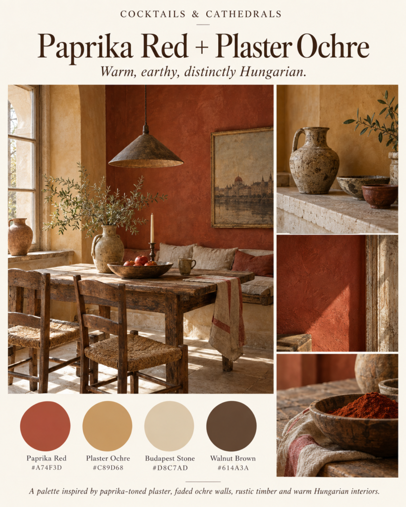
This is the warmest scheme in the collection.
Rather than using a bright red, I’ve pulled paprika towards brick and terracotta.
That makes it much easier to live with.
Against ochre and old stone colours, the red feels earthy rather than dramatic.
It’s particularly good for kitchens and dining spaces.
Try:
paprika-coloured ceramics, an ochre wall, timber furniture and off-white plaster.
You could also reverse it and keep the room predominantly cream, introducing paprika red only through artwork, cushions or a patterned rug.
5. Oxidised Copper + Danube Blue
Colours
- Oxidised Copper — #6D857A
- Danube Blue — #54788A
- Budapest Stone — #D8C7AD
- Old Brass — #AE8951
Feel
Cool, elegant, European
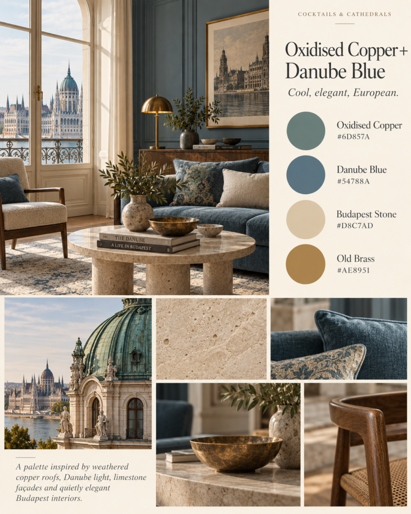
Budapest has another colour combination hiding above eye level.
Greened metal roofs and architectural details sit against blue-grey skies and warm historic façades.
It creates a beautifully subdued green-and-blue palette.
Neither colour should be bright.
That’s important.
Choose:
sage rather than emerald
slate blue rather than navy
aged brass rather than polished gold
The result feels historical without requiring historical furniture.
This palette would look excellent in a contemporary bedroom or living space.
6. Habsburg Cream + Faded Ochre
Colours
- Habsburg Cream — #E9DDC8
- Plaster Ochre — #C89D68
- Budapest Stone — #D8C7AD
- Walnut Brown — #614A3A
Feel
Warm, grand, quietly European
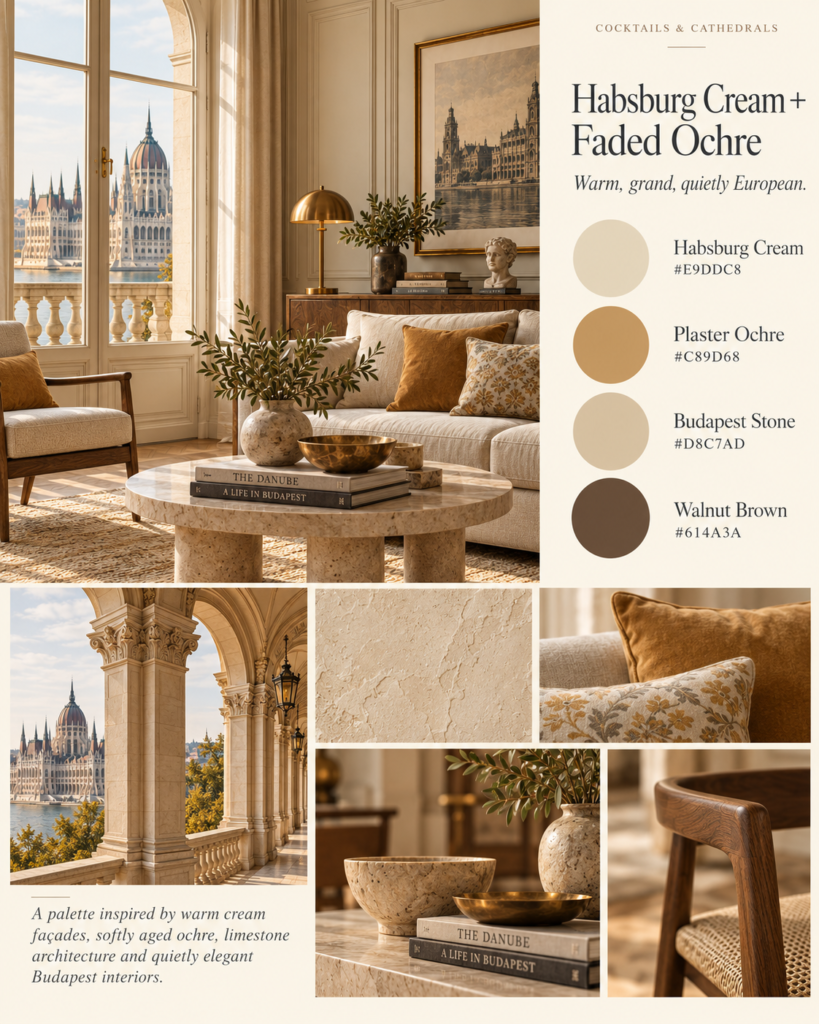
Not every Budapest palette needs dramatic colour.
Much of the city’s beauty comes from layers of closely related neutrals: cream plaster, pale stone, faded yellow and warm brown.
The trick is avoiding modern grey.
Instead, keep everything warm.
A Budapest-inspired neutral room might combine:
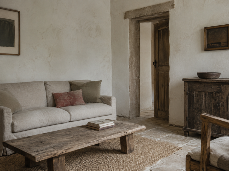
warm cream walls, linen upholstery, walnut furniture, aged stone, a muted ochre cushion and a little brass.
It works particularly well if you like quiet luxury interiors but want them to feel less generic.
7. Literary Budapest
Colours
- Café Burgundy — #703E46
- Walnut Brown — #614A3A
- Danube Blue — #54788A
- Habsburg Cream — #E9DDC8
- Old Brass — #AE8951
Feel
Bookish, moody, sophisticated
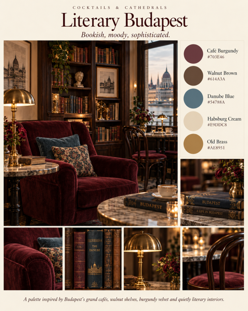
This is the Cocktails & Cathedrals palette.
Imagine coming inside from a cold Budapest street and finding a small café with dark timber tables, old books, burgundy upholstery and warm brass lighting.
That’s what this scheme is trying to capture.
Start with cream walls.
Then layer in walnut shelves or furniture, burgundy fabric and perhaps one muted blue chair or painted cabinet.
Books provide much of the colour naturally.
And unlike some historic-inspired interiors, it shouldn’t feel heavily themed.
The goal isn’t to recreate a nineteenth-century Budapest café.
It’s to create a contemporary room that somehow makes you want to sit down, order something strong and read for three hours.
How to Use the Budapest Palette Without Making Your Home Look Like a Period Set
The easiest mistake with Budapest-inspired interiors would be taking the historical references too literally.
You don’t need velvet curtains, elaborate wallpaper and chandeliers in every room.
Instead, steal the colour relationships.
A modern room could have:
warm limestone walls, simple walnut furniture, one muted turquoise cabinet, aged brass lighting and a burgundy cushion.
That’s already enough to suggest Budapest.
Use the city’s architecture as inspiration rather than instruction.
The more restrained the room, the more interesting those unusual colours become.
What Colours Best Represent Budapest?
If I had to reduce the city to just five colours, I would choose:
Gellért Turquoise
Budapest Stone
Danube Blue
Café Burgundy
Old Brass
Together they capture Budapest’s unusual combination of water, monumental architecture, thermal baths and grand Central European interiors.
And that might be what separates Budapest from some of Europe’s more obvious design cities.
Paris gives you cream and black.
Lisbon gives you tile blue and terracotta.
Rome gives you ochre and stone.
But Budapest gives you something stranger:
turquoise, burgundy, limestone, walnut and gold.
And somehow, it works.
Britt & Tyler
We’re Britt and Tyler, the two Australians behind Cocktails & Cathedrals. We’re drawn to old buildings, beautiful rooms, bookshops and places that seem to hold a story. Our journal brings those interests together, with a fondness for slow afternoons and a well-made cocktail. We hope it helps you find places you’ll want to linger.
Travel slowly. Stay beautifully.
A little more about us →
One Comment