5 Timeless Vienna Color Palettes for an Elegant Old-World Home
Vienna has never really believed in understatement.
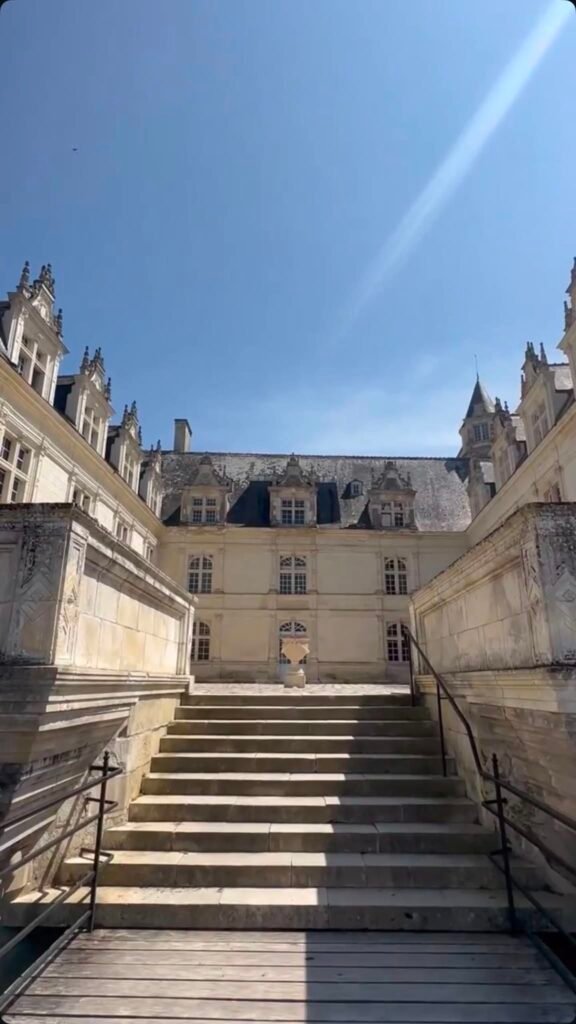
This is a city of enormous staircases, gilded concert halls, marble cafés and apartment buildings that look as though someone decided four metres was a perfectly reasonable ceiling height.
And yet, look a little closer and Vienna’s colour palette is surprisingly restrained.
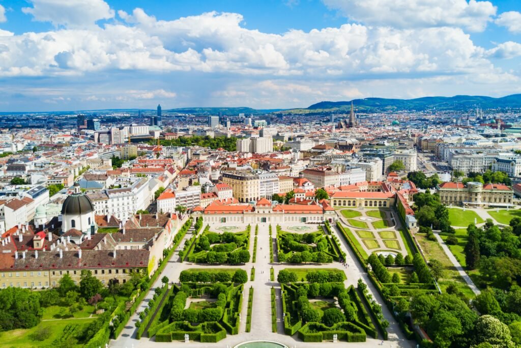
Behind all that architectural grandeur are soft limestone greys, aged creams, dark walnut, faded burgundy, muted green and flashes of old brass. Even the gold rarely feels shiny or new. It looks burnished, softened by age and surrounded by materials that have already lived a life.
That might be why Vienna translates so beautifully into interiors.
You don’t need parquet floors, ceiling frescoes or a nineteenth-century apartment overlooking the Ringstrasse to borrow something from the city. In fact, the most convincing Vienna-inspired rooms don’t try to recreate a palace at all.
They simply borrow the colours.
Here are five timeless Vienna colour palettes that bring a little of that old-world elegance home — without making your living room look like a period drama.
1. Vienna Stone + Imperial Cream
The palette
- Vienna Stone — #B8B0A3
- Imperial Cream — #E6D8BE
- Plaster White — #F1ECE2
- Walnut Brown — #675044
- Aged Brass — #A7874E
If you could somehow distil central Vienna into five colours, this might be it.
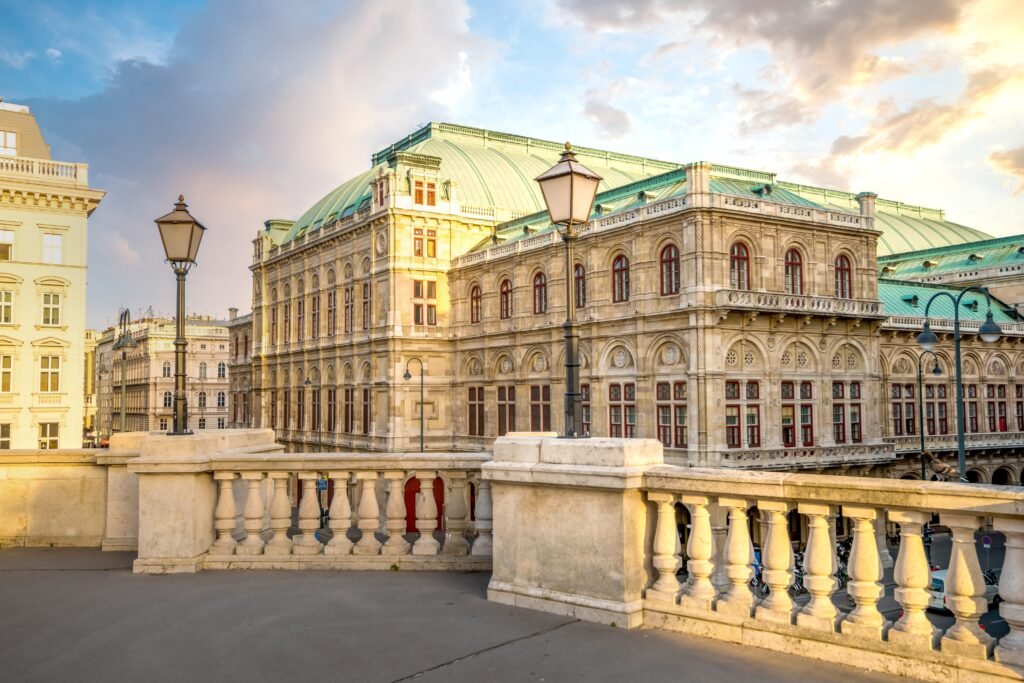
Walk through the Innere Stadt and so much of the city seems to sit somewhere between cream, grey and warm stone. The grand façades aren’t usually brilliant white. They’re softer than that — slightly aged, slightly dusty and infinitely easier to live with.
It’s a palette that works particularly well if you love beautiful European interiors but don’t necessarily want a room that feels heavily decorated.
How to use it at home
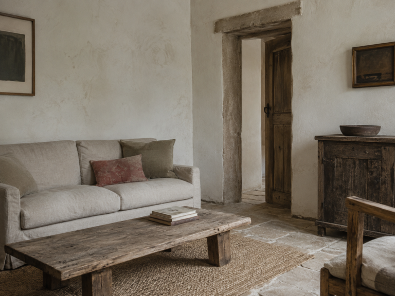
Start with Imperial Cream or Plaster White on the walls rather than a cold architectural white.
Then bring in Vienna Stone through linen curtains, upholstery, rugs or painted cabinetry.
Walnut is what stops the room becoming washed out. A dark timber dining table, bentwood chairs, antique sideboard or simple wooden picture frames can give all those pale colours some weight.
Finally, use aged brass sparingly.
A picture light.
A small lamp.
A cabinet handle.
Perhaps the frame of an old mirror.
You don’t need very much.
Vienna is grand, but the lesson worth stealing isn’t necessarily more decoration. It’s knowing when one beautiful material is enough.
Best for
Living rooms, entrance halls, bedrooms and anyone who wants a neutral interior that still feels warm and established.
2. Coffeehouse Burgundy + Walnut
The palette
- Coffeehouse Burgundy — #6F3037
- Dark Walnut — #493A32
- Café Cream — #D7C6A8
- Marble Grey — #A7A39B
- Antique Gold — #9B7B46
Some cities are remembered through monuments.
Vienna is remembered through rooms.
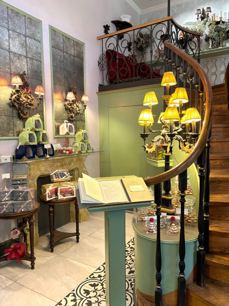
Its historic coffeehouses created an entire visual language of dark timber, marble-topped tables, bentwood chairs, mirrors, upholstered banquettes and rooms where people were apparently in no particular hurry to leave.
And this is where the richer side of Vienna’s colour palette appears.
Deep reds. Brown timber. Warm cream. Smoke-grey marble.
The colours feel intellectual somehow.
Less French château. More newspaper folded beside an espresso while somebody quietly argues about Mahler.
How to use it at home
The temptation with burgundy is to paint an entire room with it.
You can.
But you certainly don’t have to.
Coffeehouse Burgundy works beautifully in smaller doses: an armchair, velvet cushion, headboard, lampshade or even a framed artwork with deep red running through it.
Then surround it with warm neutrals.
A Café Cream wall beside dark timber furniture is already enough to create that slightly moody Viennese feeling.
Marble — real or otherwise — is another useful ingredient. A little marble side table or bedside table instantly brings in the café reference without being overly literal.
If your home is modern, this palette can be especially effective because one deep historic colour against simple contemporary furniture creates contrast.
Best for
Libraries, dining rooms, studies, bedrooms and cosy corners that should feel slightly more intimate at night.
3. Schönbrunn Ochre + Porcelain
The palette
- Schönbrunn Ochre — #C9A45B
- Porcelain Cream — #E9DEC8
- Faded Sage — #92927B
- Warm Stone — #B6A98F
- Mahogany — #65463B
Vienna isn’t only grey stone and dark cafés.
There is another side to the city: warmer, sunnier and almost golden.
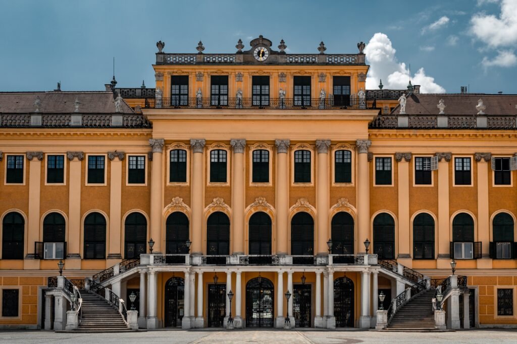
You see it in historic façades, faded plaster and the soft ochre tones that seem particularly at home against clipped gardens, old stone and green shutters.
This is probably the most traditionally European palette of the five.
But the trick is keeping the yellow muted.
We’re not talking sunflower yellow or bright mustard.
Think instead of colour that has spent a century outside.
Ochre softened by dust.
Cream that has yellowed slightly with age.
Sage green rather than emerald.
How to use it at home
Schönbrunn Ochre works surprisingly well as a wall colour if you’re brave enough to use it.
But for a quieter interpretation, reverse the balance.
Paint the walls Porcelain Cream and introduce ochre through a sofa, vintage textile, artwork or pair of upholstered dining chairs.
Faded Sage gives the palette some relief and keeps it from becoming too warm. Try it on cabinetry or perhaps a freestanding piece of furniture rather than across every wall.
Dark mahogany or similarly rich timber grounds everything.
This is also one of those palettes that gets better when the materials aren’t perfectly new.
Linen.
Old timber.
Worn leather.
Natural stone.
Unlacquered brass.
A little imperfection makes these colours believable.
Best for
Kitchens, dining rooms, sunrooms and relaxed living spaces where you want old-world warmth without going rustic.
4. Secession Green + Old Gold
The palette
- Secession Green — #64766C
- Chalk White — #EEECE4
- Old Gold — #A88A4D
- Graphite — #4B4A46
- Pale Stone — #C8C2B5
Around the turn of the twentieth century, Vienna became one of Europe’s great centres of modern design.
And suddenly the city wasn’t only about imperial interiors.
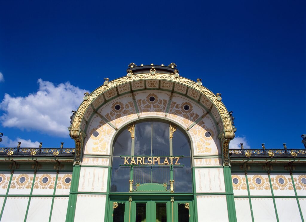
The Vienna Secession and designers such as Otto Wagner, Josef Hoffmann and Koloman Moser began stripping decoration back, simplifying shapes and experimenting with geometry.
The result still feels surprisingly contemporary.
White.
Muted green.
Black.
Gold.
Clear lines.
This palette is perhaps the easiest way to bring Vienna into a modern home because it doesn’t depend on antique furniture or architectural detailing.
How to use it at home
Begin with Chalk White or Pale Stone.
Then introduce Secession Green through one substantial element — kitchen cabinetry, a sideboard, an upholstered chair or perhaps the walls of a smaller room.
Add Graphite in thin lines rather than large blocks.
Black or charcoal picture frames.
A slender floor lamp.
Dining chairs.
Window frames, if you’re fortunate enough to have them.
Then comes the gold.
And this is where restraint matters.
The gold should feel almost architectural: a narrow picture frame, handle, lamp fitting or small decorative detail.
Not an explosion of metallic accessories.
The combination of green, white and gold gives the room personality; the graphite stops it becoming pretty.
Best for
Modern apartments, kitchens, bathrooms and contemporary homes where traditional European styling would otherwise feel too formal.
5. Danube Blue + Faded Plaster
The palette
- Danube Blue — #607984
- Faded Plaster — #D8D0C2
- Soft Dove Grey — #AAA9A3
- Tobacco Brown — #725A47
- Tarnished Brass — #93805A
Not every Vienna-inspired home has to be warm.
Some of the city’s most beautiful colour combinations are quieter and cooler: blue-grey skies, pale stone façades, weathered rooftops and the muted tones of the river.
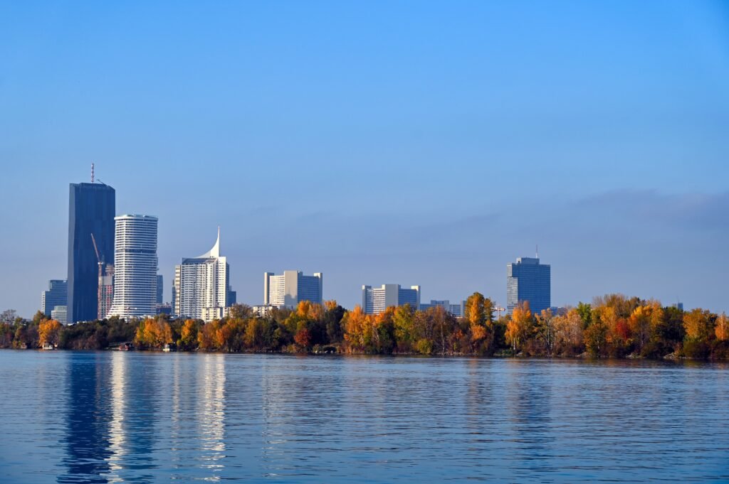
This palette is less obviously historic than burgundy or ochre.
And that is exactly why it works.
Danube Blue is the kind of colour that changes throughout the day. Against warm evening light it can almost appear green; in cooler light it becomes slate blue.
Pair it with aged plaster tones rather than brilliant white and it immediately feels softer.
How to use it at home
This may be the best palette of the five for a bedroom.
Danube Blue on the walls with warm white bedding, tobacco-brown timber and an old brass lamp would be enough.
For a lighter room, use Faded Plaster on the walls and save the blue for curtains, cabinetry or upholstery.
The brown matters more than you might expect.
Without it, blue and grey can drift into coastal territory.
Add dark wood and suddenly the same colours feel European.
Best for
Bedrooms, bathrooms, reading rooms and calmer living spaces.
What Makes a Colour Palette Feel Viennese?
Perhaps the interesting thing about Vienna is that there isn’t one defining colour.
There are really two Viennas layered on top of one another.
There is the imperial Vienna of cream façades, gilded rooms, polished timber, marble and burgundy.
And there is the modern Vienna that emerged around 1900 — geometric, cleaner and more restrained, with white surfaces, muted greens, black lines and carefully controlled decoration.
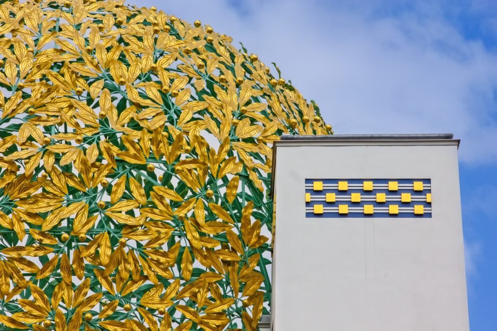
The most interesting homes borrow from both.
A contemporary sofa beneath an ornate ceiling.
A modern lamp beside an antique table.
Minimal cabinetry with aged brass handles.
A nineteenth-century portrait hanging over something unmistakably twenty-first century.
That tension is what stops European-inspired interiors becoming themed interiors.
The room doesn’t need to belong to another century.
It only needs to feel as though it remembers one.
The Vienna Rule: Don’t Buy the Whole Look
There is a trap with any European-inspired decorating style.
Once you decide you love Vienna, Paris, Tuscany or Prague, suddenly you’re searching for Viennese furniture and European décor and wondering whether your house requires an enormous gilded mirror.
It probably doesn’t.
Instead, choose one or two things from the city that genuinely appeal to you.
Maybe it’s Coffeehouse Burgundy.
Maybe it’s the combination of green and brass.
Maybe it’s simply the way warm cream looks beside walnut.
Build from there.
A beautiful home usually feels collected because its influences aren’t obvious.
Nobody needs to walk into your living room and immediately say:
“Ah. Vienna.”
It’s better if they simply think:
“This room feels wonderful.”
Which Vienna Color Palette Is Right for Your Home?
If your style is quiet, neutral and architectural, start with Vienna Stone + Imperial Cream.
If you love dark timber, books, candles and intimate rooms, choose Coffeehouse Burgundy + Walnut.
If you want your home to feel warm, European and slightly sun-faded, try Schönbrunn Ochre + Porcelain.
For something cleaner and more contemporary, Secession Green + Old Gold is probably the most interesting choice.
And if you prefer cooler, calmer interiors, Danube Blue + Faded Plaster gives you Vienna without the grandeur.
Or don’t choose at all.
Take the cream from one palette.
The walnut from another.
Perhaps the muted green from a third.
Cities aren’t colour-coordinated.
The rooms we remember rarely are either.
And that might be the most Viennese approach of all.
Britt & Tyler
We’re Britt and Tyler, the two Australians behind Cocktails & Cathedrals. We’re drawn to old buildings, beautiful rooms, bookshops and places that seem to hold a story. Our journal brings those interests together, with a fondness for slow afternoons and a well-made cocktail. We hope it helps you find places you’ll want to linger.
Travel slowly. Stay beautifully.
A little more about us →
One Comment