Vernacular Colour Palettes: 10 Timeless Schemes Inspired by Place
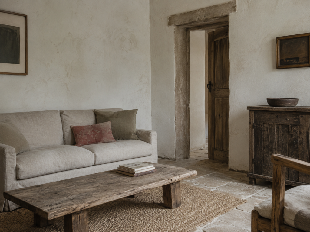
There is something wonderfully difficult to fake about a vernacular interior.
You can buy the antique table. You can limewash the walls. You can hunt down handmade tiles and fill a room with old timber. But the most convincing vernacular spaces have something else going on entirely.
Their colours seem to belong to the place.
They look as though they have been borrowed from the stone outside the window, the soil underfoot, the timber used to build the house or the landscape that has surrounded it for generations.
And perhaps that is why vernacular colour palettes feel particularly appealing now.
After years of interiors being dominated by colours selected because they were fashionable, there is something deeply reassuring about colours that seem inevitable instead.
Not perfect. Not overly coordinated.
Just right.
What Is a Vernacular Colour Palette?
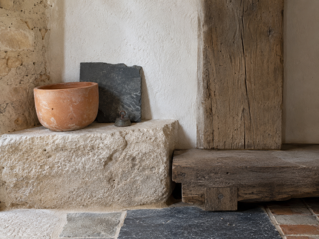
Vernacular design traditionally describes buildings and interiors shaped by local materials, climate, culture and practical necessity rather than architectural fashion.
Colour works in much the same way.
Historically, people decorated with what was available.
Local stone influenced the colour of walls and floors. Timber species determined the warmth of beams, cabinetry and furniture. Natural pigments created earthy reds, ochres, chalky whites and muted greens.
The result was rarely a carefully constructed colour scheme in the modern decorating sense.
It simply evolved.
And that is arguably the secret to using vernacular colour successfully today.
Instead of choosing five colours because they sit neatly beside one another on a paint chart, begin with materials and landscape.
Then let the palette grow around them.
Here are ten combinations that capture that feeling particularly well.
If you’re new to the style itself, start with my guide to vernacular interiors and why this centuries-old approach still feels so relevant today.
1. Limestone + Chalk White + Weathered Oak
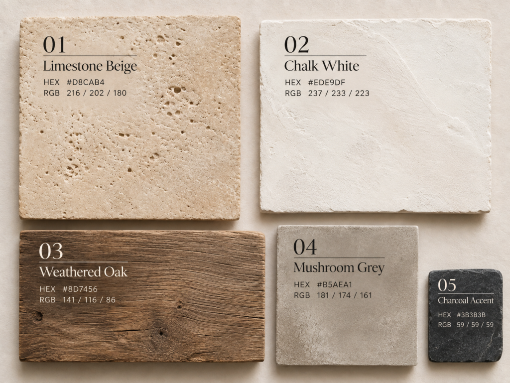
Palette references: Limestone Beige #D8CAB4 · Chalk White #EDE9DF · Weathered Oak #8D7456 · Mushroom Grey #B5AEA1 · Charcoal Accent #3B3B3B
Approximate digital colour references. Natural materials may vary.
Few palettes feel more immediately architectural.
Soft limestone introduces warm beige and grey undertones, while chalky white prevents the room becoming heavy. Weathered oak adds exactly the sort of irregular warmth that makes a vernacular interior feel lived in rather than styled.
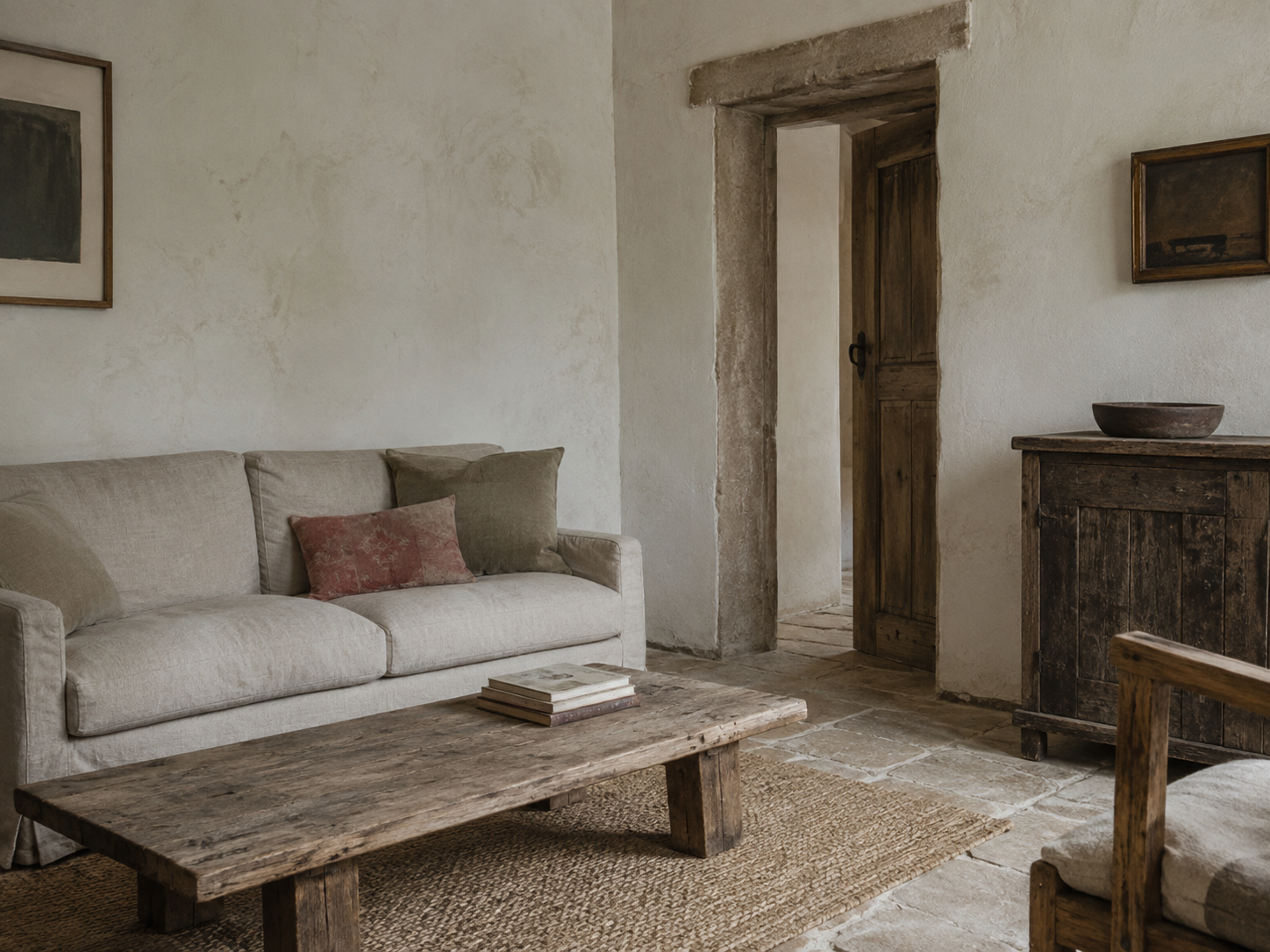
This combination works particularly well in rooms with stone floors, rough plaster walls or exposed timber.
The important thing is avoiding brilliant white.
A slightly dirty, mineral white feels far more convincing.
Think old farmhouses, converted stone cottages and houses where the walls appear to have been painted many times over several generations.
2. Terracotta + Warm Plaster + Olive Green
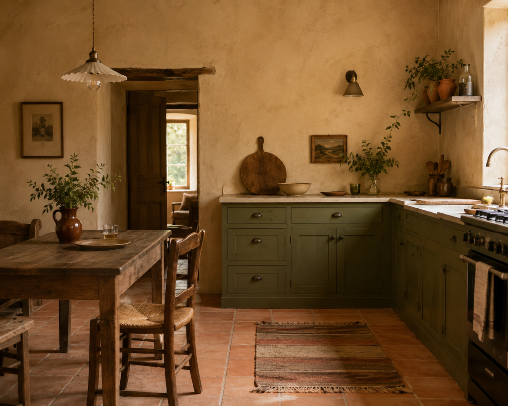
Some colour combinations seem almost inseparable from the landscape that created them.
Terracotta, warm plaster and olive green is one of them.
The terracotta might appear in a tiled floor rather than on a painted wall. Olive might arrive through cabinetry, textiles or a weathered painted door. The plaster should feel soft and slightly earthy rather than crisp cream.
Together they create a palette that works beautifully with timber furniture, aged brass and natural linen.
It is especially effective in kitchens and informal dining spaces, where the colours feel warm without becoming decorative.
3. Slate Grey + Soft White + Aged Timber
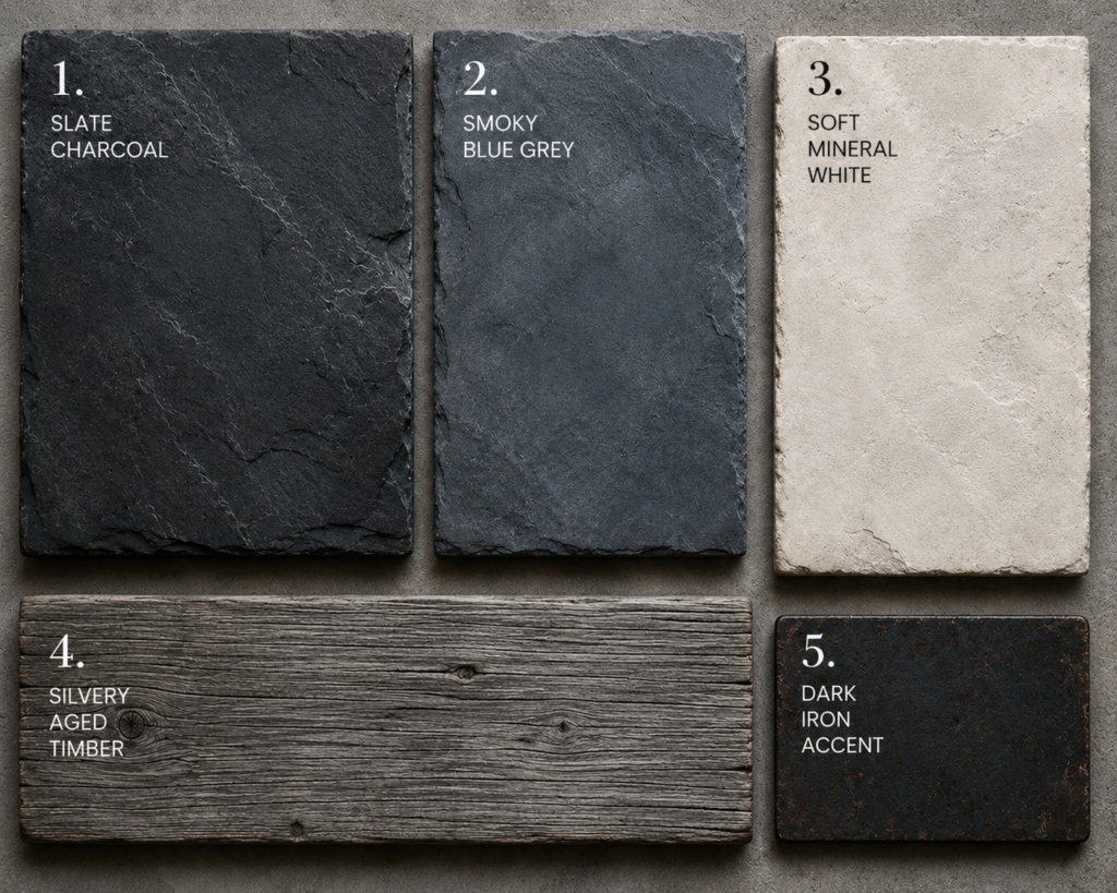
Vernacular colour does not always have to be warm.
Palette references: Slate Charcoal #3E4142 · Smoky Blue Grey #626C72 · Soft Mineral White #E8E3D9 · Silvery Aged Timber #817B70 · Dark Iron #302F2C
Approximate digital colour references. Natural materials may vary.
In cooler landscapes, darker stone and silvery timber create a completely different atmosphere.
Slate grey paired with soft white and aged timber feels wonderfully restrained. It works particularly well with rough stone fireplaces, dark floors, old beams and simple furniture.
The trick is allowing plenty of variation within the grey.
Real slate is rarely one flat colour. It contains blue, green, charcoal and sometimes almost purple undertones.
That complexity is what stops the palette feeling stark.
4. Ochre + Clay + Dark Walnut
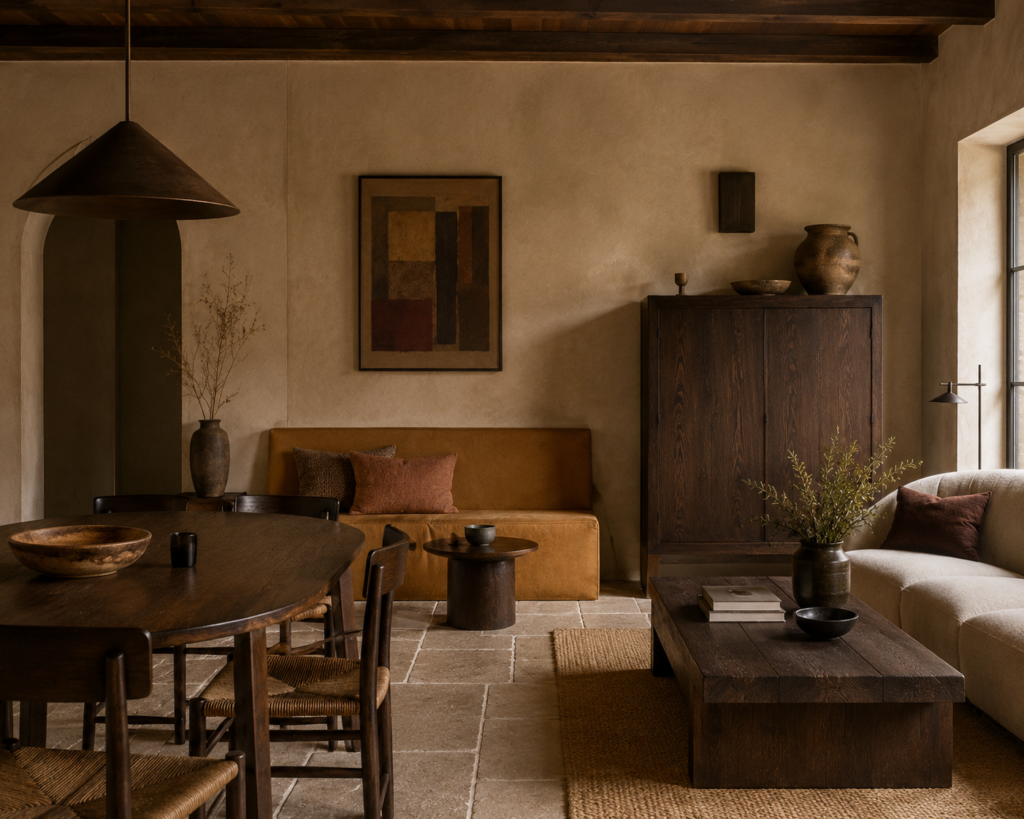
Ochre is one of those colours that can look surprisingly modern when removed from overly rustic surroundings.
Pair it with dusty clay tones and deep walnut and suddenly the palette feels rich, grounded and almost architectural.
Rather than painting an entire room bright ochre, use it sparingly.
An ochre plaster wall, handmade tile, upholstered chair or old painted cupboard might be enough.
Clay tones soften the contrast while walnut adds depth.
It is the sort of palette that becomes more interesting as the materials age.
5. Dusty Blue + Stone + Natural Oak
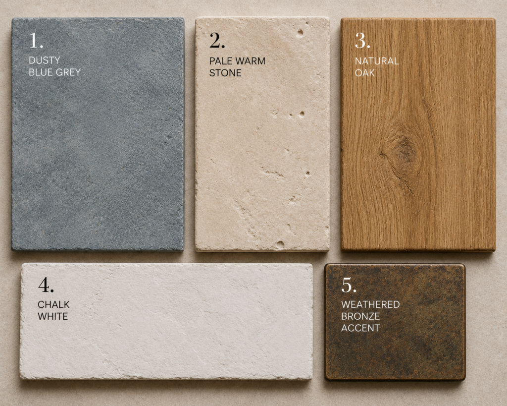
Palette references: Dusty Blue Grey #7E929B · Pale Warm Stone #D9CDBA · Natural Oak #B18759 · Chalk White #EEE9DF · Weathered Bronze #746044
Approximate digital colour references. Natural materials may vary.
Blue appears constantly in vernacular architecture, particularly in places where it contrasts beautifully with pale stone or sun-bleached buildings.
But the most convincing version is rarely a bright coastal blue.
Instead, look for something faded.
A dusty blue-grey painted cupboard, door or piece of furniture works beautifully against warm stone and natural oak.
There should be enough grey in the blue that it almost feels uncertain.
That slight muddiness makes it far easier to live with.
6. Deep Green + Cream + Red Brick
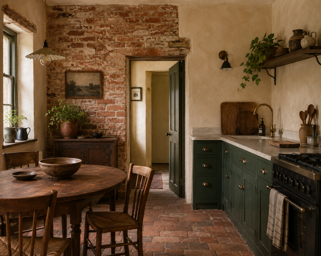
Green and brick are natural companions because both already exist comfortably within landscapes.
Deep green brings out the richness of old red brick, while cream softens everything around it.
This palette works especially well in older cottages and houses with existing brick fireplaces or floors.
A dark green kitchen, for example, can look surprisingly timeless beside imperfect brick and creamy plaster.
Add timber rather than introducing another strong colour.
The materials are already doing enough.
7. Tobacco Brown + Bone + Blackened Metal
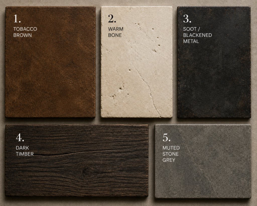
Palette references: Tobacco Brown #744A2A · Warm Bone #E5D9C6 · Blackened Metal #292A28 · Dark Timber #49382B · Muted Stone Grey #8C877D
Approximate digital colour references. Natural materials may vary.
Some vernacular interiors are less about picturesque country colour and more about beautifully utilitarian materials.
Tobacco brown, bone and blackened metal captures that mood.
Think dark timber furniture, worn leather, creamy limewashed walls and simple iron hardware.
There is a subtle industrial quality to the combination, but it never feels polished enough to become fully industrial.
That distinction matters.
Vernacular interiors should retain a sense that things were chosen because they worked, not because they matched.
8. Faded Red + Mushroom + Old Oak
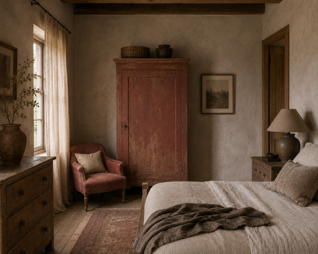
There is something wonderfully unfashionable about a faded earthy red.
Which may be precisely why it feels interesting again.
Rather than burgundy or bright rust, look for a red that appears slightly sun-faded and dusty. Pair it with mushroom-coloured plaster and old oak.
The result is warm without becoming overly rustic.
Faded red works particularly well on cabinetry, internal doors, textiles and small areas of wall.
It also looks beautiful against stone.
9. Moss Green + Sand + Grey Stone
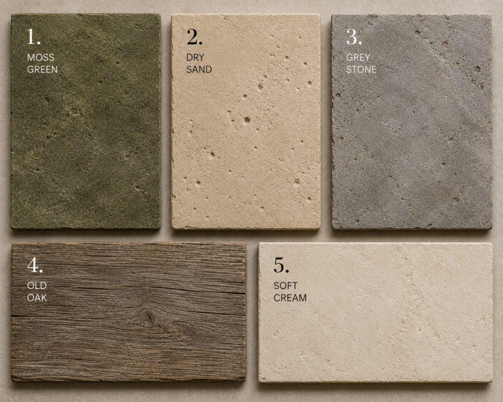
Palette references: Moss Green #666746 · Dry Sand #D1BFA2 · Grey Stone #98978F · Old Oak #796851 · Soft Cream #E7DDCA
Approximate digital colour references. Natural materials may vary.
This is perhaps one of the easiest vernacular palettes to use in a contemporary home.
Moss green feels natural without being obviously botanical. Sand brings softness, while grey stone prevents the scheme becoming too warm.
It works especially well where there is a connection to a garden or landscape outside.
Rather than matching the green exactly to plants beyond the windows, choose something muddier and less saturated.
Vernacular colour tends to look better when it feels slightly weathered.
10. Earth Brown + Limewash + Charcoal

A nearly neutral vernacular palette can be extraordinarily beautiful.
Earth brown, chalky limewash and charcoal create enough contrast to feel deliberate without introducing obvious colour.
The interest comes from texture instead.
Rough plaster. Dark timber. Stone. Hand-forged metal. Woven textiles.
This is where vernacular design separates itself from generic neutral interiors.
A neutral vernacular room should never feel smooth.
It should feel layered.
Vernacular Colour Usually Comes From Materials First
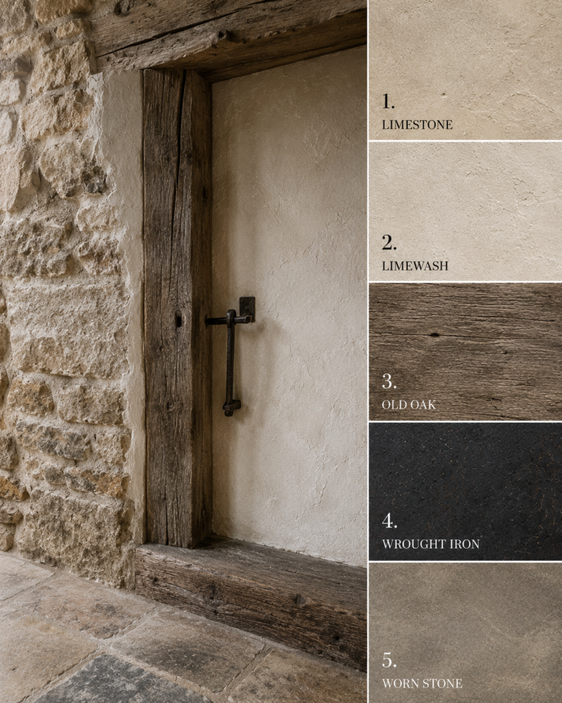
One of the easiest mistakes to make when recreating vernacular interiors is beginning with paint colours.
Traditionally, paint probably came much later.
The palette was already there.
Stone walls established one colour. Timber beams introduced another. Floors might have been brick, flagstone or timber. Furniture added yet another layer.
Only then did painted surfaces enter the picture.
It is a useful approach today too.
Start by identifying the permanent materials in the room.
What colour is the floor?
What timber is already present?
Is there brick, stone or tile?
Once those elements are considered part of the palette rather than merely background materials, choosing wall colours becomes far easier.
The Colours Should Be Slightly Imperfect
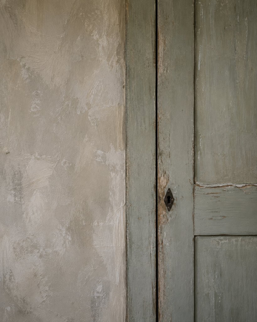
Perfect colour can sometimes work against vernacular design.
Colours historically created from mineral and natural pigments had variation. Surfaces aged. Paint faded. Timber darkened. Plaster changed tone depending on the light.
That inconsistency created depth.
Modern interiors can recreate the feeling without artificially distressing everything.
Choose complex colours instead.
A green with brown underneath it.
A cream with grey rather than yellow.
A red softened by clay.
A blue carrying enough grey that it changes completely between morning and afternoon.
The colour should become more interesting the longer you look at it.
You Do Not Need to Live in an Old Cottage
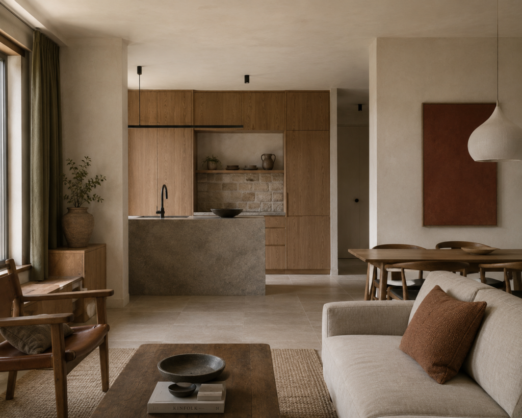
Perhaps the best thing about vernacular colour palettes is that they do not require vernacular architecture.
A completely ordinary contemporary house can borrow the idea.
Use locally familiar materials. Choose colours that relate to them. Let timber, stone and brick remain visible rather than covering everything with decorative finishes.
Even one room can begin to feel connected to its setting.
And that may be the broader lesson behind vernacular design.
A beautiful home does not necessarily need to look as though it could exist anywhere in the world.
Sometimes it becomes more interesting when it looks as though it belongs exactly where it is.
Why Vernacular Colour Feels So Relevant Again
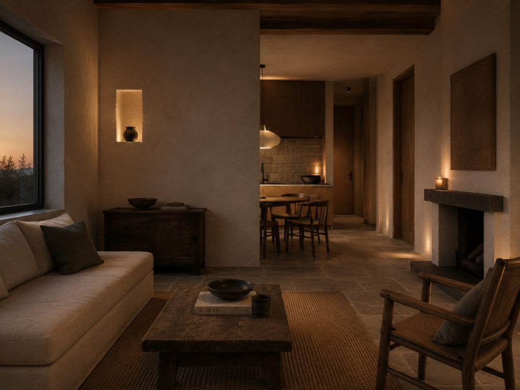
For a long time, interior colour trends travelled remarkably quickly.
The same sage green kitchen appeared everywhere. The same warm white. The same pale oak. The same carefully coordinated neutral rooms.
Vernacular colour offers almost the opposite idea.
Instead of asking what colours everyone else is using, it asks a much more interesting question:
What colours make sense here?
Perhaps the answer comes from local stone.
Perhaps it comes from old brick, eucalyptus leaves, dry grass, dark timber or the colour of the soil.
And perhaps that is why these palettes feel so timeless.
They were never really trends in the first place.
Britt & Tyler
We’re Britt and Tyler, the two Australians behind Cocktails & Cathedrals. We’re drawn to old buildings, beautiful rooms, bookshops and places that seem to hold a story. Our journal brings those interests together, with a fondness for slow afternoons and a well-made cocktail. We hope it helps you find places you’ll want to linger.
Travel slowly. Stay beautifully.
A little more about us →