Bath Colour Palettes: 7 Georgian-Inspired Schemes for Timeless Interiors
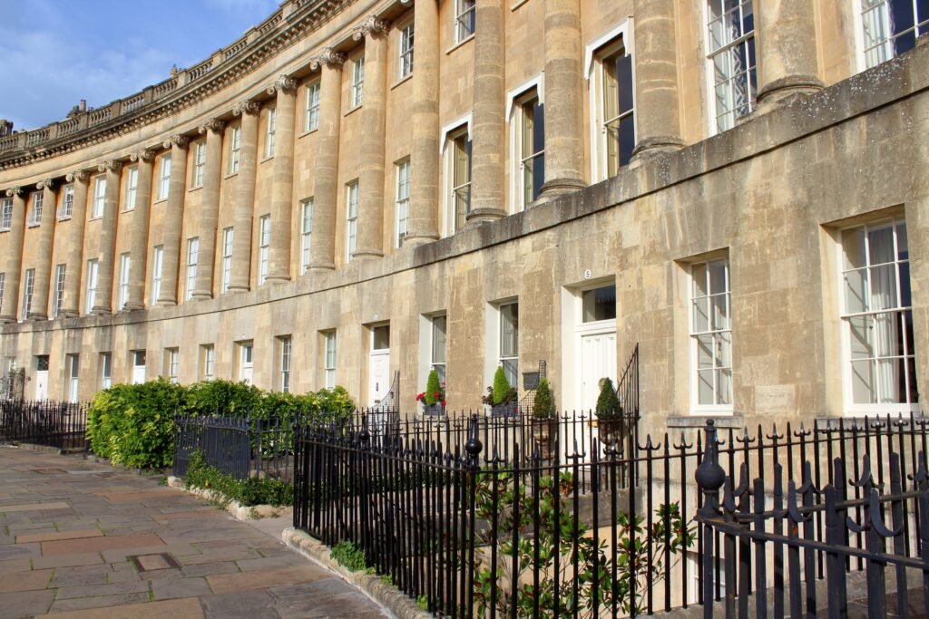
Bath has one of the most recognisable colour stories of any city in England.
Walk through its Georgian streets and almost everything seems to belong to the same quiet palette: honey-coloured stone, soft cream façades, weathered grey paving, muted green doors and occasional flashes of dusty blue or faded pink.
Yet Bath never feels monotonous.
The beauty lies in the subtle variation.
Warm limestone shifts from pale cream to gold as the light changes. Painted doors add restrained colour. Garden greenery softens the architecture, while darker timber, ironwork and historic interiors give all that pale stone some much-needed contrast.
For interior design, this makes Bath a surprisingly useful source of inspiration.
Rather than recreating a Georgian townhouse literally, you can borrow Bath’s colours and use them in a contemporary home — warm neutrals, slightly faded heritage shades and natural materials layered together in a way that feels elegant without becoming formal.
Here are seven Bath-inspired colour palettes to try.
The Bath Colour Palette at a Glance
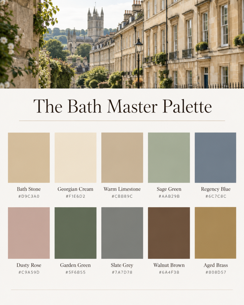
The city’s colour story revolves around a relatively small family of shades:
- Bath Stone
- Georgian Cream
- Limestone
- Sage Green
- Regency Blue
- Dusty Rose
- Garden Green
- Slate Grey
- Walnut Brown
- Aged Brass
The key is that almost none of these colours should feel overly clean or saturated.
Bath suits colours that look slightly softened by age.
Think chalky rather than bright, warm rather than stark, and elegant rather than decorative.
1. Bath Stone + Georgian Cream
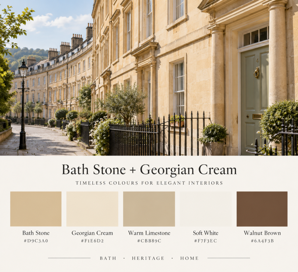
Colours:
Bath Stone
Georgian Cream
Warm Limestone
Soft White
Walnut Brown
This is the palette that immediately says Bath.
The city’s famous limestone architecture gives the streets their distinctive golden-cream appearance, particularly when the buildings catch late-afternoon sunlight.
For interiors, Bath Stone works beautifully as the main wall colour.
It should sit somewhere between cream, beige and muted sandstone rather than reading as obvious yellow.
Pair it with warmer whites instead of brilliant white, then introduce walnut or another medium-dark timber to stop the room feeling washed out.
Where it works
This palette is particularly good for:
- living rooms
- traditional kitchens
- bedrooms
- hallways
- reading rooms
Add linen, aged wood, pale stone and antique brass for a layered but understated finish.
The feeling: quiet, warm and unmistakably Georgian.
2. Sage Green + Bath Stone
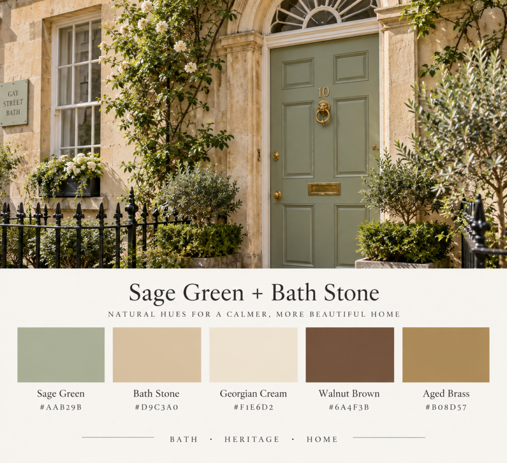
Colours:
Sage Green
Bath Stone
Georgian Cream
Walnut Brown
Aged Brass
Bath is not simply a city of beige stone.
Muted greens appear everywhere — in gardens, painted doors, shutters, railings and the countryside surrounding the city.
Sage green gives the classic Bath palette a little more life while still feeling completely at home beside limestone and cream.
Use Bath Stone or Georgian Cream across most of the room, then introduce sage through cabinetry, a painted bookcase, an armchair or textiles.
Walnut and aged brass provide the darker elements the palette needs.
Try it with
A cream sitting room with:
- sage-green joinery
- walnut furniture
- natural linen curtains
- an aged brass reading lamp
- a faded patterned rug
The result should feel historic without looking like a period-film set.
The feeling: calm, cultivated and slightly country-house.
3. Regency Blue + Limestone
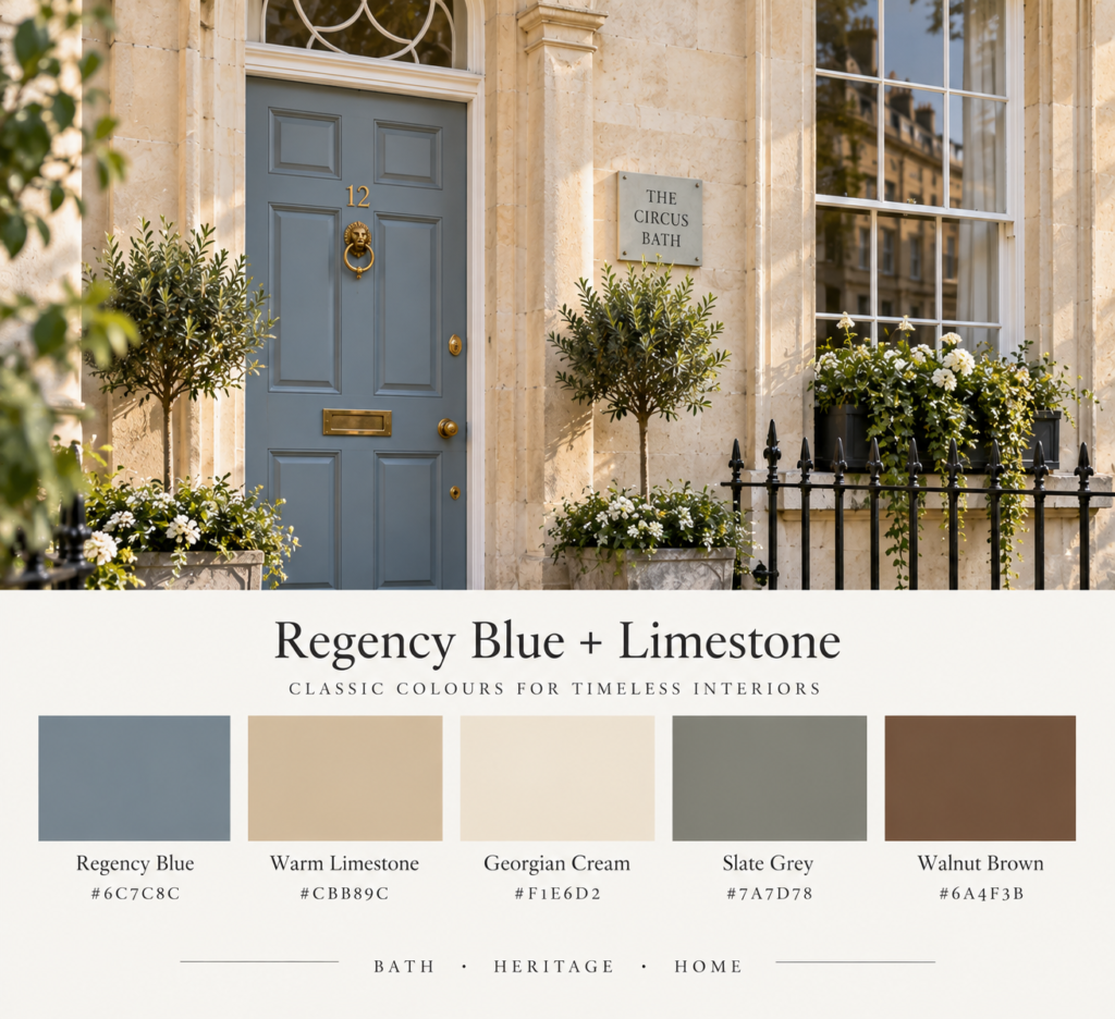
Colours:
Regency Blue
Warm Limestone
Georgian Cream
Slate Grey
Walnut Brown
Blue is an excellent way to introduce colour into a Bath-inspired interior while keeping the overall look restrained.
The right blue should feel slightly greyed and softened rather than coastal or nautical.
Think old painted doors, Georgian drawing rooms and slightly faded decorative interiors.
Use Regency Blue as an accent rather than covering every wall.
It works especially well on:
- kitchen cabinetry
- a bedroom headboard
- shelving
- doors
- upholstered chairs
- a small powder room
Pair it with limestone and cream, then ground everything with slate grey and dark wood.
The feeling: elegant, intelligent and quietly formal.
4. Dusty Rose + Georgian Cream
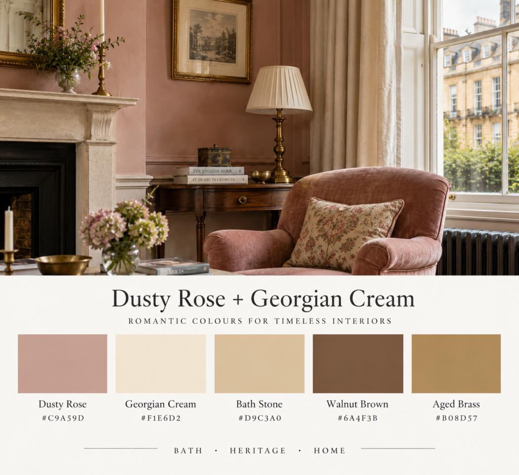
Colours:
Dusty Rose
Georgian Cream
Bath Stone
Walnut Brown
Aged Brass
Bath has a romantic side too.
Its Georgian architecture, crescents, gardens and literary associations all work beautifully with faded pink — provided the shade stays muted.
Avoid anything bubblegum or obviously blush.
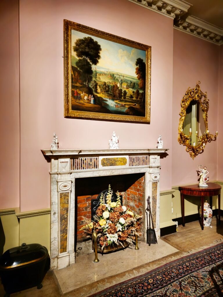
Instead, choose a dusty plaster pink that looks as though it has been softened over decades.
Dusty rose works particularly well alongside Bath Stone because both shades have warm undertones.
Try pink on a single wall, upholstered chair, faded rug or curtains rather than using it everywhere.
Add walnut, brass and cream for balance.
A simple combination
Imagine:
Georgian Cream walls,
a dusty rose armchair,
walnut side table,
cream linen sofa,
and one antique-brass lamp.
That alone is enough to create the mood.
The feeling: romantic, faded and quietly luxurious.
5. Garden Green + Cream
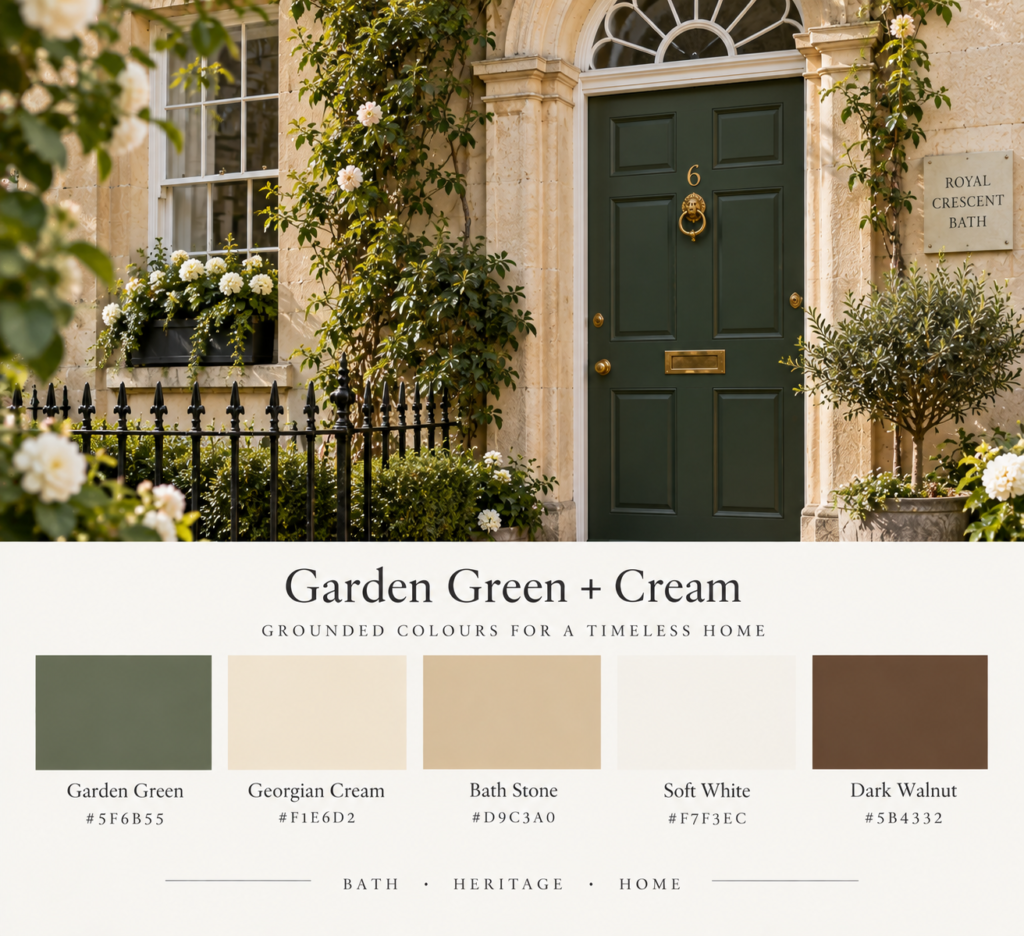
Colours:
Garden Green
Georgian Cream
Bath Stone
Soft White
Dark Walnut
One of the nicest things about Bath is the relationship between architecture and greenery.
Formal terraces are softened by trees, gardens, climbing plants and the surrounding Somerset landscape.
This palette pushes that contrast a little further.
Choose a deeper garden green rather than sage and use it against cream walls and warm limestone shades.
A dark green kitchen, library or painted internal door can look particularly effective.
The darker shade gives pale Bath-inspired interiors some architectural weight.
Materials to pair with it
Use:
- limestone
- dark timber
- natural linen
- unlacquered or aged brass
- off-white ceramics
- woven natural fibres
The feeling: grounded, English and slightly more dramatic.
6. Limestone + Slate Grey
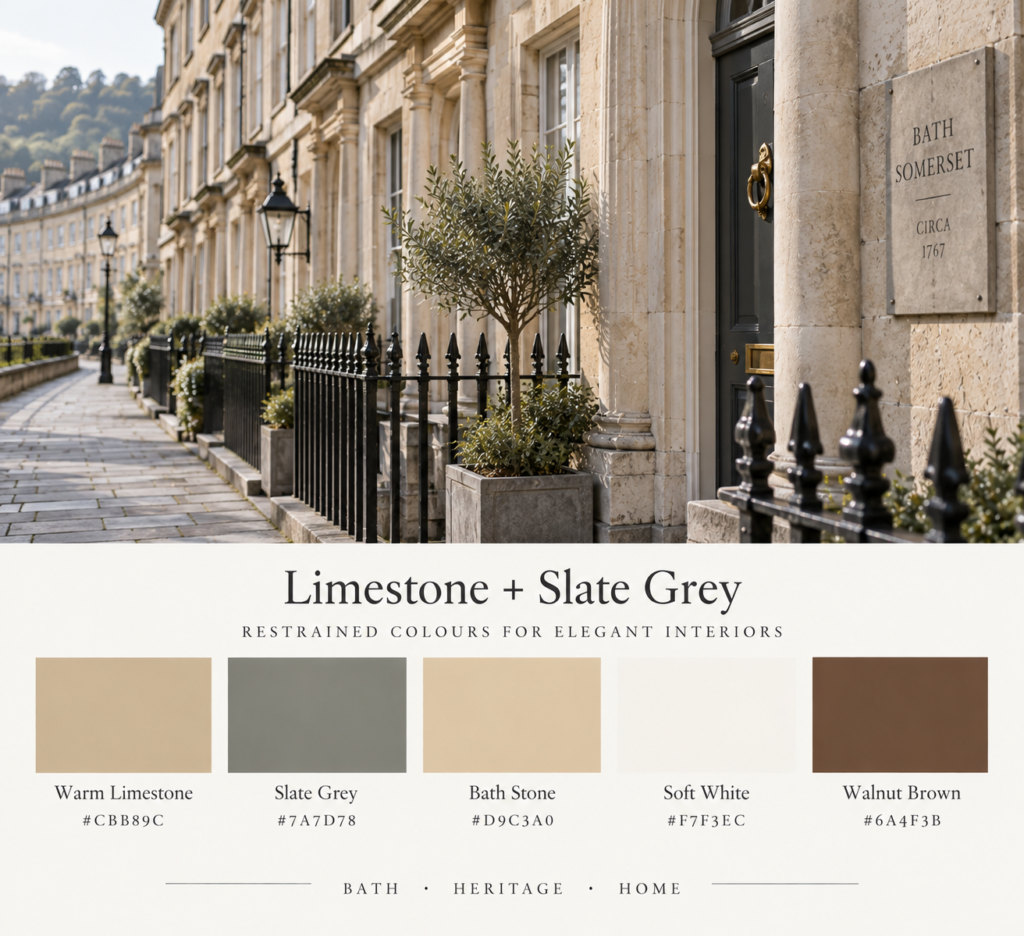
Colours:
Warm Limestone
Slate Grey
Bath Stone
Soft White
Walnut Brown
Not every Bath-inspired interior needs obvious colour.
For a quieter and more contemporary interpretation, focus on the relationship between pale stone and grey.
The city’s pavements, rooftops, ironwork and shadowed architectural details bring cooler greys into contrast with its warm limestone façades.
That same idea works beautifully indoors.
Use warm limestone or cream on the walls, then introduce slate grey through furniture, stone surfaces, rugs or upholstery.
The trick is keeping the grey warm enough that it doesn’t fight against the Bath Stone.
This palette is ideal for
- minimalist interiors
- modern Georgian homes
- apartments
- bathrooms
- contemporary kitchens
Add natural walnut to stop the scheme becoming too cool.
The feeling: architectural, restrained and contemporary.
7. Literary Bath
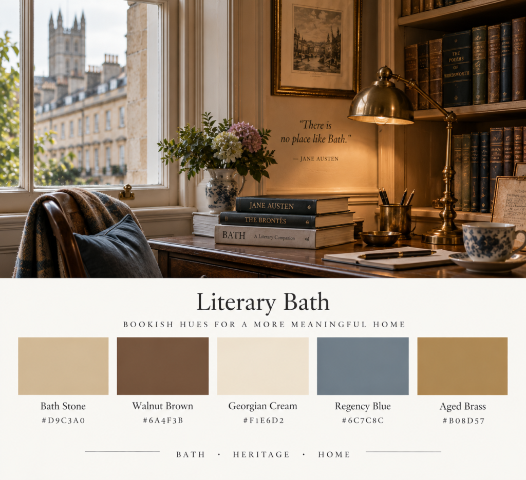
Colours:
Bath Stone
Walnut Brown
Georgian Cream
Regency Blue
Aged Brass
For us, this might be the most interesting Bath palette of all.
Bath has an obvious connection with literature, historic drawing rooms, old bookshops and writers including Jane Austen.
Rather than creating an overtly themed literary interior, borrow the atmosphere.
Start with Bath Stone walls.
Add dark walnut furniture or shelving.
Introduce a little Regency Blue through upholstery or painted joinery, then finish the space with aged brass and warm cream textiles.
Books should feel like part of the room rather than decoration added afterwards.
A slightly worn rug, leather-bound books, timber side table and old brass reading lamp are enough.
Keep it restrained
The danger with a literary interior is drifting into costume.
You don’t need:
- towering fantasy libraries
- stacks of decorative books everywhere
- excessive dark wood
- oversized chandeliers
- faux-antique accessories
Keep the room believable.
Think ordinary Georgian townhouse rather than aristocratic estate.
The feeling: bookish, atmospheric and quietly sophisticated.
How to Use Bath Colours in a Modern Interior
The easiest way to make these palettes work is to avoid using every colour equally.
Choose one dominant neutral, one secondary colour and one or two darker accents.
For example:
60% Bath Stone or Georgian Cream
25% Sage or Regency Blue
10% Walnut
5% Aged Brass
The exact percentages don’t matter.
The principle does.
Bath-inspired interiors should feel predominantly light and warm, with restrained colour layered on top.
Materials That Work With a Bath Colour Palette
Colour alone only gets you part of the way.
Bath’s aesthetic is strongly connected to natural materials.
The most effective choices include:
Limestone
The obvious starting point.
Use it for flooring, fireplaces, tabletops or decorative objects.
Walnut and Medium-Dark Timber
Dark timber adds contrast against pale walls without feeling harsh.
Linen
Natural linen curtains, cushions and upholstery suit the soft, slightly imperfect character of the palette.
Aged Brass
Use sparingly on lamps, handles, frames and hardware.
Highly polished gold tends to feel too glamorous.
Wool
A muted wool rug can soften stone floors and add texture without disrupting the restrained colour scheme.
Colours to Avoid
A Bath-inspired interior doesn’t need to be historically accurate, but some colours can quickly take the scheme in a different direction.
Be careful with:
bright white
cool blue-grey
highly saturated navy
neon green
bright blush pink
very yellow beige
The palette works best when everything feels slightly muted.
Even your blues, greens and pinks should contain a little grey, cream or brown.
Which Bath Palette Works Best for You?
If you love neutral interiors, begin with Bath Stone + Georgian Cream.
For something softer and more natural, try Sage Green + Bath Stone.
If you’d like slightly more colour, Regency Blue + Limestone works beautifully.
For a romantic room, choose Dusty Rose + Georgian Cream.
And if you’re drawn to the literary side of Bath, combine warm stone, dark timber, blue and aged brass.
The palettes are deliberately flexible.
You don’t need a Georgian townhouse to use them.
Final Thoughts
Bath proves that a memorable colour palette doesn’t have to be colourful in the conventional sense.
Much of the city’s beauty comes from small variations in stone, plaster, timber, greenery and faded paint.
That restraint is exactly what makes Bath such a useful interior-design reference.
Start with warm limestone and cream.
Add one muted heritage colour.
Bring in dark timber for contrast and a little aged brass for warmth.
The result feels timeless rather than trendy — a modern interior with just enough of Bath’s Georgian character to make it interesting.
Related reading:
Explore our Literary Walking Tour of Bath for bookshops, Jane Austen connections and atmospheric places to discover around the city.
You might also enjoy our other European colour guides and literary travel itineraries from Cocktails & Cathedrals.
Britt & Tyler
We’re Britt and Tyler, the two Australians behind Cocktails & Cathedrals. We’re drawn to old buildings, beautiful rooms, bookshops and places that seem to hold a story. Our journal brings those interests together, with a fondness for slow afternoons and a well-made cocktail. We hope it helps you find places you’ll want to linger.
Travel slowly. Stay beautifully.
A little more about us →