Trieste Interiors: The Italian Design Style You Probably Haven’t Heard Of
Trieste does not look quite like the Italy most people imagine.
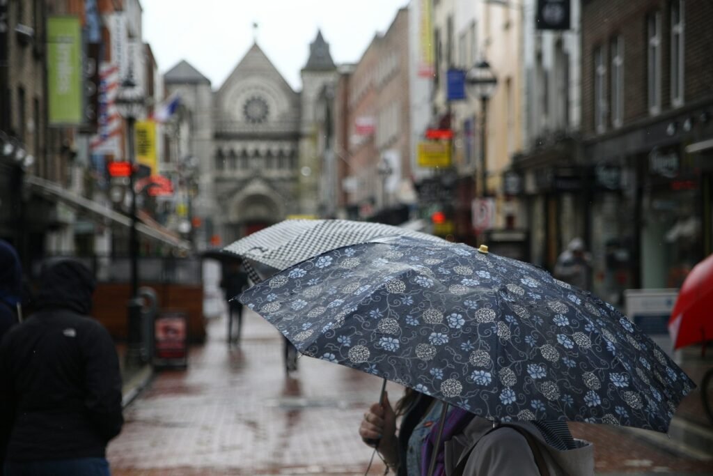
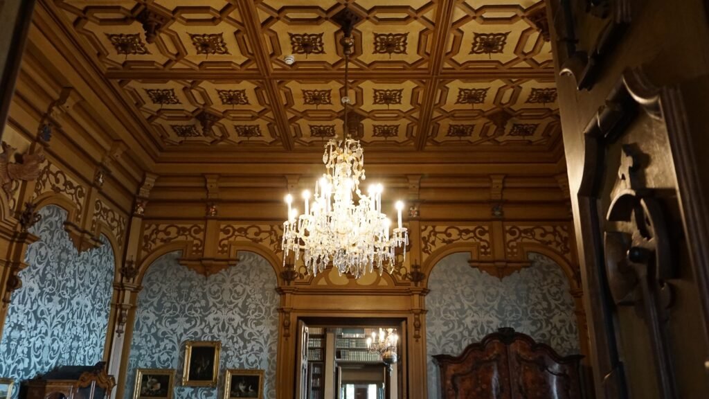
There are no terracotta Tuscan farmhouses or sun-bleached Mediterranean villas here. Instead, Trieste feels slightly grander, darker and more mysterious — a city of marble cafés, old bookshops, polished timber, pale stone façades and rooms that seem designed for reading while rain hits the windows.
That difference is what makes Trieste-inspired interiors so interesting.
Sitting on Italy’s Adriatic edge, Trieste spent centuries looking simultaneously toward Italy, Austria and Central Europe. Its Habsburg past is still visible throughout the city, particularly in its grand Neoclassical streets and its historic coffeehouses. Official tourism sources even describe Trieste’s cafés as having a distinctly Viennese character, something unusual in Italy.
The result is an interior aesthetic that doesn’t fit neatly into one box.
It is Italian, but not stereotypically Mediterranean.
It is Central European, but softened by the sea.
It is elegant, but rarely pristine.
And it may be one of the most atmospheric European looks to borrow from.
4
What Is Trieste Interior Style?
Strictly speaking, “Trieste interior design” isn’t a recognised historical design movement in the way Art Deco, Bauhaus or Mid-Century Modern are.
It is better understood as a regional aesthetic created by layers of history.
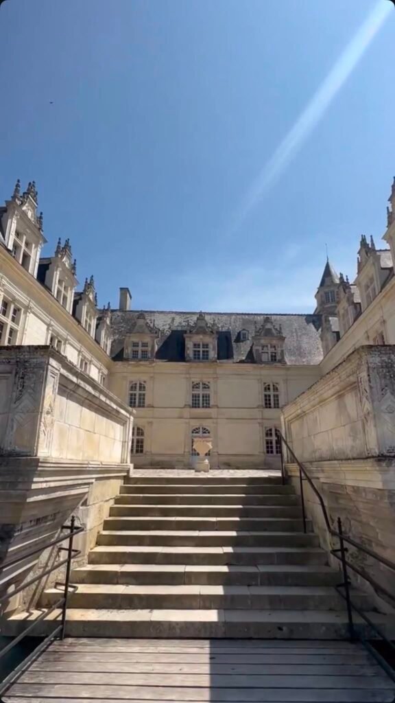
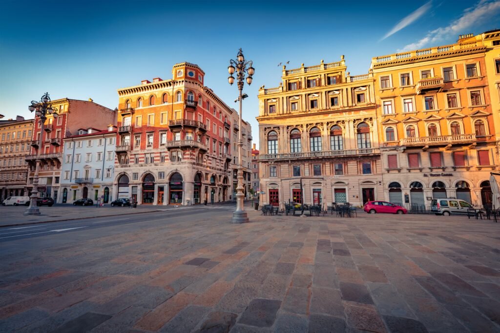
Trieste was an important Habsburg port, and its architecture developed with strong Central European influences. At the same time, its position on the Adriatic brought Italian and Mediterranean elements into the city. The historic centre still contains grand Neoclassical architecture alongside later Liberty and Viennese-influenced buildings.
Inside, those influences translate beautifully.
Imagine:
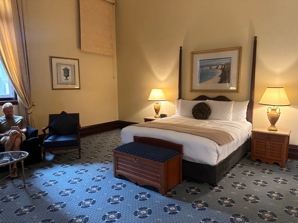
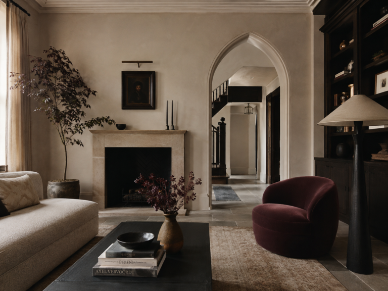
dark polished timber against warm cream walls.
Burgundy upholstery beside marble.
Parquet floors underneath old bentwood chairs.
Brass, books and mirrors.
Then add a glimpse of faded Adriatic blue.
That is the Trieste look.
Why Trieste Interiors Feel Different From Other Italian Interiors
Trieste’s geography explains much of its character.
The city occupies a cultural crossroads between Central Europe and the Mediterranean, and its architecture reflects both worlds. Italia.it describes Trieste as having both a Central European and Mediterranean soul, shaped by its Habsburg history and centuries of cultural mixing.
That makes it noticeably different from the interiors associated with southern Italy.
A classic Mediterranean room might revolve around white plaster, rustic timber, terracotta and bright sunlight.
A Trieste-inspired room is more likely to contain:
- dark walnut or mahogany
- cream and parchment walls
- marble surfaces
- parquet flooring
- brass details
- burgundy or oxblood textiles
- navy and Adriatic blue
- old books and artwork
- café-style furniture
- restrained decorative plasterwork
It feels more literary than rustic.
And that distinction is really the key.
1. Begin With Warm, Faded Neutrals
The easiest mistake when creating this look would be making the room too dark.
Trieste’s grand buildings often use pale stone, warm cream and soft neutral shades as a backdrop.
Start with colours like:
Habsburg Cream
Warm Ivory
Parchment
Faded Stone
Soft Taupe
Avoid brilliant white.
The goal isn’t crisp contemporary minimalism. The room should feel slightly softened by age.
Walls with a chalky or lightly textured finish work particularly well because they prevent the space from feeling newly decorated.
If you’re working with a modern home, even a warm off-white wall can provide the right foundation.
2. Add Dark Timber
This may be the most important ingredient.
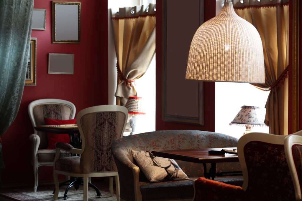
Trieste’s historic cafés give us one of the clearest references for the style. Many feature dark furniture and timber detailing alongside lighter walls and decorative ceilings.
Trieste’s coffeehouses developed from the late eighteenth century onward and took on a distinctly Viennese character in both their interiors and the way they operated.
At home, look for:
walnut bookcases
dark oak tables
bentwood dining chairs
antique writing desks
timber sideboards
dark picture frames
You don’t need an entire room full of antique furniture.
In fact, one substantial dark timber piece against a pale wall can immediately establish the mood.
3. Bring In the Historic Café
If there is one place to steal ideas from in Trieste, it is the café.
Coffee is woven deeply into the identity of the city, partly because of Trieste’s historic role as a major coffee-importing port. Its surviving coffeehouses remain an important part of the city’s culture.
And aesthetically, they are fantastic.
Think:
small round tables
marble tabletops
bentwood café chairs
mirrors
dark cabinetry
brass details
globe-shaped lights
banquette seating
You don’t have to recreate a nineteenth-century café.
A small marble-topped table beside a bookcase can be enough.
Add two dark bentwood chairs and suddenly an unused corner feels much more Trieste.
4. Use Burgundy Sparingly
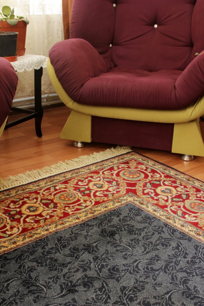
Burgundy is one of the colours that gives this style its depth.
But it works best as punctuation rather than the dominant colour.
Try it on:
a velvet armchair
a rug
a cushion
a dining-chair seat
a lampshade
a piece of artwork
Deep wine shades work particularly well against cream walls and dark timber.
For a softer version, move toward dusty wine or muted plum rather than bright red.
Our Trieste Colour Palette goes much deeper into the colours that make the city feel distinctive, including combinations built around Habsburg cream, espresso brown, Adriatic blue, café burgundy and old brass.
5. Add Adriatic Blue
Without blue, Trieste interiors can quickly become overwhelmingly Central European.
Blue brings the sea back into the room.
But we’re not talking about bright Santorini blue.
Trieste blue should feel slightly grey.
Look for:
stormy blue
dusty navy
washed denim
blue-grey
deep Adriatic blue
Use it through cushions, painted cabinetry, ceramics or artwork.
The contrast between dark timber + warm cream + faded blue is particularly effective.
It gives you the feeling of an old European apartment that happens to overlook the sea.
6. Use Marble Without Making It Flashy
Trieste can absolutely handle marble.
But the marble should feel architectural rather than luxurious.
Think café tabletop rather than gigantic polished kitchen island.
Use it for:
side tables
fireplace surrounds
small console tops
bathroom vanities
kitchen splashbacks
Choose softer stone with grey or warm veining rather than highly dramatic slabs.
One beautifully aged-looking marble surface will generally work better than covering an entire room in it.
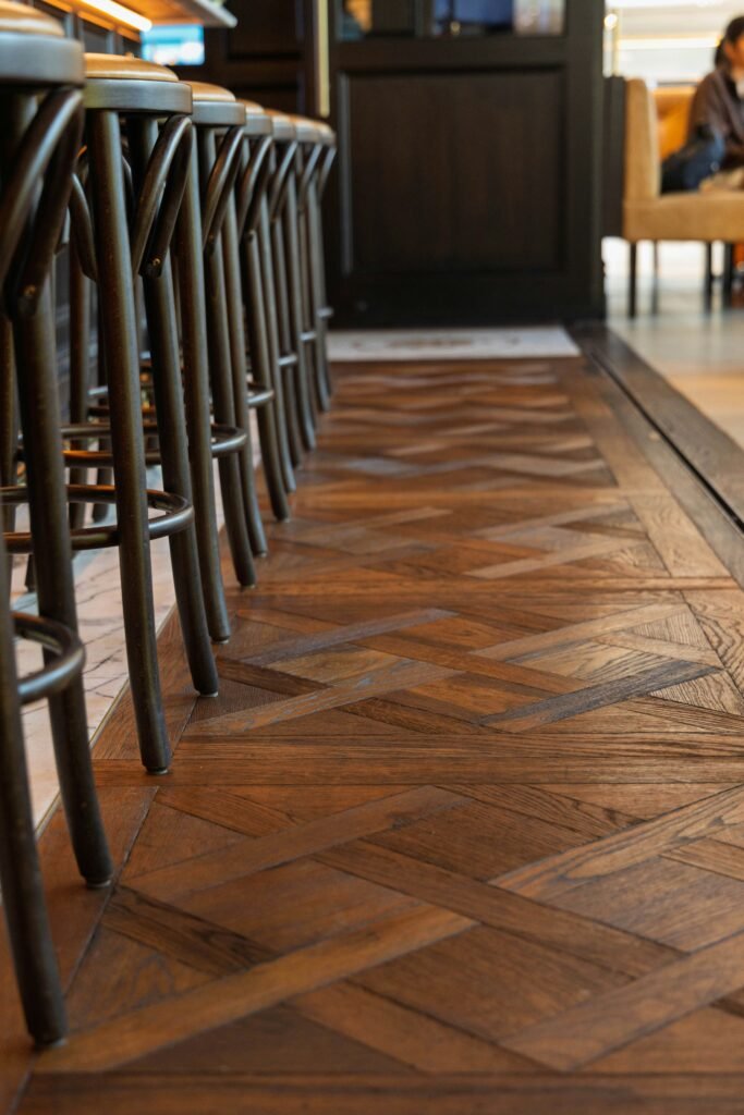
7. Parquet Floors Are Almost Perfect
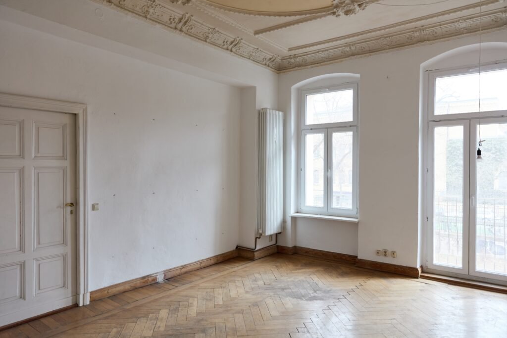
Nothing establishes this European mood faster than timber parquet.
Herringbone works especially well.
So does a simple narrow-board timber floor in medium or dark oak.
If changing the flooring isn’t realistic, don’t worry.
A faded traditional rug over timber flooring can achieve much of the same feeling.
The important thing is avoiding anything that feels excessively glossy or new.
Trieste suits surfaces with depth and variation.
8. Bring Books Into the Room
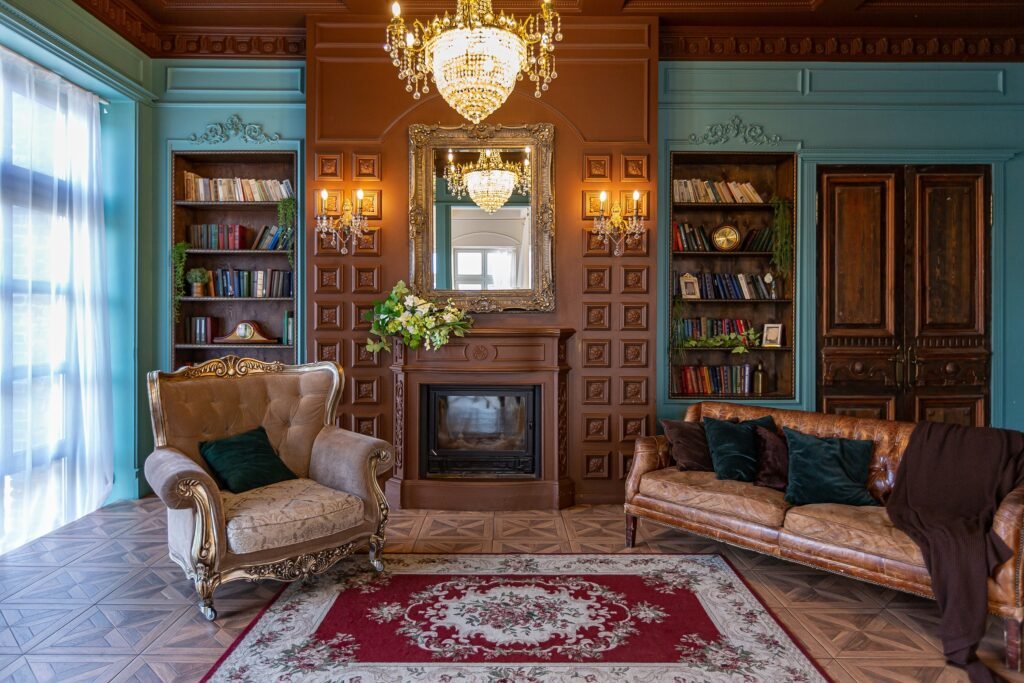
Trieste is inseparable from literature.
James Joyce lived here for years. Italo Svevo and Umberto Saba are deeply connected to the city, and Trieste’s cafés have historically functioned as places for writers, students and intellectual life.
That gives books a genuine place in this aesthetic.
Not decorative books purchased by colour.
Actual books.
Let shelves be slightly uneven.
Stack a few horizontally.
Leave newspapers or magazines on a coffee table.
Add an armchair and reading lamp nearby.
The room should feel as though somebody genuinely spends time there.
If you’ve read our Literary Trieste Walking Tour, you’ll recognise how much the city’s identity is tied to exactly this combination of cafés, books and streets.
9. Choose Lighting That Feels Established
Trieste interiors shouldn’t feel aggressively illuminated.
Use several smaller sources of light rather than relying exclusively on ceiling lighting.
Try:
opal glass lamps
traditional table lamps
simple brass sconces
small pendants
reading lamps
Warm light works particularly well against cream walls and darker timber.
The aim is atmosphere without turning the room into a themed Victorian pub.
That restraint matters.
10. Introduce Old Brass
Brass works extremely well with the Trieste palette, particularly when it looks slightly aged.
Use it in:
picture frames
cabinet handles
lamps
mirrors
small tables
curtain hardware
Avoid filling the room with shiny gold finishes.
Old brass should almost disappear into the room until the light catches it.
11. Let the Room Feel Slightly Imperfect
This is probably the most important rule.
Don’t over-style it.
Trieste works because its interiors often feel accumulated rather than assembled.
A modern sofa can sit beside an antique table.
A contemporary artwork can hang above old parquet.
A battered stack of books can sit beneath an elegant lamp.
The pieces do not all have to belong to the same period.
In fact, they shouldn’t.
That tension between elegance and everyday life is part of what makes the aesthetic interesting.
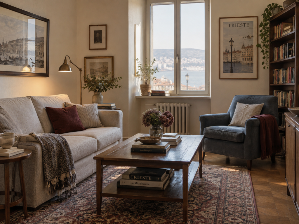
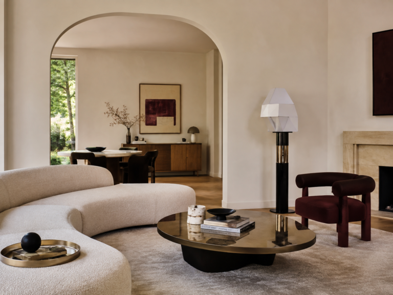
A Simple Trieste-Inspired Living Room
If you wanted to recreate the look without redesigning an entire house, start here.
Paint the walls warm cream.
Keep the existing sofa if it’s reasonably neutral.
Add a dark walnut or oak coffee table.
Place a faded burgundy or Persian-style rug underneath.
Introduce one deep blue armchair.
Add an old brass reading lamp.
Put a bookcase somewhere prominent.
Use linen curtains.
Finish with one marble side table and a few framed artworks.
That’s enough.
You don’t need chandeliers, columns or elaborate mouldings.
You’re borrowing the atmosphere rather than building a film set.
The Trieste Colour Palette
A particularly easy combination is:
Habsburg Cream — the main wall colour
Espresso Brown — timber and furniture
Café Burgundy — textiles and accents
Adriatic Blue — upholstery or artwork
Old Brass — small metallic details
You could then add:
Stone Grey
Dusty Mauve
Warm Marble
Ink Black
We’ve created a full Trieste-inspired colour palette separately, with combinations designed specifically for interiors.
That article is the better place to start if you’re choosing paint colours or fabrics.
Materials That Suit Trieste Interiors
The material palette should feel substantial but not overly luxurious.
Look for:
Walnut and dark oak
For furniture, cabinetry and shelving.
Marble
Particularly on smaller architectural surfaces and tabletops.
Linen
For curtains and relaxed upholstery.
Velvet
Used sparingly in burgundy, tobacco or blue.
Aged brass
For lamps, hardware and frames.
Plaster
Especially warm, slightly imperfect wall finishes.
Leather
Ideally dark brown or cognac and already looking a little lived in.
Wool
For rugs and heavier textiles.
Together they create that peculiar balance Trieste does so well: refined without feeling precious.
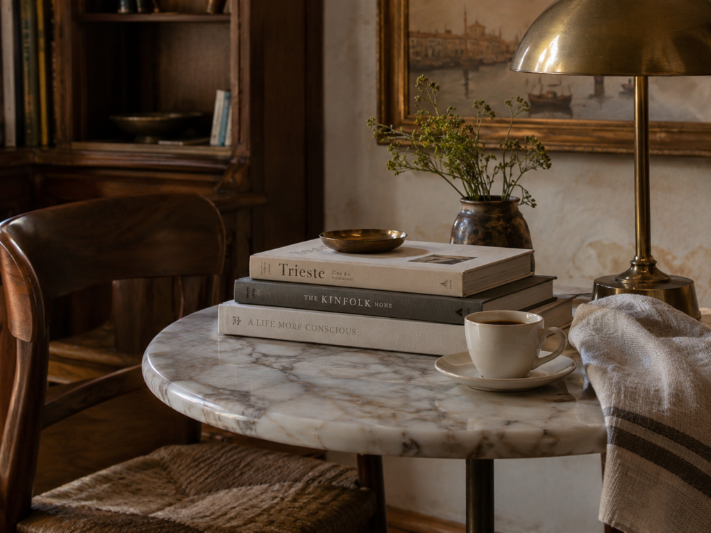
What to Avoid
Trieste-inspired design can go wrong surprisingly quickly.
Too much velvet and brass and you’ve created a hotel bar.
Too many antiques and you’ve created a period set.
Too much white and blue and you’ve lost Trieste entirely and wandered down to Greece.
Instead, keep the balance:
light walls + dark timber + muted colour + books + restrained old-world details.
And leave some breathing space.
The interesting objects become much more noticeable when the room isn’t packed with them.
Is Trieste Interior Style Right for You?
Trieste interiors will probably appeal to you if you like:
old European apartments
literary interiors
dark timber
historic cafés
quiet luxury
traditional details mixed with modern furniture
rooms that feel collected rather than decorated
It is especially good for anyone who finds conventional Mediterranean interiors a little too light and rustic, but doesn’t want the heaviness of completely traditional European décor.
Trieste sits somewhere beautifully in between.
A City Between Worlds
Perhaps that’s why the style feels so distinctive.
Trieste itself has always existed between worlds — geographically and culturally.
Its Habsburg architecture, Italian identity, Viennese café tradition and Adriatic setting have produced something that doesn’t feel entirely like anywhere else. Even the city’s grand newer districts are largely Neoclassical, while its cafés preserve a Central European tradition unusual elsewhere in Italy.
You don’t need to reproduce a historic Trieste apartment to capture it.
Take the cream walls.
Take the dark wood.
Take a little burgundy, marble and brass.
Add books.
Then soften everything with the faded blues of the Adriatic.
The result is elegant, literary and slightly melancholic — a room that feels like somewhere you might order another coffee simply because you’re not quite ready to leave.
Continue Exploring Trieste
If this is your kind of place, pair this article with our Literary Trieste Walking Tour to explore the cafés, streets and writers behind the aesthetic, then see our Trieste Colour Palette for the exact shades inspired by the city.
Britt & Tyler
We’re Britt and Tyler, the two Australians behind Cocktails & Cathedrals. We’re drawn to old buildings, beautiful rooms, bookshops and places that seem to hold a story. Our journal brings those interests together, with a fondness for slow afternoons and a well-made cocktail. We hope it helps you find places you’ll want to linger.
Travel slowly. Stay beautifully.
A little more about us →