Usonian: The Interior Design Style You Know Without Knowing Its Name
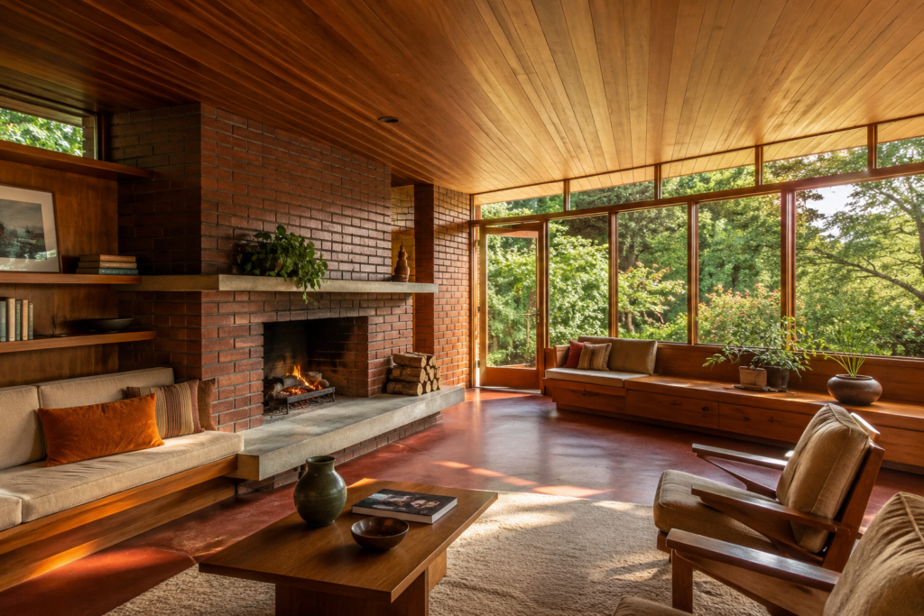
Warm timber. Built-in furniture. Walls of glass. Open-plan living. Rooms designed around nature rather than decorated against it.
It sounds remarkably contemporary.
Except Frank Lloyd Wright was doing it nearly a century ago.
Usonian design is one of those styles that feels strangely familiar even if you’ve never heard the word before. Its influence is everywhere: in mid-century houses, architect-designed cabins, warm minimalist interiors and the current obsession with natural materials, built-in furniture and enormous windows overlooking something green.
But Usonian wasn’t really created as an interior design style.
It was an idea about how people should live.
And perhaps the most interesting thing about it is that many of the ideas Wright proposed for modest American houses in the 1930s still feel surprisingly relevant today.
So, What Exactly Is Usonian Design?
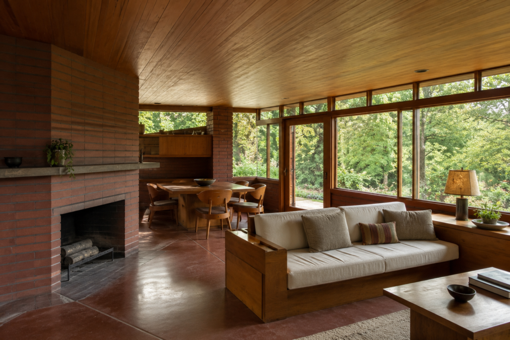
The term Usonian is most closely associated with American architect Frank Lloyd Wright, who began developing Usonian houses during the 1930s.
By then, Wright had already designed some extraordinarily elaborate homes. But Usonian architecture was intended to be something different.
These houses were supposed to provide beautiful, thoughtfully designed homes for middle-income Americans without relying on unnecessary size, expensive ornament or formal rooms that were rarely used.
The first widely recognised example was the Herbert and Katherine Jacobs House, completed in Madison, Wisconsin, in 1937.
It was relatively small. It had no attic, no basement and no traditional garage. Instead, Wright used a carport — a term and concept he helped popularise.
Inside, the house rejected much of the formality that had defined earlier domestic architecture.
The kitchen connected with the living spaces. Furniture was often built into the architecture. Rooms flowed into one another. Large windows connected the interior with the garden.
Rather than adding decoration to a box, Wright tried to make the house itself the decoration.
That distinction explains almost everything about Usonian interiors.
Usonian Was Never Really About Decorating
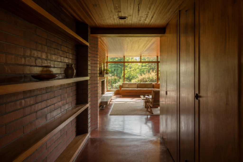
This is probably the most important thing to understand.
You don’t create a convincing Usonian interior by buying a particular chair, choosing a particular paint colour or putting some vaguely mid-century objects on a shelf.
Usonian design begins with the building.
Ceiling heights matter.
Window placement matters.
The direction of sunlight matters.
The relationship between the living room and the garden matters.
Even the way you move through the house matters.
Wright frequently designed relatively compressed entrances and corridors before allowing them to open into larger living spaces. A low ceiling might suddenly give way to a taller room filled with light.
That sense of compression and release makes the architecture feel almost choreographed.
Modern interiors are often photographed as individual rooms.
Usonian houses make much more sense when you imagine walking through them.
The Materials Are Warm, Natural and Usually Quite Simple
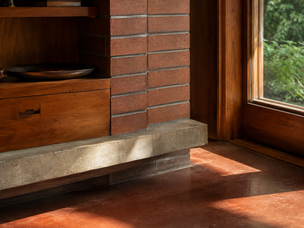
One of the reasons Usonian interiors have aged so well is their material palette.
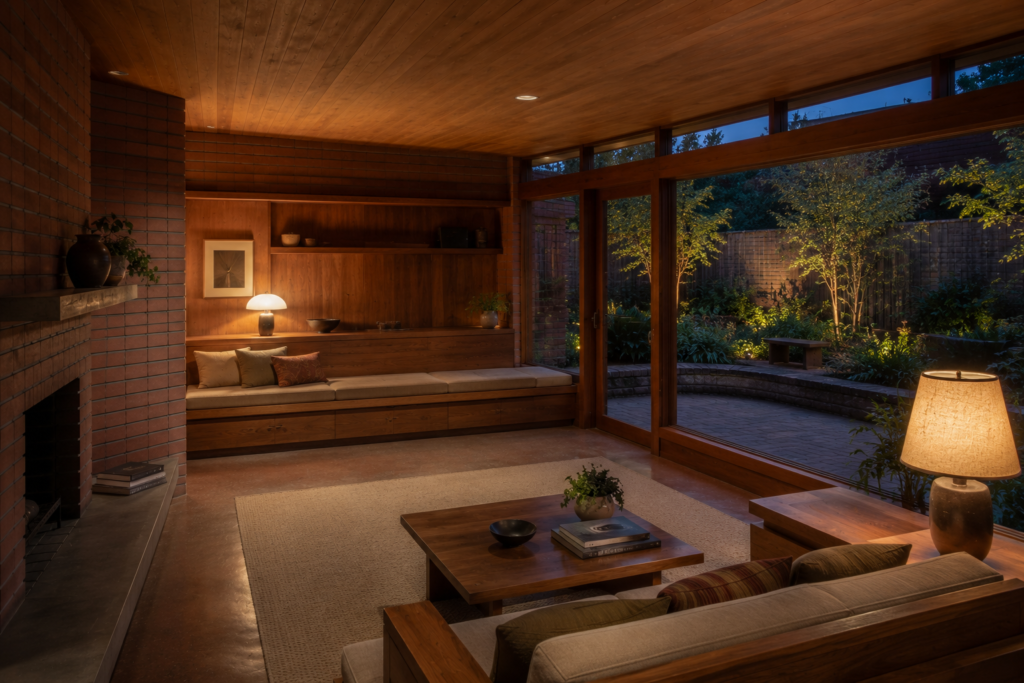
Timber is everywhere.
Walls, ceilings, cabinetry and furniture might all be made from wood, creating rooms that feel incredibly warm without needing much decoration.
Brick and stone provide weight and texture.
Concrete floors were common and were sometimes coloured with warm earthy pigments rather than being left industrial grey.
Glass provides the contrast.
Instead of treating windows as holes punched into walls, Wright often used glazing almost architecturally — long bands of windows, clerestories and large expanses of glass that dissolve the boundary between house and landscape.
The palette therefore tends to come naturally from the materials themselves:
warm brown timber, rusty brick, earthy red concrete, stone, cream, muted green and the changing colours outside the windows.
There isn’t much need to invent a colour scheme when the building already has one.
The Fireplace Is Often the Centre of Everything
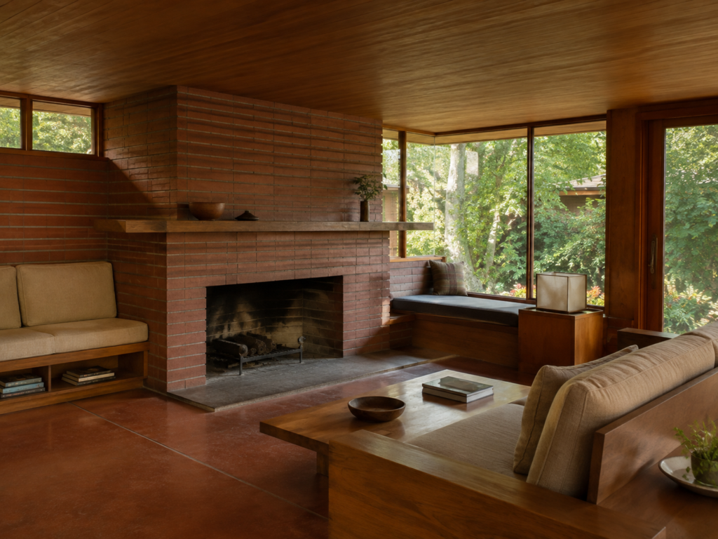
Before televisions became the gravitational centre of the living room, there was the hearth.
Wright took that idea particularly seriously.
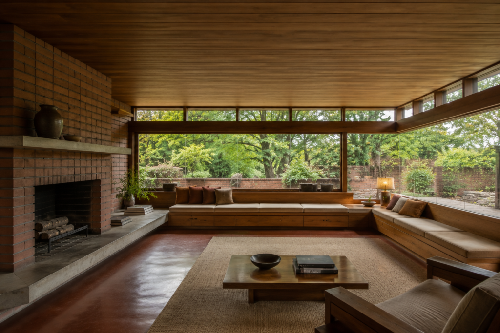
In many Usonian houses, a substantial masonry fireplace anchors the main living space. It isn’t simply a decorative fireplace inserted into a wall. It can feel like part of the structure of the house itself.
Rooms gather around it.
Furniture responds to it.
The ceiling and circulation often seem organised around it.
This creates something contemporary interiors sometimes struggle to achieve: a natural focal point that isn’t a screen.
There’s something wonderfully grounding about it.
A Usonian living room doesn’t necessarily need many objects because the combination of hearth, architecture and landscape already gives the room its identity.
Built-In Furniture Is Everywhere
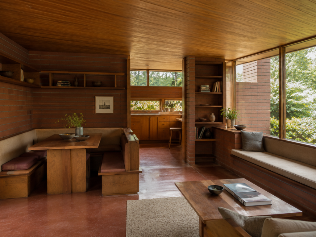
If you’ve ever admired a beautifully designed wall of cabinetry stretching seamlessly through a contemporary house, Wright would probably approve.
Usonian homes frequently incorporated furniture directly into the architecture.
Benches could run along walls beneath windows.
Shelving was recessed into rooms.
Dining tables might feel almost permanently connected to their surroundings.
Storage was integrated rather than added later.
This wasn’t purely aesthetic.
It was partly an attempt to reduce cost, use small spaces efficiently and prevent modest houses from becoming overwhelmed with furniture.
But it also created an unusually calm interior.
Instead of a room containing twenty unrelated objects, the furniture feels like an extension of the building.
It’s one of the strongest Usonian ideas worth stealing today.
Open-Plan Living Wasn’t Invented Yesterday
One of the more surprising things about looking at Usonian floor plans is how contemporary they can feel.
Formal dining rooms were reduced or eliminated.
Living and dining areas flowed together.
The kitchen — which Wright often called the workspace — became more closely connected with the rest of family life.
Remember, this was happening during the 1930s and 1940s.
The Victorian model of a house divided into specialised rooms connected by corridors was beginning to disappear.
Instead, domestic life could happen within one larger interconnected space.
It wasn’t quite the enormous kitchen-living-dining room found in many contemporary houses. Wright still used architecture, furniture, ceiling changes and fireplaces to subtly define different areas.
And perhaps that’s something we’ve forgotten.
Open plan doesn’t have to mean one gigantic room with an island bench floating in the middle.
Spaces can be connected without becoming indistinguishable.
The House Is Supposed to Look Outward
Perhaps nothing makes a Usonian interior feel more modern than its relationship with nature.
Wright’s houses weren’t designed as objects that happened to sit on a block of land.
The site mattered enormously.
Walls might remain relatively closed toward the street while the opposite side of the house opens dramatically toward a private garden.
Windows wrap around corners.
Doors lead onto terraces.
Rooflines extend beyond the walls.
Interior materials sometimes continue outside.
From the living room, the garden begins to feel like another room.
This principle has become so familiar in contemporary architecture that it’s easy to forget how radical it once was.
Today we call it indoor-outdoor living.
Wright was thinking about it generations ago.
And Then There Are Those Windows
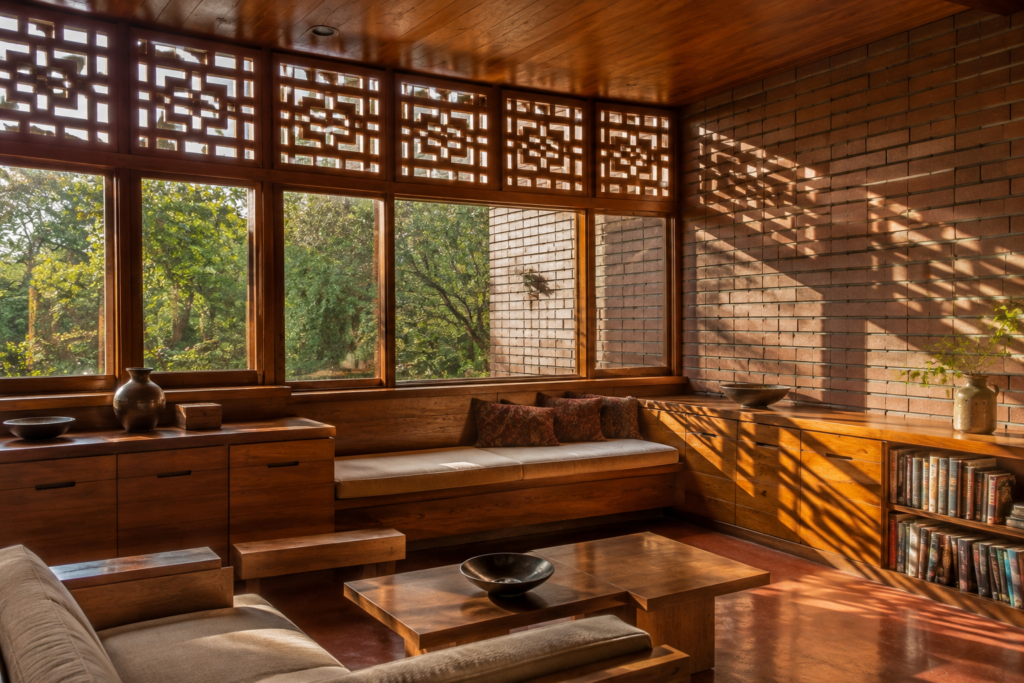
Usonian windows deserve their own mention because they weren’t always simply enormous sheets of glass.
Wright frequently incorporated clerestory windows — smaller windows positioned high on the wall — to bring daylight into a room while maintaining privacy.
Some houses also featured intricately patterned plywood panels over sections of glazing.
These geometric cut-outs cast changing patterns of light across the interior throughout the day.
It’s ornament, but not ornament in the traditional sense.
Nothing has been added simply because an empty surface needed decorating.
Instead, the decoration comes from light interacting with architecture.
That feels very Usonian.
Usonian Is Not Quite the Same as Mid-Century Modern
This is where things get slightly confusing.
Look at a Usonian house today and it’s tempting to simply call it Mid-Century Modern.
There is certainly overlap.
Both favour relatively clean lines, open living spaces, large windows, natural materials and a stronger relationship between architecture and landscape.
But Usonian design began earlier and came from a much more specific architectural philosophy.
Mid-Century Modern eventually became a broad international design movement encompassing architecture, furniture, lighting and product design.
Usonian remained closely associated with Wright’s vision for an American house.
And visually, Usonian interiors can feel heavier and more organic.
There is often more timber.
More masonry.
Lower ceilings.
Stronger horizontal lines.
A greater sense that the house has grown from its site rather than simply been placed upon it.
If classic Mid-Century Modern can sometimes feel crisp and optimistic, Usonian often feels earthier, quieter and more architectural.
The Ceilings Are Often Surprisingly Low
This might be one of the harder Usonian ideas to sell in an era obsessed with enormous ceilings.
Contemporary property listings practically shout about double-height spaces.
Usonian houses often do the opposite.
Ceilings can be deliberately low.
Wright understood that intimacy and grandeur only really exist in relation to one another.
A lower ceiling over a dining area can make it feel sheltered and comfortable. A narrow passage can make the room beyond it feel larger. A compressed entrance makes the openness of the living room more dramatic.
Not every room needs to feel like an airport terminal.
Sometimes architecture becomes more interesting when it changes scale.
There Is Very Little Room for Clutter
This doesn’t mean Usonian interiors need to look empty.
They can contain books, ceramics, textiles, artwork and objects collected over time.
But the architecture generally wants to remain visible.
If every wall is covered with furniture and every surface is crowded with accessories, much of the effect disappears.
The eye needs somewhere to rest.
The grain of the timber becomes decoration.
Brick becomes decoration.
Sunlight becomes decoration.
A view through the windows becomes decoration.
This is one reason Usonian design feels surprisingly compatible with today’s interest in warm minimalism.
The difference is that Usonian rooms rarely feel sterile.
There’s too much natural material for that.
How to Bring Usonian Ideas Into a Normal Home
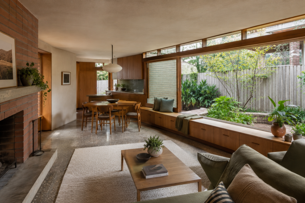
Unless you’re planning to commission an architect to design an entire house around Wright’s principles, you’re probably not going to create a genuinely Usonian home.
And that’s fine.
Copying the style literally isn’t really the point.
The more interesting approach is borrowing its ideas.
Start with materials.
Natural timber, brick, stone, terracotta and warm-toned concrete immediately move a room away from generic white-box minimalism.
Then consider built-ins.
A long timber bench beneath a window can provide seating and storage while making the room feel more architectural.
A wall of cabinetry can replace several individual pieces of furniture.
Bookshelves can be designed as part of the room rather than added as an afterthought.
Lighting should be integrated where possible rather than relying entirely on decorative fittings.
And perhaps most importantly, look outside.
If a room has a beautiful tree, garden or even a small courtyard beyond the window, arrange the interior around that view.
The sofa doesn’t always need to face the television.
You Don’t Need a Forest Outside the Window
This is another useful lesson.
Architectural photography has conditioned us to think that connecting a house with nature requires a spectacular mountain, desert or forest.
It doesn’t.
A carefully positioned window overlooking one mature tree can be enough.
So can a tiny enclosed courtyard.
A patch of ornamental grass moving in the wind can completely change how an interior feels.
Usonian design isn’t really about having spectacular scenery.
It’s about not treating the outside world as irrelevant to the room.
That’s something almost any home can learn from.
Why Usonian Design Feels Relevant Again
It’s interesting that a style conceived during the 1930s suddenly feels so compatible with contemporary interiors.
Part of that is visual.
We’re moving away from the cold grey-and-white minimalism that dominated interiors for years.
Warm timber is back.
Natural stone is everywhere.
Earthy colours have returned.
Built-in furniture is increasingly desirable.
People want rooms that feel calm without feeling empty.
But there’s something deeper going on too.
Usonian design questioned whether bigger automatically meant better.
It questioned whether houses needed formal spaces nobody really used.
It valued efficient floor plans, multifunctional spaces and thoughtful storage.
It tried to make relatively modest houses feel special through design rather than sheer size.
Nearly ninety years later, those questions feel strangely current.
Of Course, Wright’s Affordable Dream Didn’t Quite Work
There is a wonderful contradiction at the heart of Usonian architecture.
Wright wanted these houses to represent an affordable form of good architecture for ordinary Americans.
But highly customised architecture has a habit of becoming expensive.
Some Usonian houses exceeded their intended budgets. Others required specialised construction methods or enormous attention to detail.
And surviving Wright-designed houses are hardly ordinary pieces of suburban real estate today.
Many are treasured architectural landmarks.
The democratic dream was imperfect.
But the ideas survived.
Open-plan living.
Carports.
Radiant floor heating.
Built-in storage.
Large expanses of glazing.
Indoor-outdoor connections.
Smaller houses designed more intelligently rather than simply made larger.
Those ideas escaped Usonia and entered mainstream residential architecture.
The Best Usonian Interiors Don’t Really Look Decorated
And perhaps that’s the thing worth remembering.
There isn’t necessarily a spectacular sofa.
There isn’t a giant chandelier.
There isn’t a marble kitchen island the size of a small European country.
The room works because the proportions are right.
The timber is beautiful.
The fireplace feels substantial.
The light changes throughout the day.
The furniture belongs exactly where it is.
And outside the window, something green is moving.
Usonian design reminds us that an interior doesn’t always become more interesting when we add something.
Sometimes the better question is whether the architecture was interesting enough in the first place.
A Style That Was Really an Idea
Calling Usonian an interior design style isn’t entirely accurate.
It was architecture.
It was social thinking.
It was Frank Lloyd Wright trying to imagine what a distinctly modern American home could become.
But its interiors developed such a recognisable language that almost a century later, we’re still borrowing from them.
Warm natural materials. Integrated furniture. Open living spaces. Lower ceilings. Built-in storage. Strong geometry. Rooms organised around landscape and light.
You might never live in a Usonian house.
You might never even see one in person.
But there’s a good chance you’ve already admired a contemporary interior influenced by the ideas behind one.
And perhaps that’s the most remarkable thing about Usonian design.
It doesn’t really look like the past.
It looks remarkably like where we’re heading.
Britt & Tyler
We’re Britt and Tyler, the two Australians behind Cocktails & Cathedrals. We’re drawn to old buildings, beautiful rooms, bookshops and places that seem to hold a story. Our journal brings those interests together, with a fondness for slow afternoons and a well-made cocktail. We hope it helps you find places you’ll want to linger.
Travel slowly. Stay beautifully.
A little more about us →