Postmodernism Interior Design: The Style That Broke Every Rule
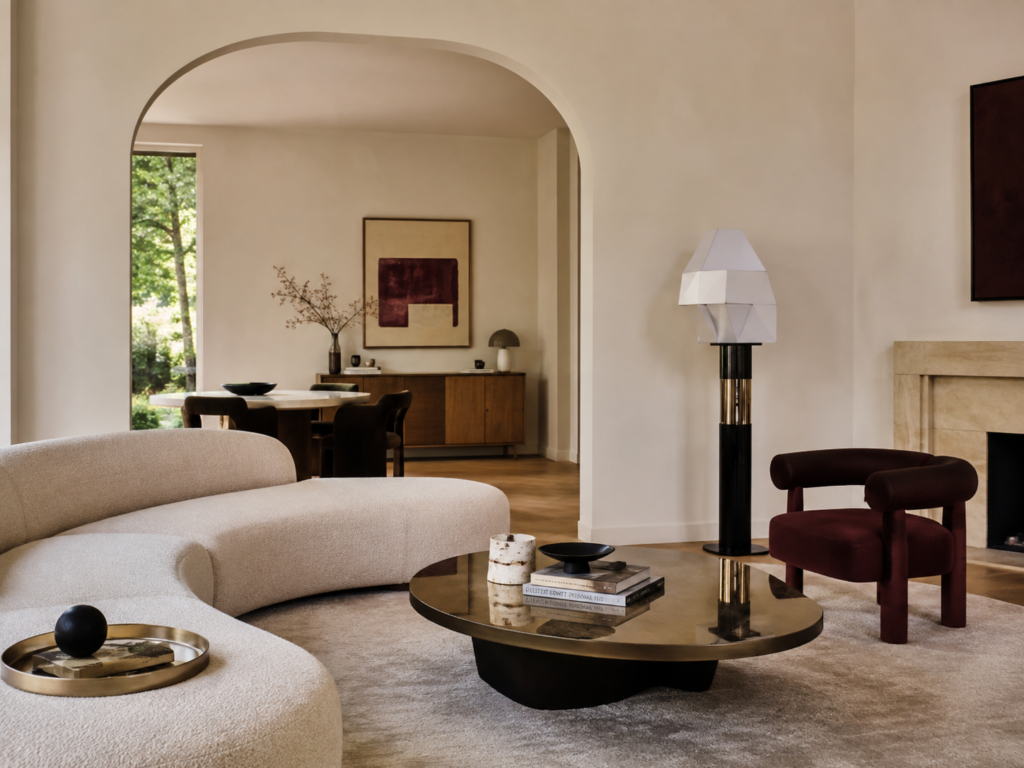
For a style built around breaking rules, Postmodernism has somehow ended up with a surprisingly narrow reputation.
Mention Postmodern interior design and most people picture the same things: bright primary colours, squiggly furniture, checkerboard floors, oversized geometric lamps and something vaguely Memphis Milano sitting in the corner.
And yes, all of that happened.
But Postmodernism was much bigger, stranger and more intelligent than that.
It was architecture quoting ancient Rome with a wink. It was marble used beside laminate. It was a perfectly serious room containing one completely ridiculous chair. It was arches that did not need to be arches, columns that were barely pretending to hold anything up, and furniture that occasionally seemed more interested in making a point than providing somewhere comfortable to sit.
Postmodernism arrived because designers had grown tired of being sensible.
After decades of Modernism insisting that form should follow function, decoration should be restrained and buildings should express their construction honestly, Postmodern designers essentially asked:
Why?
And then proceeded to have quite a lot of fun.
What Is Postmodern Interior Design?
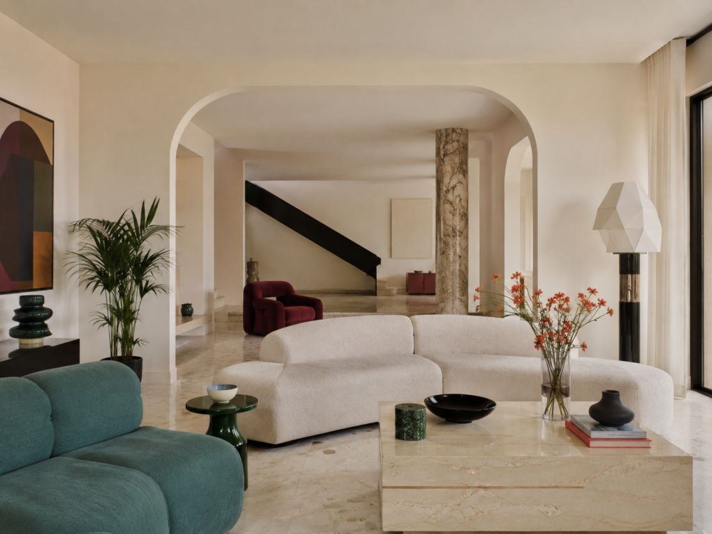
Postmodernism emerged during the second half of the twentieth century, becoming particularly influential from the 1970s through the 1990s.
It developed partly as a reaction against Modernism and the increasingly rigid International Style that had reshaped cities around the world.
Modernism had originally been radical.
By the middle of the century, however, its visual language had become almost institutional: glass towers, white walls, rectilinear furniture, exposed structure and the idea that unnecessary decoration was somehow intellectually suspect.
Postmodern designers rejected that seriousness.
Instead of stripping things away, they brought things back.
Colour.
Pattern.
Historical references.
Decoration.
Humour.
Symbolism.
Contradiction.
Sometimes all in the same room.
The result was not one single recognisable aesthetic. Postmodernism was more like an attitude toward design.
A designer could borrow a Roman arch, exaggerate it, paint it pink and place it beside a chrome table.
Another might create an almost austere room interrupted by a wildly sculptural piece of furniture.
Another might combine Art Deco geometry, classical columns, terrazzo flooring and industrial materials without feeling any obligation to explain why.
That freedom is really the point.
Postmodernism Was a Reaction Against Modernism
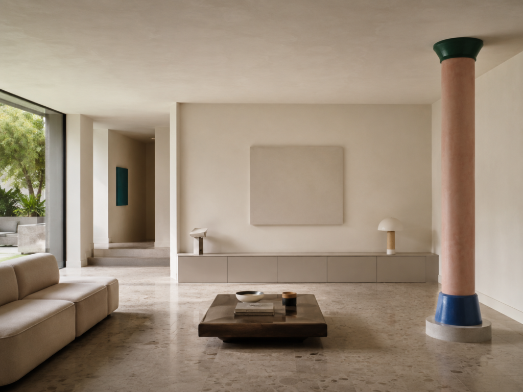
To understand Postmodern interiors, it helps to understand what they were reacting against.
Modernist design had pursued clarity.
Rooms were supposed to be logical.
Materials were supposed to be truthful.
Decoration was generally reduced.
Structural elements were supposed to perform structural functions.
Postmodern designers questioned nearly every one of those assumptions.
Why couldn’t a column exist simply because it looked interesting?
Why couldn’t a cheap material imitate an expensive one?
Why couldn’t architecture reference ancient Greece, Art Deco and contemporary pop culture simultaneously?
Why did everything need to be so serious?
The famous Modernist phrase “less is more” eventually inspired architect Robert Venturi’s equally famous response:
“Less is a bore.”
That line captures Postmodernism remarkably well.
It did not necessarily mean that every room needed more objects.
It meant that interiors were allowed to communicate more ideas.
Postmodernism Is Not Just Memphis Design
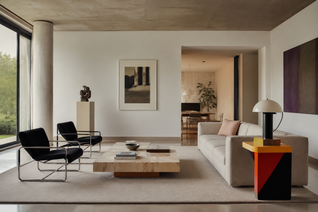
This is probably the biggest misconception surrounding the style.
Memphis Milano is certainly Postmodern.
But Postmodernism is not synonymous with Memphis.
The Memphis Group was founded in Milan in 1980 by designer Ettore Sottsass and became famous for furniture and objects using bold colours, plastic laminates, exaggerated geometric forms and playful patterns.
It produced some of the most recognisable design objects of the 1980s.
But Postmodern design existed well beyond Memphis.
Architects such as Robert Venturi, Michael Graves, Charles Moore and Philip Johnson explored historical references and ornament in very different ways.
Interior designers mixed classical architectural details with contemporary furniture.
Luxury hotels adopted oversized geometry, polished stone and dramatic colour.
Private homes experimented with arches, mirrored surfaces, terrazzo and unconventional layouts.
There was theatrical Postmodernism.
Minimal Postmodernism.
Italian Postmodernism.
Corporate Postmodernism.
And plenty of interiors that would barely register as Postmodern at first glance.
That variation is what makes the style much more interesting than its stereotype.
Architecture Became Decorative Again
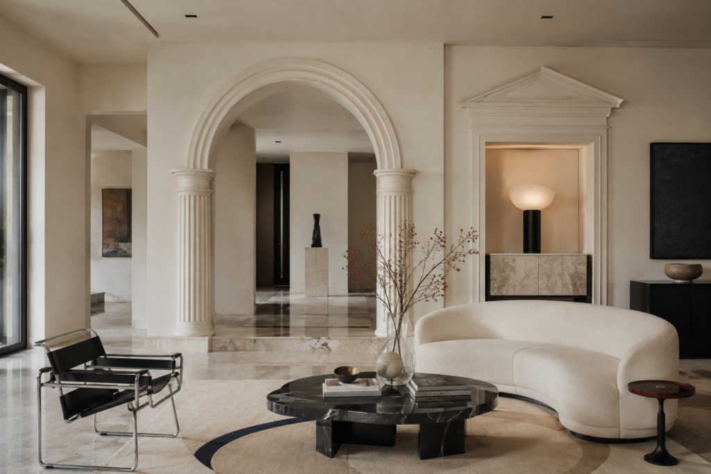
One of Postmodernism’s biggest departures from Modernism was the return of architectural decoration.
Walls stopped being merely walls.
Doorways became shapes.
Ceilings became opportunities.
Columns appeared even when structural engineers had absolutely no need for them.
Arches were particularly popular.
Sometimes they were genuinely architectural.
Sometimes they were completely decorative.
And sometimes they seemed to exist primarily because somebody thought an enormous semicircular opening would look fantastic.
Postmodern interiors frequently manipulated scale as well.
A doorway might be unusually large.
A column might be strangely short.
A fireplace might resemble a classical monument.
A staircase could become an enormous sculptural feature.
The room itself became part architecture and part visual joke.
Classical References Were Used Differently
Historicism had existed long before Postmodernism.
Victorian buildings freely borrowed from Gothic, Classical and Renaissance architecture.
But Postmodern designers approached history differently.
They often treated historical elements almost like quotations.
A classical column might appear, but simplified.
A pediment might sit above something that clearly did not require a pediment.
An arch could be exaggerated until it became more graphic than architectural.
The designer assumed you recognised the reference.
That recognition was part of the experience.
This is why Postmodern spaces sometimes feel slightly theatrical.
They are not trying to convince you that you have stepped into ancient Rome.
They are reminding you of ancient Rome while also reminding you that you are very definitely standing in 1986.
Colour Returned With Confidence
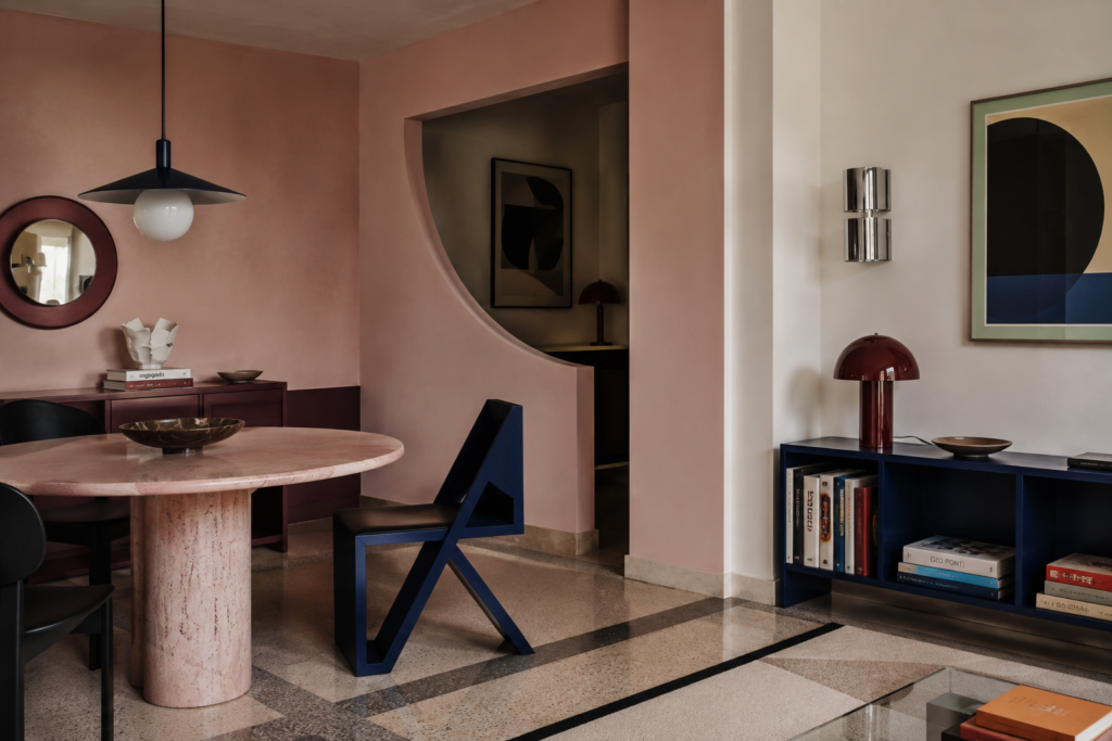
Modernism never completely abandoned colour, of course.
But many late-modern interiors became dominated by restrained neutral palettes.
Postmodernism enthusiastically reopened the paint cupboard.
Dusty pink.
Teal.
Burgundy.
Cobalt.
Mustard.
Forest green.
Black.
Cream.
Primary red.
Terracotta.
Lavender.
Sometimes several appeared together.
The important thing is that Postmodern colour was often architectural rather than merely decorative.
A wall might be divided into geometric blocks.
A doorway might have a contrasting surround.
Cabinetry could become a large coloured object.
Flooring might introduce a graphic pattern that defined the entire room.
Colour was not always there to make a room cheerful.
Sometimes it was there to make the architecture stranger.
Geometry Became Playful
Circles, triangles, arches, cylinders and exaggerated rectangles appear constantly in Postmodern design.
But they are rarely arranged with the strict mathematical discipline you might associate with early Modernism.
Postmodern geometry likes being slightly awkward.
A round window might appear beside a sharply rectangular doorway.
A curved sofa could sit against a rigid grid of shelving.
A triangular table might interrupt an otherwise symmetrical room.
These unexpected relationships create tension.
And Postmodern interiors often depend on that tension.
Everything matching perfectly would almost defeat the purpose.
Furniture Was Allowed to Be Weird
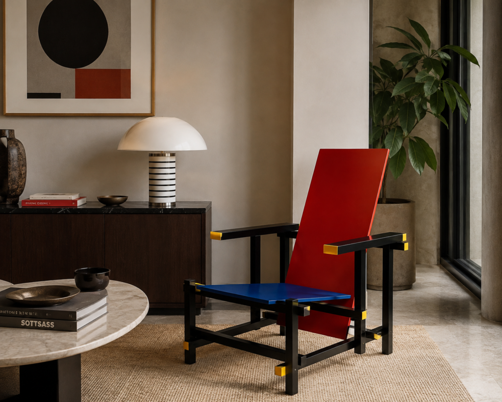
Postmodern furniture frequently sits somewhere between functional object and sculpture.
A chair could have a strangely oversized back.
A lamp might look like a piece of abstract architecture.
Tables could rely on geometric shapes rather than traditional forms.
Shelving might behave more like sculpture than storage.
The room did not necessarily need dozens of unusual pieces.
In fact, some of the best Postmodern interiors are relatively restrained.
One strange object can completely change the atmosphere.
A conventional sofa beside an enormous geometric floor lamp suddenly feels different.
A plain dining room with an eccentric set of chairs becomes memorable.
A simple hallway with one sculptural console can shift the entire space.
This is one of the easiest Postmodern ideas to borrow today.
Materials Did Not Have to Behave Properly
Postmodernism had very little interest in Modernism’s obsession with material honesty.
Laminate could imitate stone.
Plastic could sit beside marble.
Terrazzo could appear with polished metal.
Mirrors could cover large architectural surfaces.
Glass block could become decorative rather than purely functional.
A designer might combine something expensive with something deliberately ordinary.
That mixture created another layer of contradiction.
Luxury and kitsch.
Traditional and synthetic.
Architectural and disposable.
The combinations were sometimes intentionally uncomfortable.
That was often the point.
Glass Block Deserves a Mention
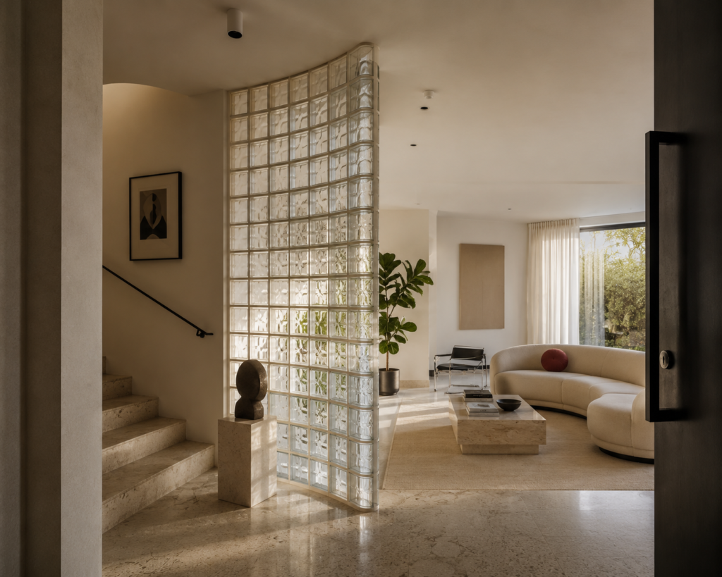
Few materials are as strongly associated with late twentieth-century interiors as glass block.
And after decades of being removed from renovations, it has quietly returned.
It makes sense.
Glass block creates privacy while allowing light through.
It can form walls without making rooms feel completely enclosed.
And its grid pattern naturally introduces geometry.
In Postmodern interiors, glass block was used for shower partitions, staircases, curved walls and internal windows.
Today, it works particularly well when used sparingly.
A short curved glass-block wall beside a shower can look contemporary rather than retro.
A small internal window between rooms can introduce texture and light.
The trick is avoiding the temptation to recreate an entire 1980s shopping centre.
Kitchens Could Become Architectural
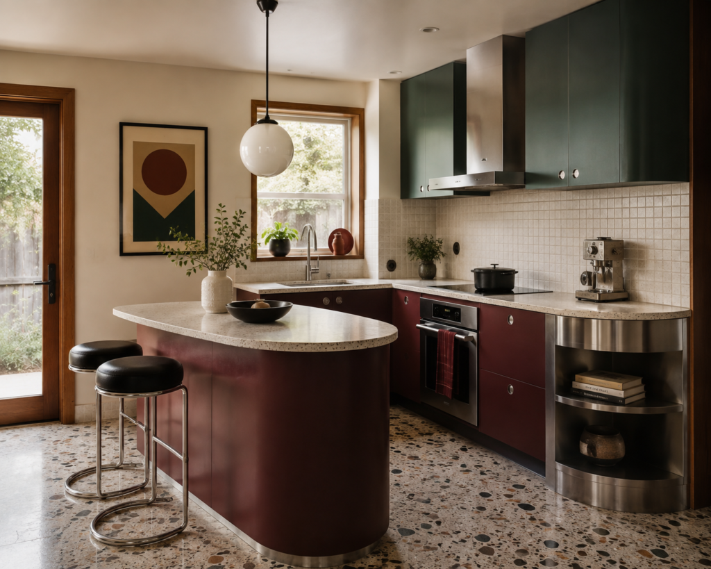
Postmodern kitchens were often more adventurous than today’s endless stretches of pale cabinetry.
Cabinets could be strongly coloured.
Benchtops might contrast dramatically.
Curves could appear in islands or breakfast bars.
Terrazzo and patterned tile added graphic texture.
Stainless steel could be paired with colourful laminate.
Open shelving might be deliberately asymmetrical.
Again, the most useful lesson for contemporary kitchens is not to reproduce everything.
Choose one idea.
Perhaps rounded cabinetry.
Perhaps burgundy joinery with pale stone.
Perhaps a tiled geometric splashback.
Perhaps a sculptural pendant above an otherwise straightforward kitchen.
Postmodernism works surprisingly well when diluted.
Bathrooms Are Almost Too Easy
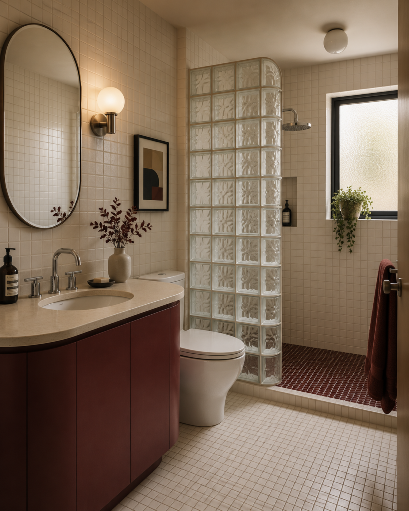
Bathrooms naturally suit Postmodern design.
They are small.
They contain lots of geometric surfaces.
And they already involve a mixture of ceramic, metal, glass and stone.
Small-format square tiles immediately introduce a Postmodern grid.
A curved vanity changes the architecture without overwhelming the room.
Chrome tapware provides just enough shine.
Glass block adds both texture and privacy.
An unusual mirror can introduce geometry.
And colour can be concentrated in one surface rather than covering everything.
A modest bathroom with cream tiles, a burgundy vanity, rounded mirror and chrome fittings can feel clearly Postmodern without becoming a period set.
Lighting Became Sculpture
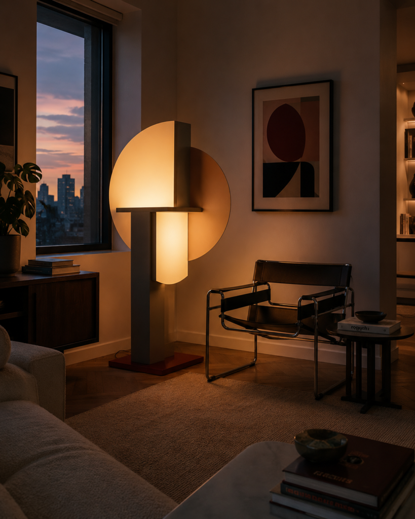
Postmodern designers understood something that interiors occasionally forget:
A lamp does not have to disappear.
Lighting can be architecture.
Oversized floor lamps, geometric pendants, spherical lights and sculptural table lamps all became important features.
Some looked almost absurd when switched off.
Then evening arrived and suddenly the whole room made sense.
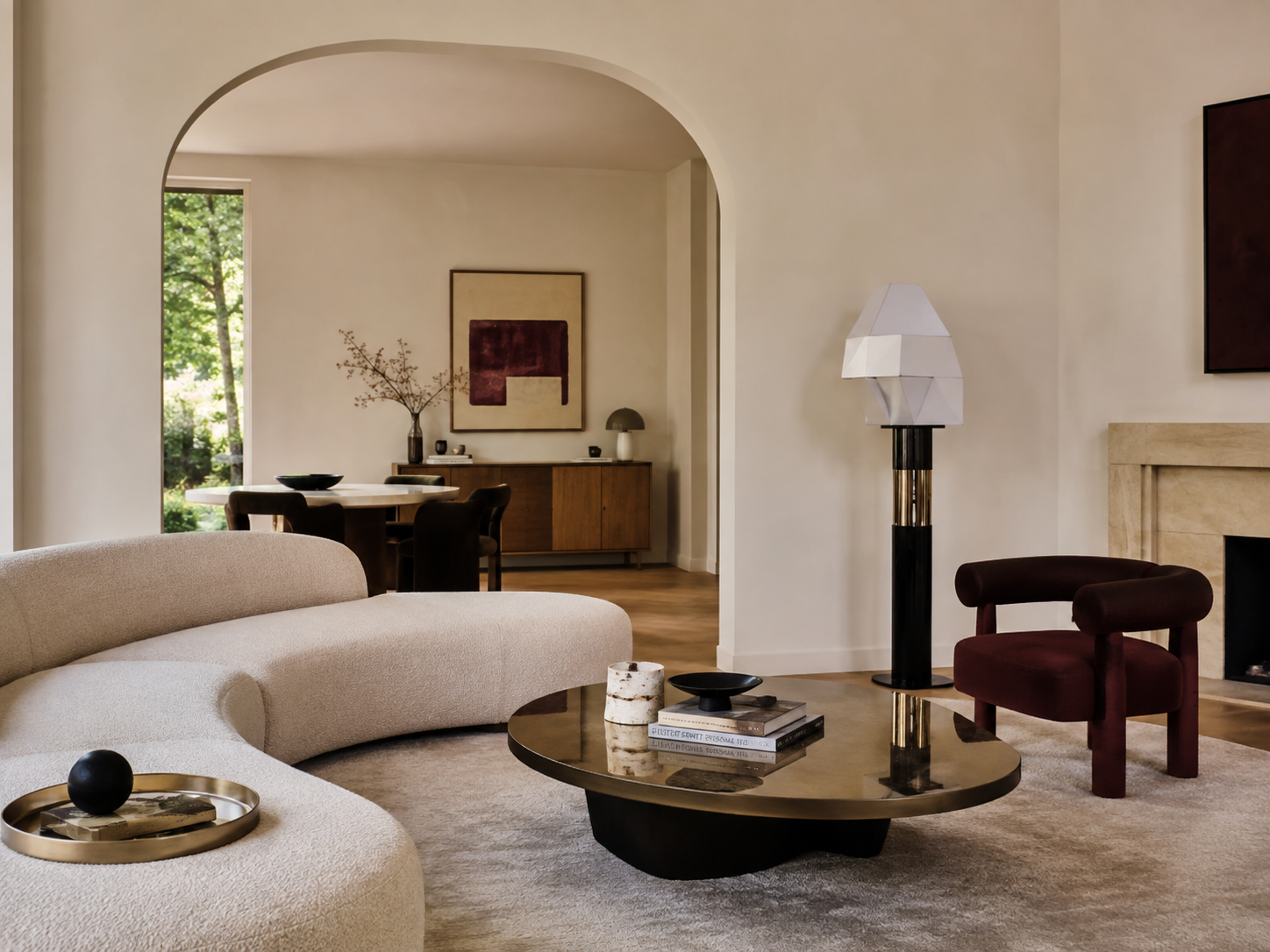
A large Postmodern lamp can still do enormous work in an otherwise simple contemporary interior.
It provides exactly the kind of visual interruption the style thrives on.
The Best Postmodern Rooms Have Tension
A completely coordinated Postmodern interior can become exhausting very quickly.
The best ones usually contain tension between restraint and eccentricity.
A calm room with one bizarre chair.
Traditional timber beside high-gloss laminate.
A perfectly symmetrical fireplace with an asymmetrical piece of art.
Neutral walls interrupted by cobalt cabinetry.
A classical arch framing extremely contemporary furniture.
That contrast creates energy.
Without it, Postmodernism can slide into theme-room territory.
Why Some Postmodern Interiors Aged Badly
There is no denying that plenty of Postmodern interiors aged terribly.
The style was enthusiastically adopted by shopping centres, office buildings, restaurants and hotels during the 1980s and 1990s.
Many of those spaces copied the superficial ingredients without understanding the ideas behind them.
Add some peach marble.
Throw in teal upholstery.
Build an oversized geometric entrance.
Install enough polished brass to signal passing aircraft.
Done.
Once the commercial world adopted Postmodern visual language at enormous scale, it quickly became associated with a particular period.
That happens to most influential styles eventually.
But enough time has now passed that designers are rediscovering the ideas beneath the clichés.
Postmodernism Is Already Coming Back
Look closely at contemporary interiors and Postmodern influences are everywhere.
Curved sofas.
Glass block.
Terrazzo.
Coloured marble.
Chunky geometric furniture.
Stainless steel.
Unexpected arches.
Sculptural lighting.
Primary-coloured accents.
Even the renewed interest in 1980s Italian furniture reflects the same shift.
After years dominated by beige minimalism, Japandi and extremely restrained interiors, people appear increasingly interested in rooms with personality again.
Postmodernism provides plenty.
Perhaps too much, if you are not careful.
How to Use Postmodernism in a Normal Home
You do not need to turn your living room into an Ettore Sottsass exhibition.
Postmodernism works extremely well in small doses.
Start with architecture if you are renovating.
A curved doorway.
A rounded kitchen island.
A glass-block partition.
A geometric tiled floor.
Then keep most of the furnishings relatively calm.
Alternatively, keep the architecture simple and introduce one or two unusual objects.
A sculptural chair.
A chrome lamp.
A colourful side table.
An oversized piece of abstract art.
Even cabinetry can carry the idea.
Deep green, oxblood, dusty blue or muted pink joinery can create a Postmodern feeling without relying on loud patterns.
The goal is not to recreate the 1980s.
It is to borrow the willingness to make an unexpected decision.
Postmodernism Is Not About Making Everything Loud
This may be the most useful thing to remember.
Postmodernism is often described visually when it should really be understood philosophically.
It is not necessarily about colour.
It is not necessarily about pattern.
It is not necessarily about Memphis furniture.
It is about rejecting the idea that there is one correct way to design a room.
A quiet interior can still be Postmodern if it contains historical references, exaggerated geometry or deliberately contradictory objects.
A neutral room with an absurdly monumental fireplace could be Postmodern.
So could a restrained kitchen with curved stainless cabinetry.
Or a cream bathroom with glass block and one strange cobalt basin.
The attitude matters more than the colour palette.
Why Postmodernism Feels Relevant Again
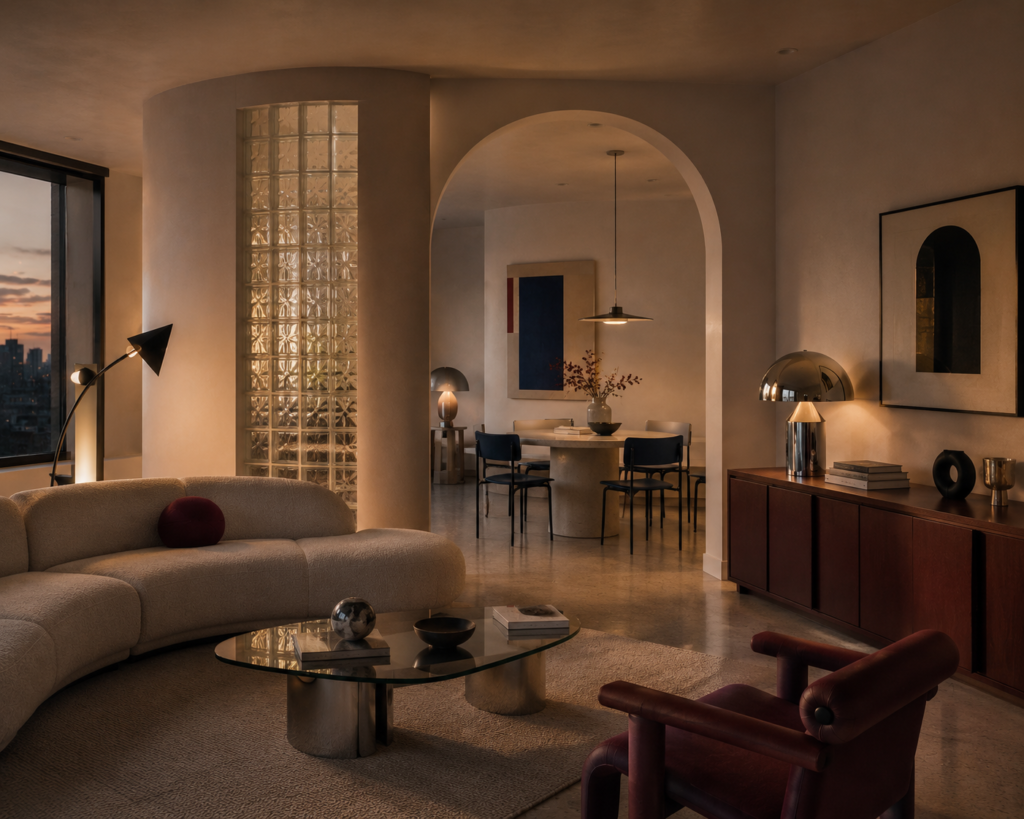
For years, interior design has been drifting toward safety.
Beautiful safety, certainly.
Warm oak.
Travertine.
Linen sofas.
Cream walls.
Soft curves.
Perfectly styled ceramics.
There is nothing wrong with any of those things.
But eventually, perfection becomes predictable.
Postmodernism offers an antidote.
It reminds us that interiors can be funny.
They can be strange.
They can contain references that do not perfectly match.
They can include one object that makes absolutely no sense and somehow improves everything around it.
Most importantly, rooms do not have to look as though they were designed by an algorithm optimised for universal approval.
They can reveal the person who lives there.
Maybe Less Really Was a Bore
Postmodernism occasionally went too far.
That is part of its charm.
Designers experimented because they were willing to produce things that might fail.
Some did.
Others became icons.
But beneath all the columns, terrazzo, oversized lamps and slightly ridiculous chairs was a genuinely important idea:
Design should not become so correct that it stops being interesting.
And nearly fifty years later, that feels unexpectedly relevant.
Perhaps the best way to use Postmodernism today is not to copy its appearance at all.
Borrow its confidence instead.
Choose the strange chair.
Paint the cabinetry the unexpected colour.
Build the unnecessary arch.
Put contemporary furniture beside something classical.
Allow one thing in the room to make you wonder whether it really belongs there.
Because sometimes the thing that does not quite belong is the thing that makes the entire room work.
Britt & Tyler
We’re Britt and Tyler, the two Australians behind Cocktails & Cathedrals. We’re drawn to old buildings, beautiful rooms, bookshops and places that seem to hold a story. Our journal brings those interests together, with a fondness for slow afternoons and a well-made cocktail. We hope it helps you find places you’ll want to linger.
Travel slowly. Stay beautifully.
A little more about us →